Listen up. Time for some tough love. That picture of your laughing grandchild, that snapshot of your beloved bulldog, the antique photo of your great-grandmother: what wonderful memories they elicit!
But they may not be the perfect subject for a fabric collage quilt.
It’s hard for me to say no. When students bring me these photos as potential subjects for a four- or five-day fabric images class, I try to guide them toward the best choice. I list the criteria that I think will give them the highest chance of success:
High contrast: Dark and light in equal measures. Shadows should be close to black and highlights close to white. But not ALL high contrast.
A variety of values: Are there some good in-between values as well? Does it have shades of color, or value, that gives form to the subject? (For more on value, see my blog entry, “Why Color is Irrelevant.”)
Sharp focus: Is the focus clear enough to blow up to the size needed to work with?
Close cropping: For a recognizable portrait, get in close. You don’t want a picture of someone standing fifty feet distant.
Three-quarters or profile pose: A subject staring straight ahead is the most difficult. It’s easier to define a nose if it’s not foreshortened.
Do my students’ (or even my own) subject photos always meet all of these guidelines? No. We muddle through despite, but the effort we put in when we start with a photo that lacks these criteria is much greater than it might have been had we chosen a different picture to work from.
Let’s take a look at the photos I used for some of my people and pet portraits. Along the way, I’ll point out the photos’ strengths and weaknesses.
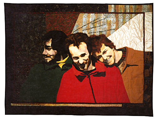
Surprise Me

“Surprise Me” is a quilt I made of my husband Tom and his two college roommates based on the above photo. I really like this shot. The affection and intimacy of the guys is clearly evident. But just because I like it, does that make it a good subject for a portrait?
Here’s why it works for me:
- Nice contrast. Look at the highlights and shadows on their faces.
- Focus is sharp.
- There’s a variety of poses. It’s not just three mug shots. Joe is in profile, Tom mostly straight on, and Mike is three-quarter profile with a head tilt to boot.
- Tight composition. There’s no wasted space between the subjects.
While the bright sunlight makes for great contrast, it leaves Tom and Mike a little washed out in the mid-values. I had to really work to find enough variation in tone to define Tom’s forehead and the right side of Mike’s face. Overall, though, the good aspects of the photo far outweigh the challenging ones.

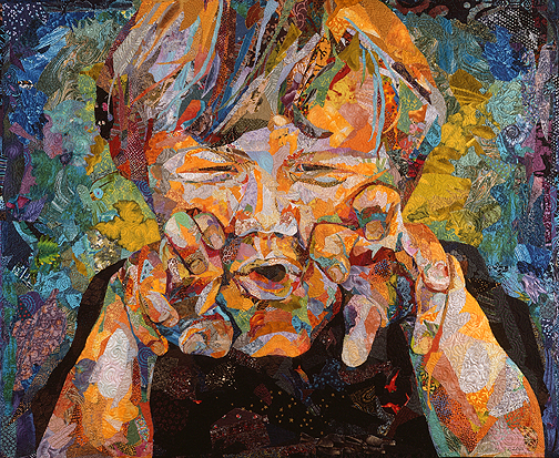
Samuelsaurus Rex

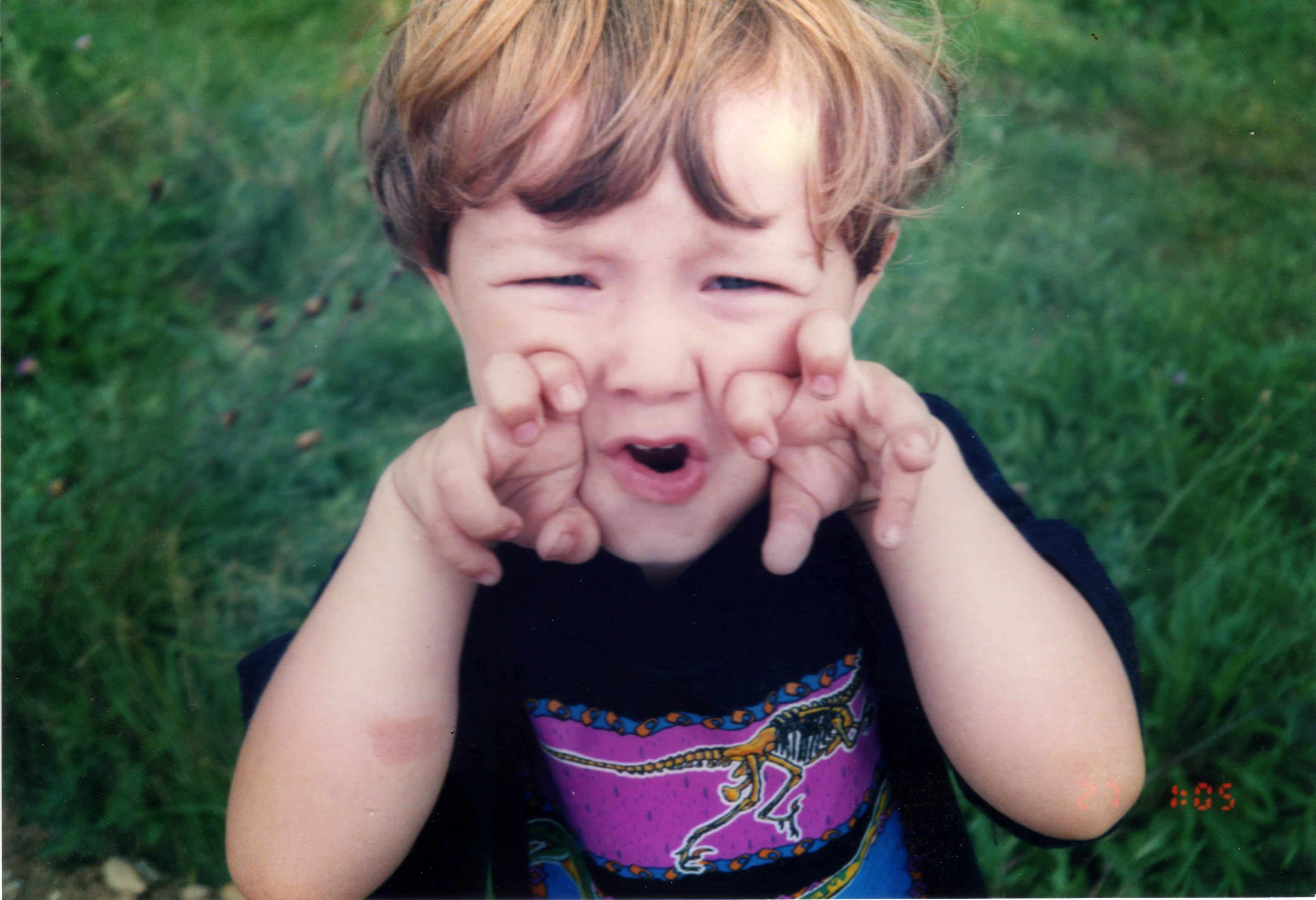
I used this photo to create the portrait of my son Sam, “Samuelsaurus Rex.” Besides being the cutest, sweetest, most charming little boy in the world, what makes this photo good or bad as the source of a portrait?
- The pose is of course the best part of this photo. The hands curled in Tyrannosaur claws, the squinted eyes, the open mouth, the tousled hair. It’s immediately engaging.
- However: the contrast isn’t good at all. His pale skin shows barely any change in value.
- The straight on framing introduces a bunch of foreshortening. His stubby little nose is one thing, but his cute little curled fingers present a foreshortening quagmire.
Verdict: This is not a picture I would encourage a beginner to use. I would gently suggest that the student choose a different subject for their first piece. Once they had some experience, this would be a good photo to return to later.
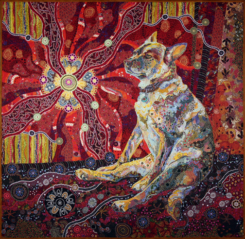
Dixie Dingo Dreaming
Aside from family members, another favorite subject for portraits among my students is pets. My own are no exception.
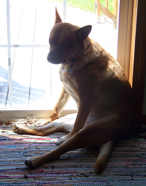
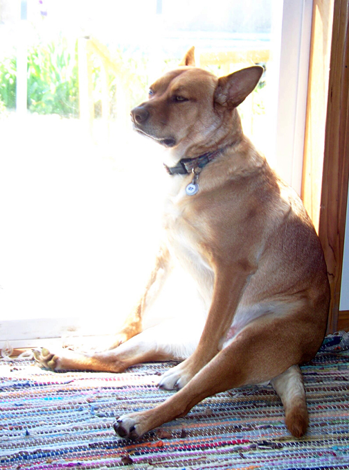
When I decided to make a quilt of my dog Pippin, I especially wanted to catch her in her unique “cattle dog” slouch. Here are some photos I considered using:
Let’s look at each one separately.
- One nice thing about animals as subject matter is that most of them come with built in value variation. Fur and feathers come in a variety of colors and shades. So the the fact that the flash has eliminated most shadows on Pippin here doesn’t really bother me. I can use her natural coloration to give her form shape.
- Focus and cropping are both fine.
- But it’s the pose that comes up short for me. Specifically, her snout will be foreshortened, which is always a challenge. And her expression is a bit “dubious”, uncharacteristic of her self-assured nature.
Verdict: Close but no cigar. But I did end up using this version of her tail. It has a nice curve to it.
- The problem here is obvious. The backlighting has left her totally in shadow.
- The pose isn’t quite right either.
- Bingo. The pose here is perfect. Pippin is drowsing in the sun, her ears are relaxed, her eyes are just starting to droop. Her front left paw is visible, which is a bonus. Most important, her muzzle is in ¾ profile, giving her head and face a nice shape.
- The overexposure of this photo is a problem, but how big a problem is it really? Sure I lose a lot of detail on her right side, but there’s a fix for that: I can use the underexposed photo above for that part of her.
- So, by referring to all three photos I come up with a good composite to work with.
What also makes the third photo so attractive to me is the context. It shows Pippin in a pose typical for her, in her favorite spot, in the sunshine. Even if you didn’t know Pippin you get a sense of her.
Golden Temple of the Good Girls
Let’s say you have multiple pets that you want to include in a single quilt. Are you going to take on the Sisyphean task of trying to get one photo of all of them? Let’s say you have a dog, a cat, and a bird. Still want to try it? It would be like that brain teaser involving ferrying a fox, a goose, and a bag of grain across a river.
The obvious solution is to use three (or more!) different photos and combine them. That’s what I did with “Golden Temple of the Good Girls.”
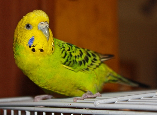
Here’s Kiiora the budgie.
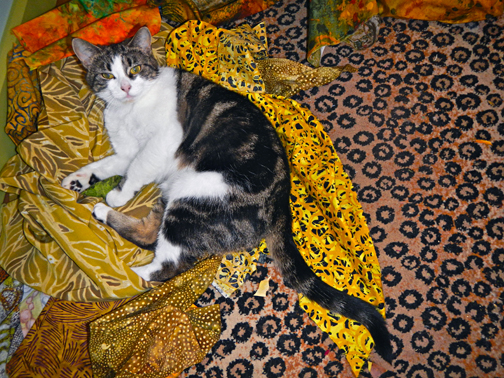
And Djinni the cat on a pile of “Crocodylus Smylus” fabric.
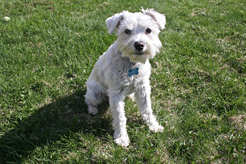
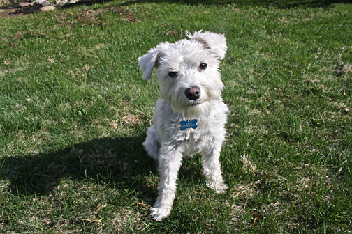
And Kali the mini-Schnauzer.
- Exposure and contrast are fine on all three.
- Cropping is fairly tight.
- Notice that each animal is looking at you. That’s important.
In fact, I only made one substantial change. Like using the underexposed photo for part of Pippin in “Dixie Dingo Dreaming,” here I used to two photos of Kali to get the perfect composition. I liked the pose of Kali’s body in the photo above, but I preferred the cock of her head in this one:
Here’s my solution for how to combine the three pets into one quilt:
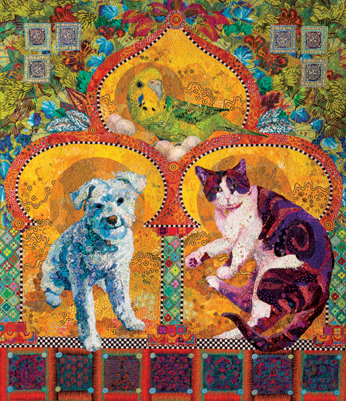
Kiiora obviously had to go at the top, in the peak of the temple, with her clutch of eggs (which, yes, she’s laid eggs, and no, they don’t hatch”“she’s single). Kali and Djinni each occupy a niche in the shrine down below. Notice how each breaks the “frame”: Kiiora and Djinni’s tails and Kali’s paw help bring them forward in the composition. (For more on “Golden Temple of the Good Girls” go to my previous blog post.)
Learning to See
Teaching students to see clearly is one of my most important tasks during class. Usually that involves asking them to learn to see values in their photos or to see the true shape of facial features such as eyes or mouths.
Sometimes when students bring in photos, they’re not seeing their subject clearly. Their vision is clouded by affection and maybe nostalgia. They’re so attached to a particular subject that the quality of the photo doesn’t really matter to them. All they see is their loved one—a departed parent, a devoted pet, or darling grandchild. They’re seeing with their hearts, not their eyes.
And there’s nothing wrong with that.
There’s a lot of value in being emotionally connected to the subject of a portrait. It may provide important details such as a typical expression or way of dressing that the photo lacks. At the very least, that connection provides motivation to stick with the project.
Do any students arrive with the perfect photo? Yes. And it makes for an easier start on the project. However, a lot of shortcomings that other photos might have can still be overcome—with extra effort—by a willing heart.


An excellent post. I am going to read it and reread it before I even start my search for a photo. Thank you so much Susan!
Thank you so much for your explanation on viewing light and dark. The interpretation of your son’s photo is amazing.
Miffy
London
Susan, what an excellent post. It is so often very difficult to understand just what the requirements for workshops are. Your post takes away the grey… and literally fills it with colour! Then again, I have been to so many workshops where people attend who don’t want to open their minds and listen to new ideas or techniques. This amazes me. Then there are others who are so incredibly giving and share their knowledge and talents. I do so love this element of our craft, whether it is in a workshop with a paid Tutor or at a sewing day between fellow Stitchers or Patchworkers. I have two prints of your beautiful Rhino & Dodo, who are to be framed and will bring joyous colour into our family home. Thank you for your wonderful contribution to our craft! xOx
Christine Blayney Workshop Co-ordinator (& avid stalker of Patchwork Guru’s Worldwide… And eclectic lover of colour) Geraldton Patchwork Club Geraldton Western Australia
Sent from my iPhone
Thank you so much Susan. Your blog is just incredible. I have enjoyed and learned so much from every entry. All can tell you love your work!
Susan I am so glad you are blogging. I learn so much with each post, such as looking at things from a different perspective. All of which can be applied to so many aspects of creative endeavors. Thank you so much for sharing your wealth of experience with us.
I love this blog also. It is really informative and I really appreciate your sharing and time to explain.
I am just finishing a portrait of our cat, Shadow and this blog made me notice the backgrounds you used. Stunning. Now I have to give that process some thought! Thank you.
Yes, I definitely will. I should have written “finishing piecing” in my comment. Your statement “These look ok, but these look better with more” was replaying in my head the past two days. I added to his face and am quite happy with the results. I then completely changed direction for a background and am currently working on the new design. You are keeping me busy. 🙂
Send me a picture! I’d love to see it. I also had a cat named Shadow.
I am in awe of your work, beautiful
Thanks for your information Susan. The details you’ve given make it that much easier for those of us still learning.