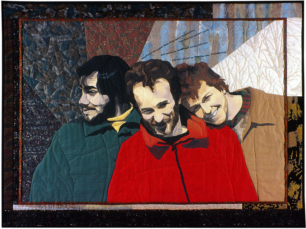
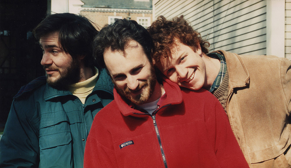
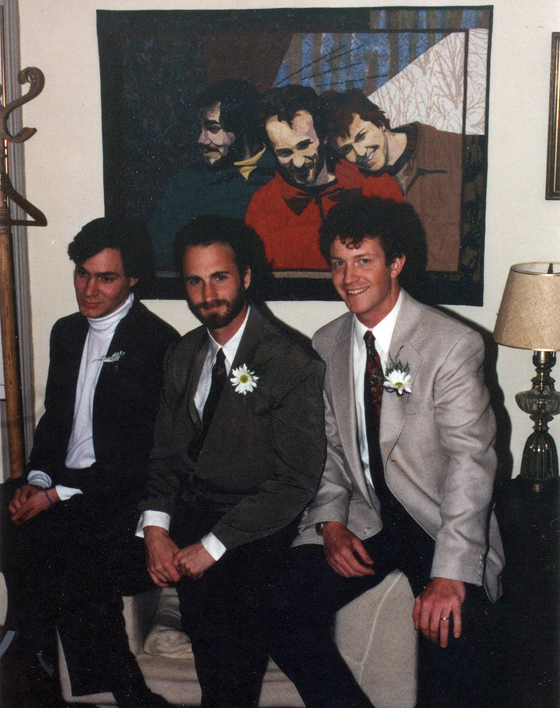
There’s a lot I can—and will—say about how I made this quilt, but “Surprise Me” is more than a quilt, more than art. It hangs behind my husband’s office chair, where we both see it every day. On a shelf nearby rests the photograph that inspired it.
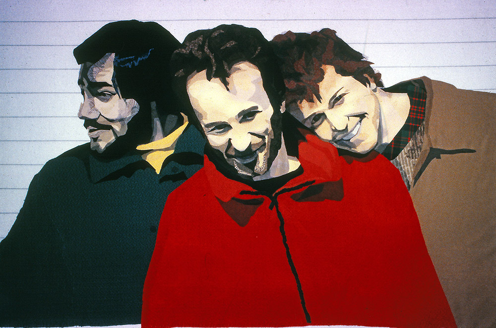
The challenge of portraiture is to create more than a likeness. The goal is to say something about the person—to capture something of his or her personality. In a portrait of three people, that challenge expands exponentially. You’re trying to capture the likenesses and personalities of three subjects. On top of that, you’re striving to capture something of the relationship between the subjects.
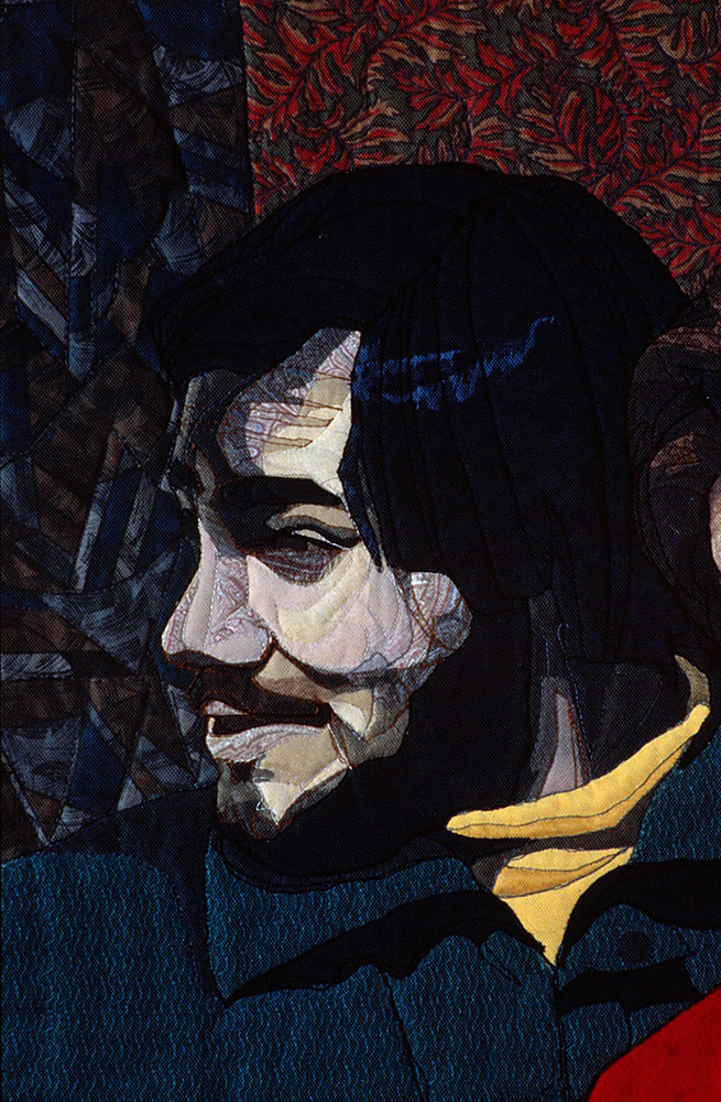
While not a perfect photo to work with in terms of value (see From Photo to Fabric: Choose the Best Shot)—Mike’s face is washed out, Joe’s face is in shadow—this photo does a lot of the work for me. The photo was a stroke of luck, a lightning strike, that says so much. You don’t need to know who these guys are to know they’re buddies. Mike is hamming it up. Tom is amused or bemused. Joe is looking away as if to say, “I don’t know them.”
This image was a joy to make into a quilt because of its personal significance. The occasion of this photo was the time I invited Tom’s college roommates to come surprise him on his birthday. The quilt encapsulates a memory of a happy time and reflects on their friendship as a whole.
Before I describe—and show—how this quilt was made, let me do my bad parent impression and tell you: “Do as I say, not as I do.”
As with some of the other “Quilt Stories” of my older pieces, the way I made this quilt is not representative of how I work now. I don’t suggest you try to emulate how I made this piece. In fact, I suggest you don’t. At least not if you like my current work better. But it’s all part of the personal evolution of my art and the early works still hold a special place in my heart. So consider this an interesting bit of history, kind of like reading about how people used to make their own candles by boiling down sheep’s fat. You can do it, but why would you? (This by-the-way, is Tom’s analogy not mine, though it did tickle me, so we left it in.)
Boiling the Fat
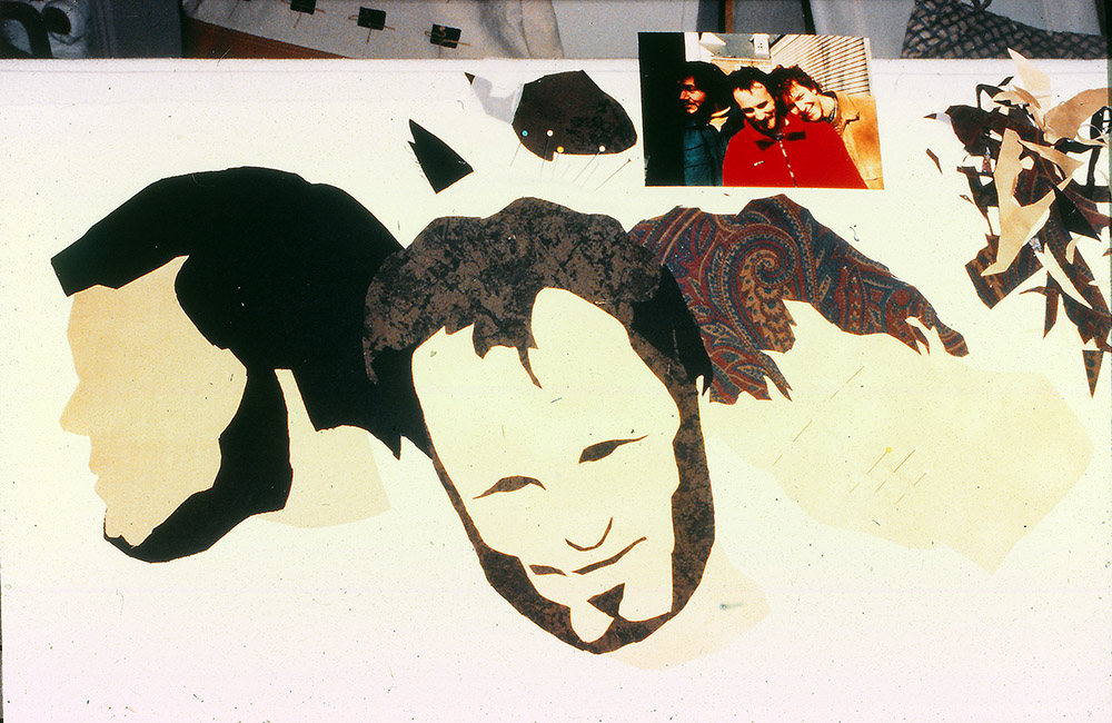
Like any other quilt I make, I started by using a plain foundation fabric. However, instead of sketching my image onto that base, I simply began free-hand cutting the fabric. My idea was to treat fabric as you would paint. I do have a degree in Illustration and plenty of experience in interpreting what I see into what I put down onto paper or canvas. It’s how I approached all my earlier fabric collage quilts. However, it’s different than how I approach it now, mostly since once I started teaching this process, I had to come up with a way that didn’t cause a panicked expression in my student’s eyes. And, as it turned out, it works better for me too.
But getting back to “Surprise Me”, I chose fabrics based on natural skin tones and hair colors—something I don’t think I would do today. The fabrics are solid or gently shaded with very few patterns mixed in. Mike’s red hair is as wild as I got.
I blocked in the faces using large pieces of fabric. This is another thing I do not do now, which is sketching a shape onto the foundation first, then filling the shape with smaller pieces of fabric, blending from one value to the next to create form. Starting with a large piece of fabric like this can lead to a flatter, more paint-by-number look—though I tried hard for that not to happen.
After blocking in the faces, I started with a simple indication of placement of features. In this case I used pins. Most of the detail in the faces were more of those solid fabrics plus plenty of sheers for variation of skin tone and shadows and highlights. I used netting, semi-sheer organzas, and chiffons—all in skin-tone colors or brown or black variations.


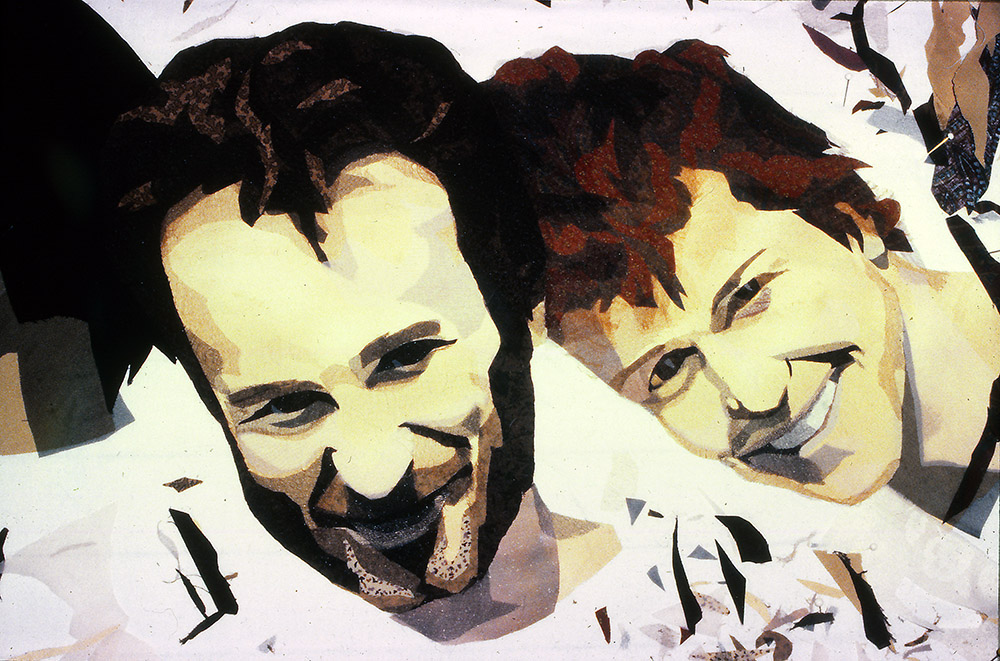
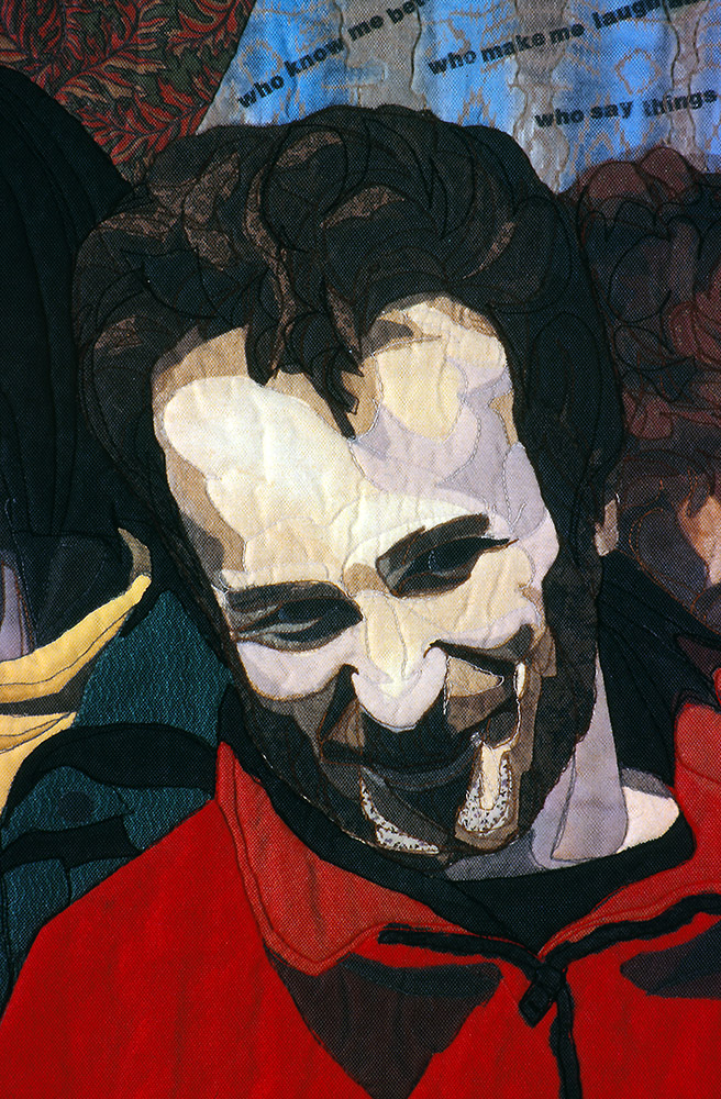
I soldiered on adding more detail. In the above photos, you’ll see that I concentrated on Tom, making the most progress on him to start. Eventually, though, I reached a point where I couldn’t overlook the fact that there was something wrong with Mike. He just wasn’t looking like himself. It took me a while to figure it out, which could have been avoided altogether if I’d started with a sketch.


See it now? Trimming off that extra half inch of jaw and chin made Mike look like Mike.
This is why I now teach people to start with a drawn design. Especially if you trace an existing photo, following the design will get the features placed right where they should be. We are evolved as humans to recognize faces. We can distinguish between the most infinitesimal differences in size, shape and placement of eyes, noses and mouths. If they’re off by only a little—Mike’s was off by a lot—we’ll notice and it will bug us.
Say It: Don’t Spray It
As I worked I glued pieces down. In this case, I used a spray adhesive, which meant removing the piece of fabric, turning it right side down onto newspaper, then spraying it and praying that those little pieces wouldn’t going flying who knows where. This was the second or third portrait I made using spray adhesive and was the one that finally convinced me to give it up. The fumes were the deciding factor. I just couldn’t continue sucking in all that nasty stuff. (See “Why Glue?” for more info on using glue for fabric collage.)
Back to the Background
Once the faces were done, I moved on to clothing. A very simple treatment: large blocks of color with a little bit of shadows and highlights around the necks. When quilting, I would add just a touch of detail with stitching lines. But before then, I needed to figure out the background.
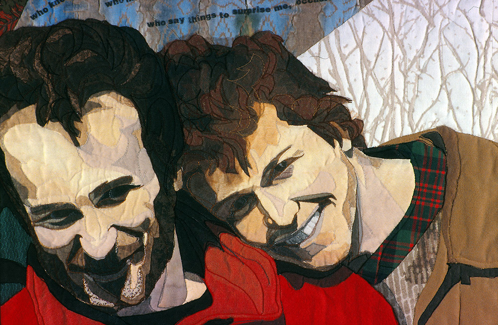
Because the heads and bodies were glued to muslin, I could cut away the image from the foundation, which you see in the above photo. The background there is simply the flannel on my workboard. Once free of the foundation, I could then lay the image of the three guys onto different backgrounds. In this way I could very easily see how different colors, values, and prints would look behind each figure.
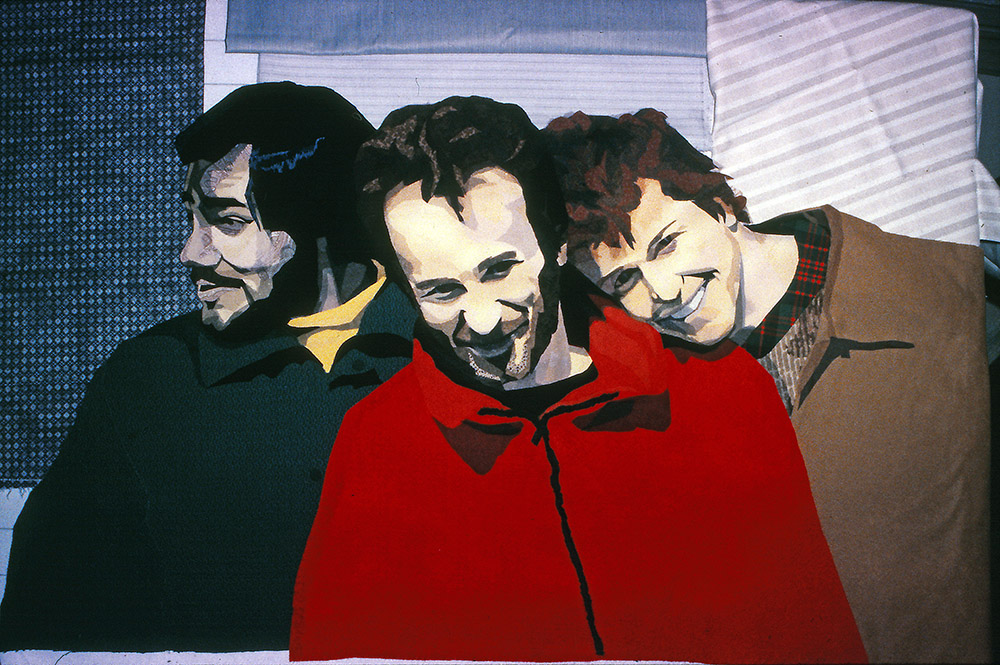
I tried a couple different versions, but since this was to be Tom’s quilt, I gave him veto power. He didn’t like the one I had settled on, the one that matched the jacket colors. So I told him he would have to choose.
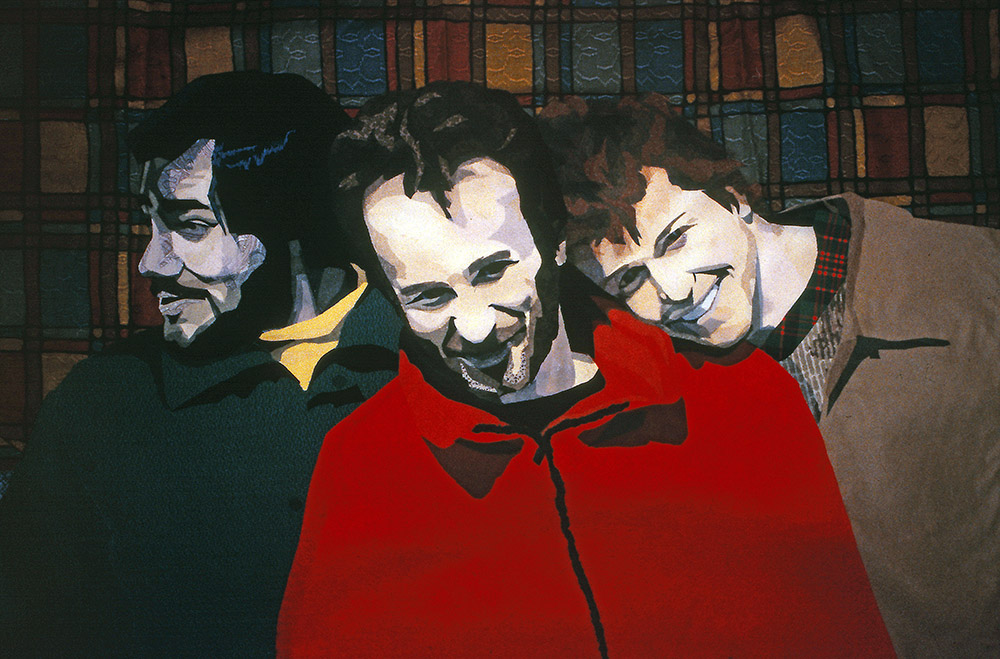
He designed a background that had more movement to it. The fabrics were fanned out in a windmill shape. Each fabric also had a particular underlying symbolism as well. The trees behind Mike, the woodsman. Blue behind himself because of his connection to the ocean. And the abstract shapes behind Joe, the mathematician and musician.
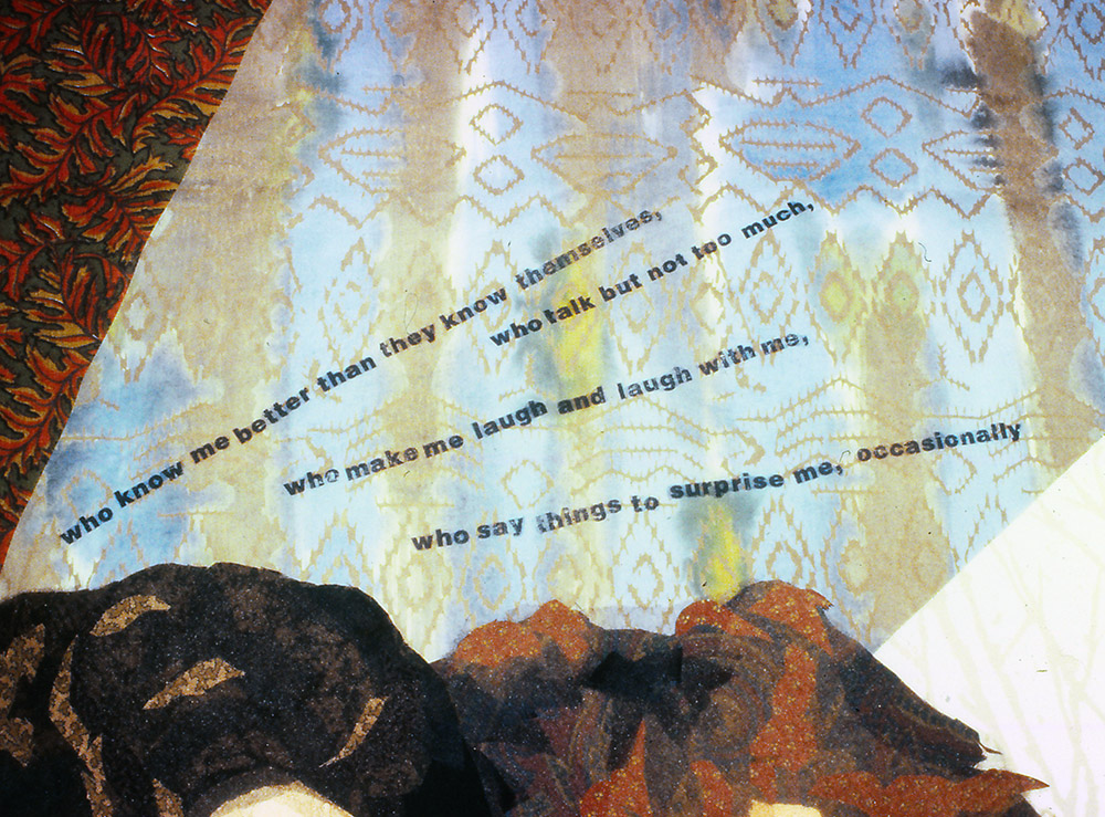
During the process of piecing the background, we also added a quote by the Canadian poet Alden Nowlan. It was from that—and from the fact the photo was taken at his surprise party—that we came up with the title, “Surprise Me.”
Once the piecing was complete I laid beige tulle over the entire image and shadow quilted it. At that time—the first two years of working this way—I put tulle over all my portraits because I thought that’s what you needed to do. I knew that tulle would hold all those little pieces in place, even though I did quilt along edges of shapes to emphasize the contour or form. It wasn’t thread painting. I was mostly just tracing basic contours. And I used beige tulle since I saw it as being neutral, and I didn’t really know that it came in different colors. My, how times have changed! But that’s another story.
I added the border after quilting. In retrospect it looks a lot like the matting and framing I designed at my job as manager of a local frame shop during that time. Another case where life influences art.
Some of the colors and lines from the interior are worked into the border. As in the photo, sunlight comes from the upper right. I also extended Mike’s shoulder into the border. The border itself isn’t quilted, though I strip quilted it in place with a flat piping as the inner border. For the final edge I used a traditional stitch and turn binding.
Bad Mommy
So remember, do as I say, not as I do. Learn from my lesson and give yourself a head-start.
But then again, as I mentioned earlier, I’m still quite fond of this and my other older pieces. There’s something fun and enlightening to look back and see how I’ve progressed since those first collage quilts. I learned a lot from them, and you know, I wouldn’t change them now if I could, even though the difference between then and now is a little startling actually. Here’s a detail of a quilt—made about 20 years later—of our 13 year old son Sam, “Peace, Love, Tie-Dye, Save the Whales,” for comparison. Quite the contrast, don’t you think?


For me, each quilt has a bunch of memories attached to it. Each is a time capsule, both of the subject and of my technique. Looking at them releases a flood of associations—old friends, old places, good times. Even though other people can’t share my memories, I think they get a sense of the feelings my quilts evoke. I’m not really sure how it happens, but I think something of myself goes into every quilt I make. The choices of fabric, the colors, the composition all combine in a sort of alchemy that is near to magic for me.
I think it is great! But I do tend to lean towards realistic looks so perhaps that is the attraction of this quilt for me. I love the way you share Susan and am ever grateful for the time you take out to write these blogs for us.
Susan: “Surprise Me” is one of your first quilts I saw that intrigued me and changed the focus of my quilting. I took 3 classes from you through the years and from there was inspired to make several portrait quilts. It is my favorite type of quilt! I lean more towards your “old” way of making quilts (minus the spray glue!) but have worked on letting loose a bit more by using prints instead of solids and solid-appearing fabrics. Although I have to say that it still satisfies me more to make a portrait that looks more realistic than artistic! This is just a long way to say thank you. You have made a difference in my life by giving me a focus in my quilting. I appreciate your gentle persuasions and positive spirit when teaching and am greatly enjoying your blog posts.
You are amazing I cannot wait to meet you in June.
The colours you use I would never think of and it comes out so real. Jo
Wonderful post! Great portrait quilt! How did you add the text?