
In a previous post I talked about how looking and seeing are two different abilities. From a few details, our brains leap to conclusions about what we’re looking at. While this is evolutionarily advantageous when what we’re looking at is a tiger that’s stalking us, that same trait can be a hindrance in recreating an image, whether in pencil, paint, or in our case fabric collage.
We need retrain our brains to really see not just look.
In the previous post, I used the example of a student’s “brown” dog. It was indeed a very brown dog. The student wanted to use other colors in the portrait, but couldn’t get past the brownness of the fur. Where would she introduce color? And what color? I showed that when we really see clearly, some areas of the dog were actually other colors, especially in the highlights and shadows. By examining these areas more closely, we could see purples, oranges, pinks, and yellows.
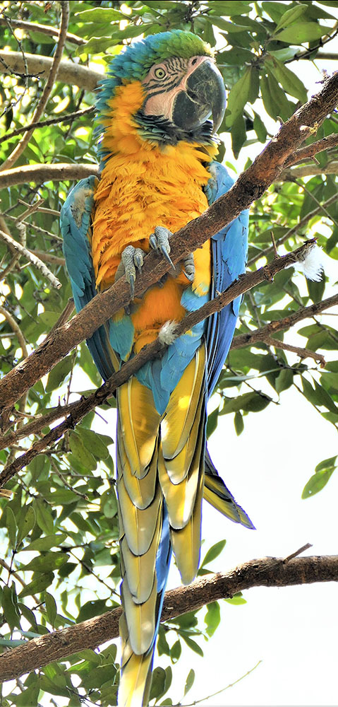
In this post, I use a quilt by Jean McCreary, a student from my April 2021 Live Online Class, as an example of how necessary it is to see clearly in order to recreate your image as accurately as possible.
Even before the class began, Jean had this to say about our pre-class coaching session:
Susan suggested I use shades of teal for the beak rather than the dark gray I saw in the inspiration photo, and we spent a fair amount of time together finding the dark shaded and brighter highlight areas to give shape and texture to the beak. This kind of one-on-one instruction, using my own fabric pallet and Susan’s eagle-eye and patient guidance, really helped me “see” finer details within the inspiration image and to learn how to translate them into my quilts.
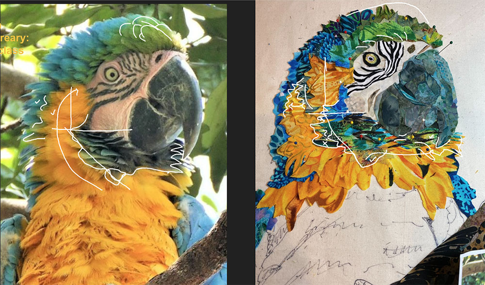
During class I was giving Jean feedback by annotating a photo of her image right on the screen for both of us to see. A couple times during the process she was noting that “something was wrong” with an area of her collage. Even though she couldn’t see it, she just knew, something was bugging her.
And that’s also the way our brains work. We are highly evolved to recognize shapes, especially faces and outlines. When we’re recreating subjects like a face or even, in Jean’s case, a bird like a macaw, we “know” what it’s supposed to look like. And when it doesn’t, even if we can’t tell what’s wrong, we notice it. It may be obviously wrong or it may be a niggling detail, but we know something is off.
In such a case it’s often helpful to go back and take another look at our subject. We must try to really see it this time, not assume we know what it looks like.
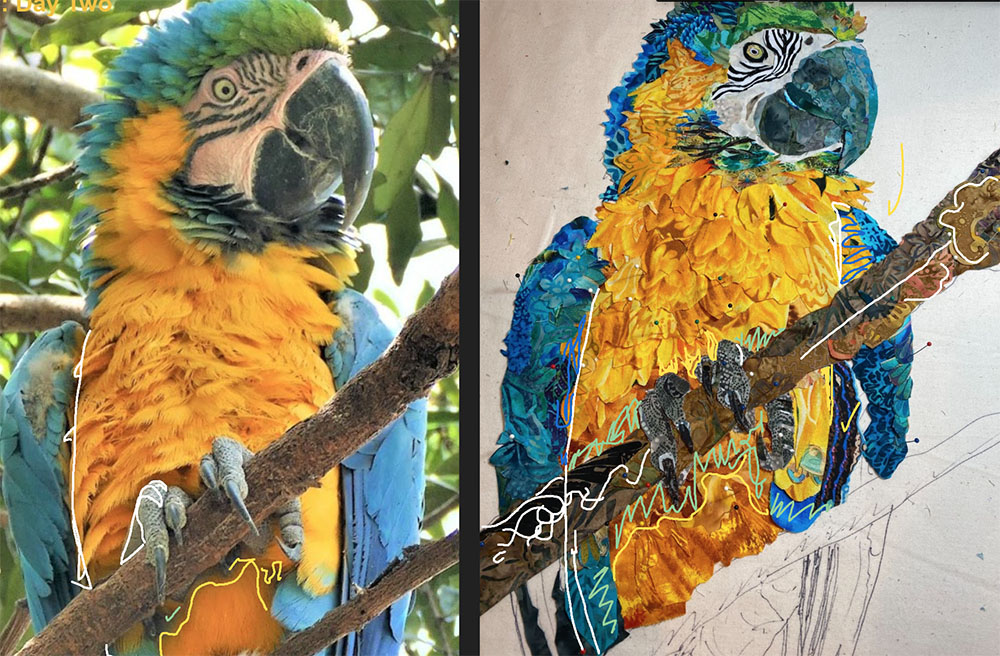
By outlining shapes on the original image, then recreating those shapes on the collage image (below), I’m able to show areas where something is “off.” In this case, the blue-green feathers under his face were bleeding too far into the yellow. And when I pointed this out, Jean saw it.
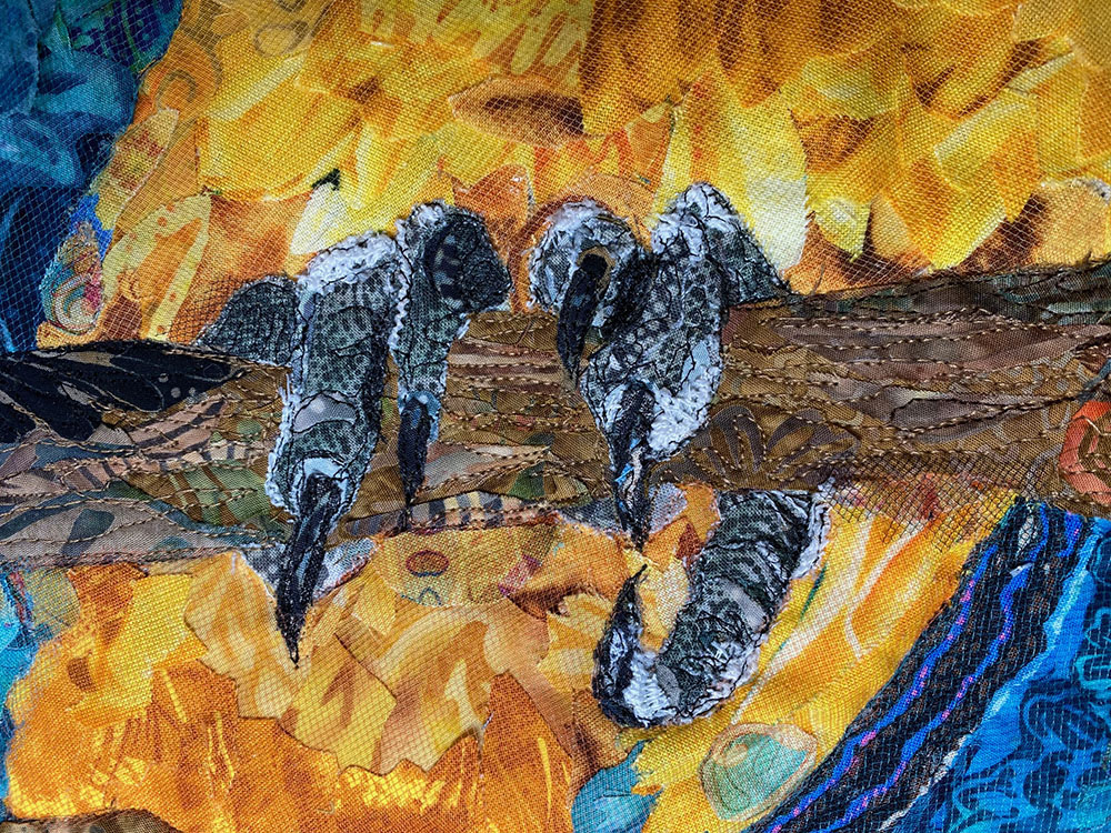
Bird feet are a great exercise in seeing—in both shape and texture. Jean had some fabric with great visual texture set aside to try with this macaw’s feet (below). Within that first day of class, Jean had fashioned her own set of beautifully gnarly bird feet.
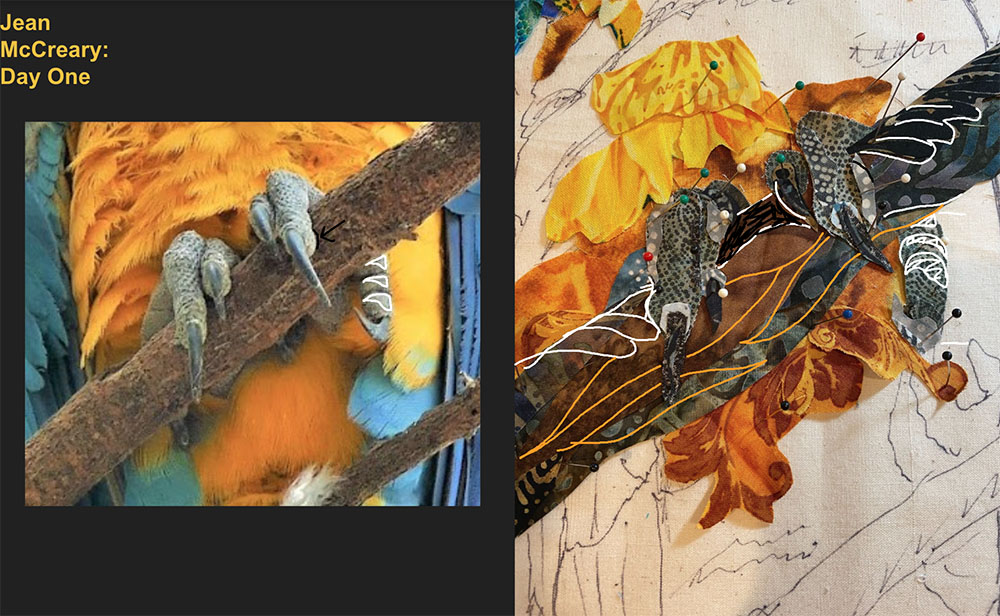
However, when you’re working with given fabrics and issues about value present themselves, sometimes the solution—in this case the grays of the feet blending into the shadowed branch and belly feathers—isn’t replacing the (feet) fabrics that you love, it’s adjusting the values of the surrounding fabrics (belly and branch), even if it strays from what you’re actually seeing in the photo. Every rule has its exception, and in this case it’s called “taking artistic license.”
From Jean:
Susan pointed out that while the macaw’s claws were made of a darker fabric than the inspiration photo, I could make the darker claws stand out better if I lightened up the belly area around the claws.
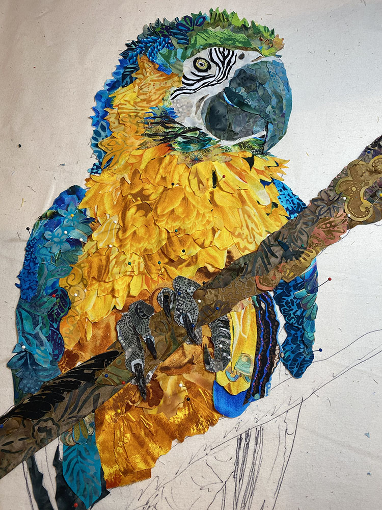
During Day Two of the five-day class, Jean was progressing quite nicely. During our consultation time, she brought up how she thought the body of her bird was looking “too round and fluffy” (above).
When I compared her quilt to the original image, I could see pretty quickly what had happened. She had brought yellow belly feathers too far into the wing area under the beak. Below I have drawn lines in white on each image to show the border between the blue wing feathers and the yellow belly feathers. When I colored in those errant yellow areas (with blue scribbles) it slimmed him down nicely.
From Jean:
Susan noticed I had made the right shoulder of the bird with yellow chest feathers, but the inspiration photo showed that this shoulder area was blue and my changing it to yellow would affect the wing line for entire right side of the bird. I redid the area in blue, and it really improved it.
To see more of in-progress photos of Jean’s excellent Mr Macaw, as well as all the other amazing and inspirational student work from that class, check out the April Online Class post.
From Jean:
I am seeing my work in a whole new light. Susan has triggered a burst of creativity that hasn’t subsided yet. I went to JoAnn’s and bought a gnarly lace which has worked well on the claws, with the thread painting [that Jean loves to do]. Going to try to keep going! Thanks so much for all the input and an inspiring class. Starting [quilting] on the chest and belly next, but with the details Susan kept suggesting I know I will stitch less and do more with fabric going forward.
Jean’s macaw is magnificent. Having her as a classmate inspired me to keep working and stay motivated.
Wow, this is a stunning piece. Makes me think my next collage should be in an online.
I struggle so much with getting the correct color especially in those shaded areas of my photos.
Thank you for this fine explanation of how you worked this out with Susan’s guidance.