
Something that isn’t obvious about fabric collage (as I teach it) is the importance of the sequence in which you approach the construction of your image. Where you start, and the order in which you proceed, can make a big difference in the ease of progress and outcome of your quilt.
Over the next few months I’ll be contributing to an ongoing series of blog posts that will discuss the best sequence to approach a fabric collage project using various quilt examples.
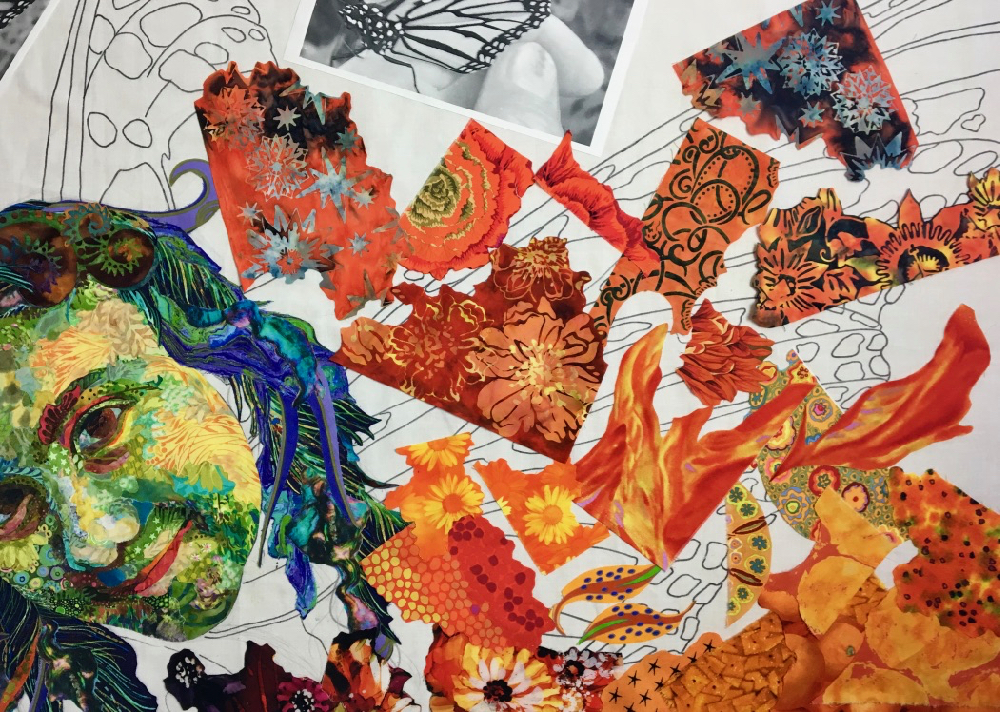
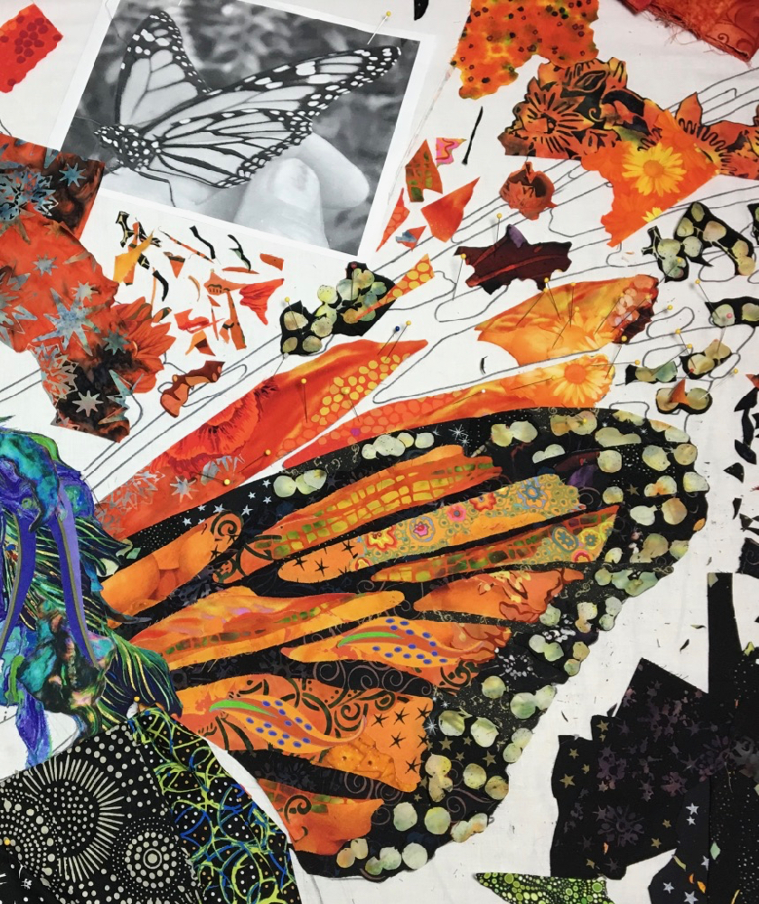
Recently I have been hard at work on my upcoming online eWorkshop, Susan Carlson Fabric Collage: Sea Turtle (above, in progress). The shell of a turtle presents thin lines in its design. It is similar in fact to another quilt I made, “Monarch Maia,” which features a portrait combined with the wings of a monarch butterfly.
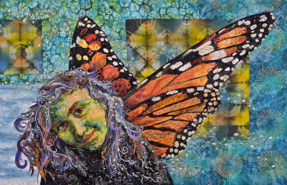
The Monarch wings in that quilt were made in a very similar fashion to how I demonstrate making the shell on the sea turtle in the new eWorkshop.
In each case, panes or plates of color are surrounded by thin dark lines. Working the way I do, the full-size pattern based on your image is traced onto a plain foundation fabric. The temptation for many, when faced with such lines in their design, is to cut a dark fabric to fill the entire wing or shell first, then add the colored shapes on top.
The problem with this approach is that once you have placed the large dark color over the entire wing or shell, you’ve obscured the other shapes that you have drawn on your foundation fabric. How do you fill in those shapes if you’ve covered them up?
The answer would be a template approach—trace the shapes, number them, cut them out, pin them to your choice of fabrics, cut them out again, and figure out where to place them on that solid piece of fabric. Let me say right now that it’s not “wrong,” it’s just not how I approach fabric collage, and how I teach it.
I developed this form of fabric collage in my quest to make the process of creating an image in fabric more immediate, more painterly, less paint-by-numbers. I wanted to look at my subject and immediately respond by free-hand cutting and placing fabric directly onto a foundation fabric. Templates were, to me, unbearably tedious—for how I wanted to work.
So how do I approach creating a butterfly wing or a sea turtle shell?
I start with the panes or plates first. Instead of creating these smaller shapes with one piece of fabric, I like to use several, depending on the size of the given area to fill. This to me gives the piece a richer more interesting look—like multiple dabs of paint—not at all the single color of a paint-by-number. As I glue the fabric pieces down I make sure that I leave their edges, especially those at the edge of the plate or pane, loose. Once the panes or plates are completed, I go back and slip strips of fabric between them and under the loose edges, again using not just one fabric for the contrasting lines, but as many as I like, depending on the look I’m trying to achieve.
In the photo below of the turtle shell from my eWorkshop, I’ve cut a sliver of brown and black fabric to slip into the gap between the plates. I have left the edges of the plates loose and cut the fabric sliver wider than the gap itself in order to ensure that the foundation fabric is covered and the gap is filled.
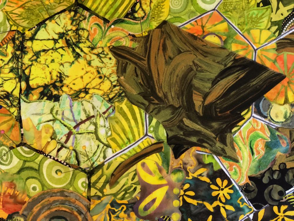
Here that sliver of fabric has been placed between the plates.
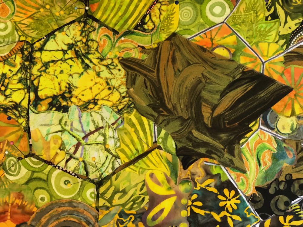
Note that I choose to vary the color and value of the fabric I use to fill the gaps. I do this to add interest, but more importantly to ensure that the plate and the gap fabrics have contrasting values. This is something that would be very difficult to preplan if you placed a large dark fabric down first then created the plates on top of it.

In the video excerpt below—a preview from the eWorkshop—I demonstrate how I choose, cut, place, and glue the strips of fabrics to fill the gaps between the plates on the turtle’s shell.
For another demonstration of this technique and other techniques for creating very fine lines, visit a previous blog post: “Get in Line: Skinny Lines in Fabric Collage.”
I like to work this way both because of the sense of (relative) immediacy it gives me and because of the customized results I get. Basically, ’cause I like the way it looks when I’m done.
Monarch Wing Example
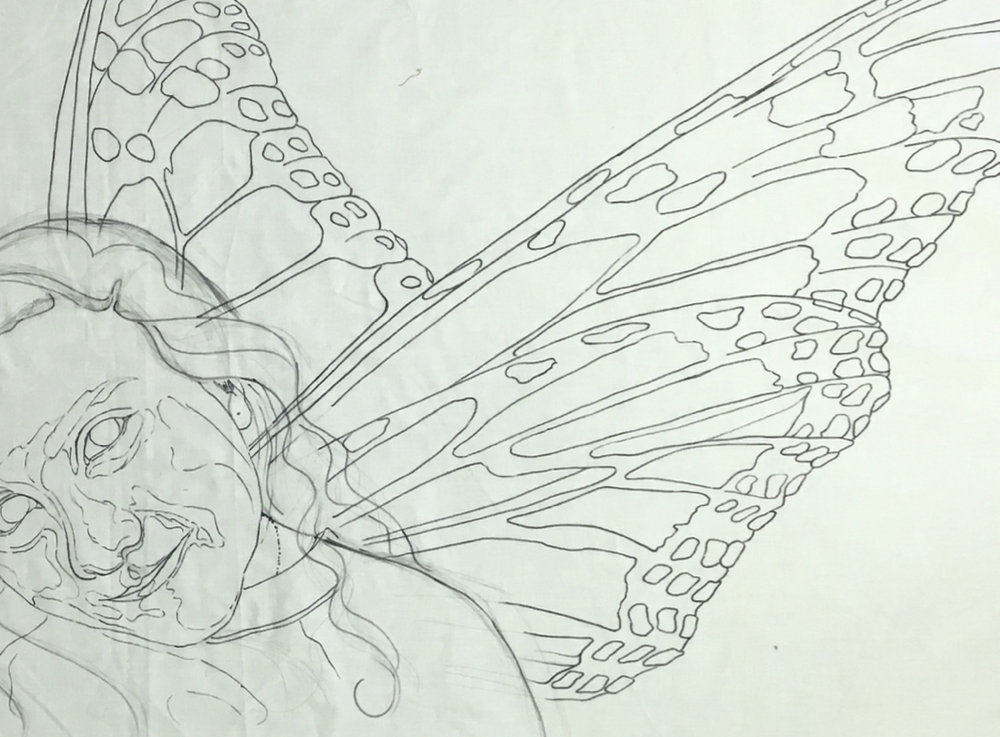
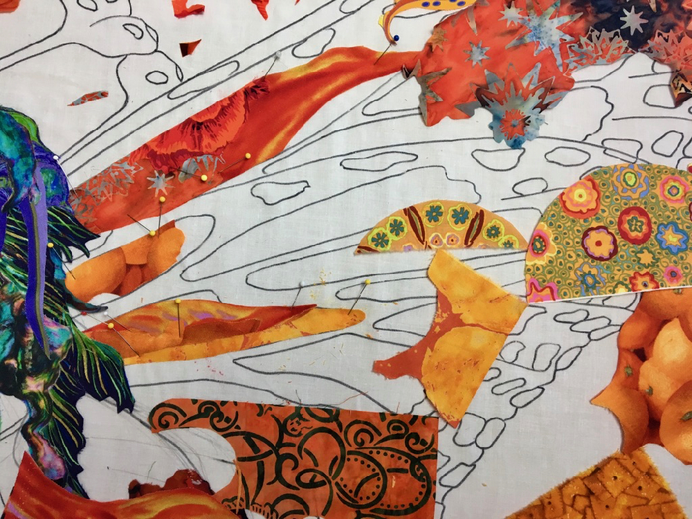
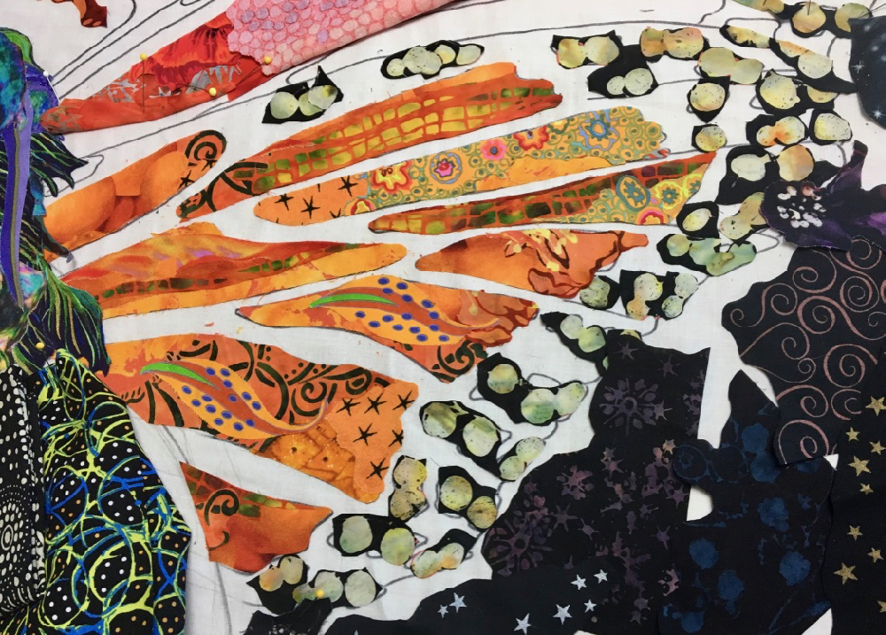
In the following photos I show the sequence in which I approach the wings—specifically the lower part of the right wing—in this fanciful portrait of my niece, entitled “Monarch Maia.” I’ll be referring to the two parts of the right hand wing—please note that the lower part overlaps the upper part.
Below, the pattern I created has been traced onto a foundation fabric. My next step is to decide where to start. Where would you start?
Here’s the answer: you start with what is in front. I started with her face—specifically the nose, eyes, and mouth— because that is what is in front of the wings.
Now that the first draft of the face and then hair is done, I keep moving backwards on my subject to the wings, which are behind the hair. The lower right wing is in front of the rest of the wings, so I begin with that one. And on each part of the wings, I begin with the orange “panes.” Why? Because they are in front of the dark lines.
By choosing to work with the shapes that are in front of others first, I can see exactly where the orange shapes fit and what shape they should be. I retain the ability to work with my drawn lines and take full advantage of the work I put into the design.
I do use several pieces of fabric to fill each pane. The use of multiple fabrics allows me to blend easily from one value to the next—dark to light— and I feel the variety of prints gives a richness to the visual texture of the piece.
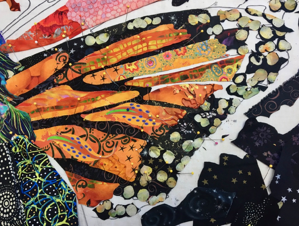
In the photo below I have completed a first draft of the orange panes on the lower right wing, but because of all the pins, I can tell they have yet to be glued in place.
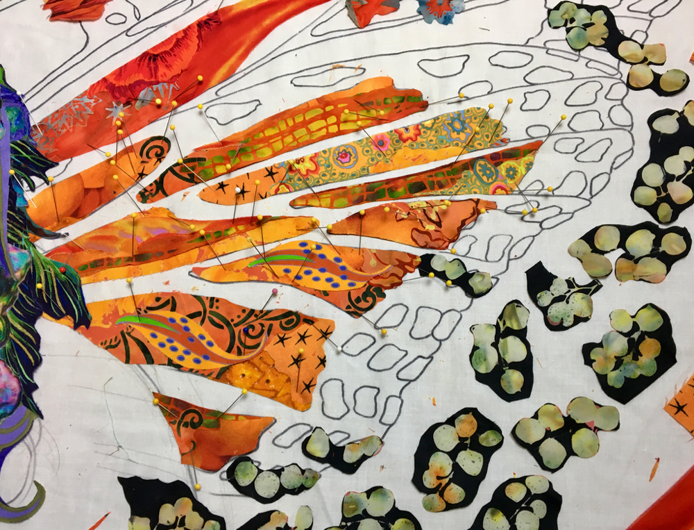
I have also cut down groupings of “white” spots from another fabric, picked to represent the white spots of the Monarch wing edges—which are also in front of the black background of the wing. I leave a little of the black print surrounding the white spots, it saves me some work and will eventually blend with the rest of the black fabrics anyway.
All these fabrics shapes are still in front of the (eventual) black wing background. Here the first draft of the panes and white spots is complete. As I glue each piece of fabric onto the foundation, I tack only the centers with glue, leaving the edges loose, which will allow me to slip the dark fabrics behind either the orange or white shapes.
This way of construction makes sense to me and seems very logical—what’s in front overlaps what’s behind, right? Create the orange panes and white spots (what’s in front) first, then tuck the black behind.
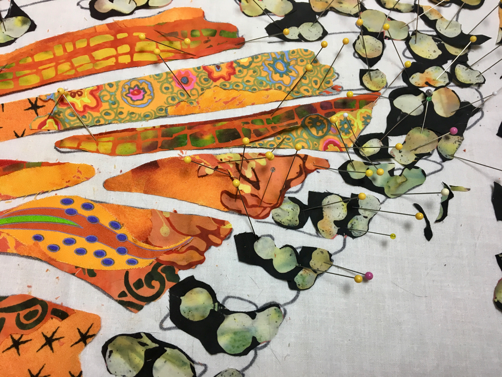
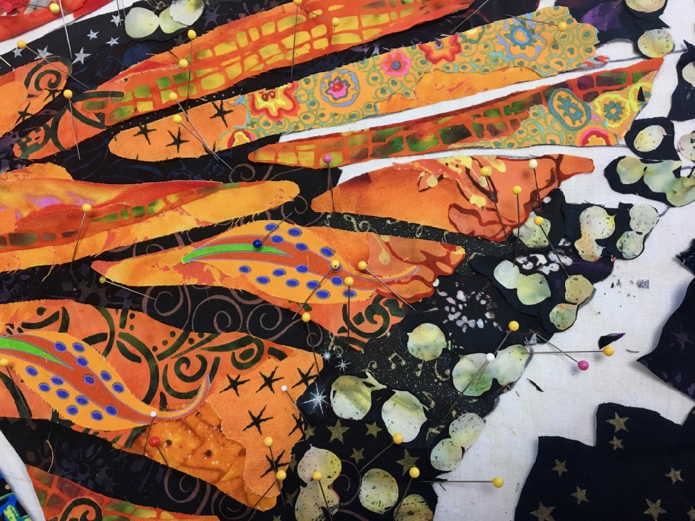
Note in photo above the many different varieties and patterns of “black” I plan to use.
The first draft of the dark background is in progress above and below. It moves quickly since I’ve already done the work creating the orange and white shapes. The black bits of fabric just slip under those shapes and fill in the open spots on the foundation fabric.
Below, the first draft of lower wing is now complete. I make sure I’ve trimmed the black upper edge to my drawn line before I move on to the top wing section—the next area in my front to back sequence. Once that line is defined and the black fabrics secured with some glue (keeping edges loose), I can start tucking the orange fabrics of the upper part of the wing behind the lower part of the wing and repeat the process.
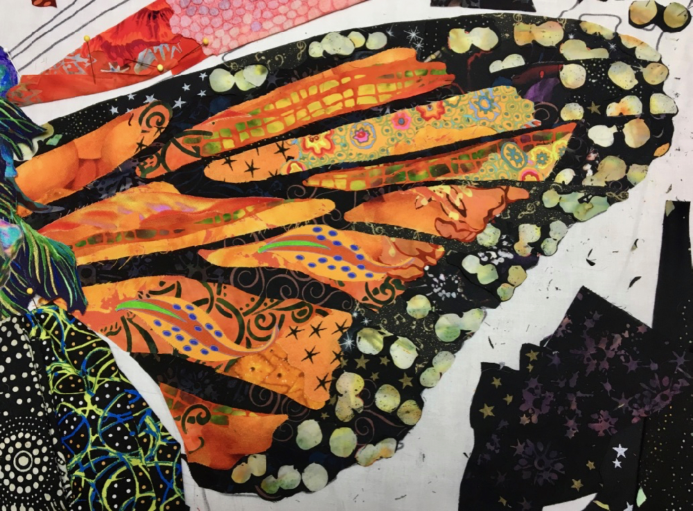
Below I’m making progress on the upper part of the front wing. The orange panes abutting that black edge tuck right underneath, the contrast creating a smooth, definitive division between the two parts of the wing. Check out more in-progress photos of “Monarch Maia” here.
Stay tuned for more examples of this—start with what’s in front—fabric collage construction sequence using other quilt subjects in following months.
Addendum to Sequence in Fabric Collage
The month that the above, Sequence in Fabric Collage Part 1, was written and published, the Covid pandemic also came into being. Like many things for all of us, plans for 2020 were rearranged. New Sequence posts did however get written and posted, in 2021. You can read them in the links below.
I live in Brasil and love your work. I have your books and I’m trying collage. Thank you
This post really helped me! I now realize what wasn’t working in my lion: I made fabric pieces too large to “fill in” areas instead of using multiple fabrics in these sections. Thank you so much!
It seems so totally logical when you explain it. Now if only I could be more logical.
I have I idea how to follow your blog. Not social media savvy. Please let me know
Aileen, to receive the blog each week in your email become a subscriber. You can do that by following this link: https://susancarlson.com/subscribe/. All I need is your email address.
Thank you so much! Is there a video for beginners?
Aileen, if you want to learn the technique go to any blog post and use the drop down menu on the side to select How-To from the Category menu.
Your work is amazing… Thank you so much for sharing your knowledge! I love my Saturday morning classes and hope one day to submit a completed project to the finish line!
Thank you for the great tips. I think you are the Seurat of fabric collage.
Thank you for sharing your tips! I have a piece that has been on hold for a few years now. If I keep reading and watching the energy (and smarts!) will come. I want to move on!
This is all so well explained. I have bought your online masterclass course and am really enjoying it. Thank you so much.