
It’s becoming more and more clear to me how important it is to pay attention to sequence in fabric collage. The order in which you tackle the phases of your fabric collage makes it easier to create and results in a better outcome. For a review, visit the first two posts in this series: “Sequence in Fabric Collage Part 1” and “Sequence in Fabric Collage Part 2: Faces”. The first concentrates on creating fine lines between larger shapes, the second focuses on a sequential order in which to create the facial features of a portrait.
In this post I’ll address using sheers, because I’ve realized that even the use of sheers in a collage involves a sort of sequence. I use the word “sheers” to include all semi-translucent fabrics: sheers, netting, tulle, lace, organza, chiffon—solid or printed or sparkled—anything that when you lay it down you can see some of the base fabric underneath.
I use sheers near the end of the fabric collage process, usually in the stage I call the third draft. At this point I have the subject and background mostly done. I’ve checked over the image already and made changes as needed. I’m now ready to give it the fine-tooth comb treatment, picking all the nits, really zeroing in on what is working and what needs help. For more on how I use sheers in fabric collage visit this post: “Using Sheer, Netting, and other Semi-Transparent Fabrics.”
Since sheers are semi-transparent it makes sense they come near the end of the process. They will be overlaying the image that I’ve created with my opaque fabrics. At this stage they can be used for many purposes, the most basic of which is to add shadows and highlights, general visual interest or, in the case of sparkly sheers, some bling.
I’m going to focus on three ways these fabrics can be used. For examples, I will use my quilt “Golden Temple of the Good Girls” (above). Each of the good girls will help me demonstrate a different way sheers can be used.
We’ll start with our dog Kali, who will demonstrate the use of lace to create highlights and visual texture in her fuzzy white fur. Djinni cat will expose how the use of sheers blend and soften the look of the fabrics on her silky belly. And Kiiora the budgie will proudly show off how the use of overlapping sheers create dimension on her eggs.
Highlights and Visual Texture
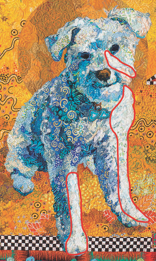
In the detail of Kali above, I’ve circled the areas where I used lace most extensively (it’s in other places too but isn’t as noticeable). I used white lace where the highlights would fall, on the edges of her legs and face that are closest to the light source.
Could I have used lighter fabrics to achieve the highlights? Yes. In fact, I did. There are light fabrics under the lace—you can see bits and pieces of them peeking out. But the lace added a boost of highlight AND also provided visual texture—in this case mimicking the “fluffiness” of her fur.
Below you can see the before and after of adding the lace on Kali’s face and chest.


Blending and Softening
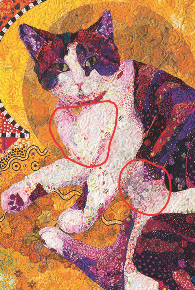
In contrast to Kali’s curly and fluffy hair, Djinni’s fur is silky smooth. In the areas I’ve circled above, pink prints with more or less white in them are my solution to the pure white on her chest and belly. Even snowy white fur has folds and curves making shadows and highlights. So in this case, various pink fabrics stand in for Djinni’s white highlights, shadows, and texture.
But all along, I knew that sheer fabrics would be the final layer for all three of my girls. So when I reached the third draft, after I had a nice first draft base of printed fabrics, I used layers of tulle in both white and shades of pink, with bits of pink chiffon here and there, to effectively “blur” the fabrics under them where needed, allowing the busy-ness of the contrasting fabrics to blend together.
Below is the before and after so you can see how the pale sheer fabrics were used to soften and blend high-contrast areas.


Shadows Big and Small
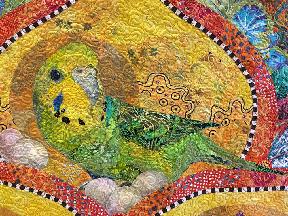
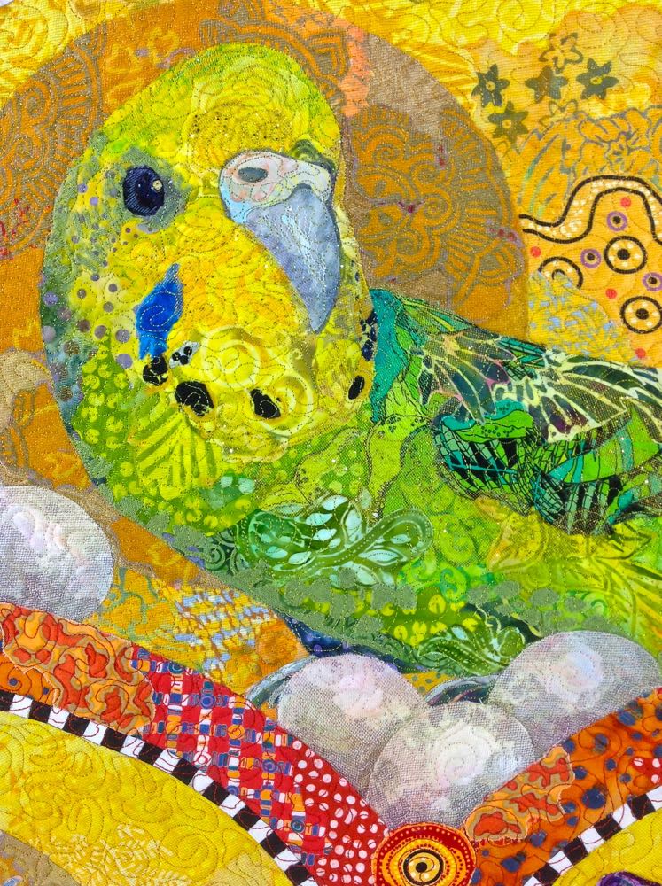
We were told that our young budgie Kiiora was a boy. Two years later, he laid his first egg. I think she was as surprised as we were. Kiiora laid more than a hundred over her lifetime, so when I was making her portrait I had to include eggs.
Rendering an egg in fabric can be a bit daunting—they’re so perfectly rounded and smooth. But a big part of creating form for a two dimensional object is shading—a highlight as it curves toward us, shadowing as it turns away from us. Netting to the rescue once again. In the case of Kiiora’s eggs, I used a fine tulle netting printed with a small-scale black and green camouflage print to create shadows. Yes, fabrics like that exist. To be more specific, I used a couple layers of that tulle to create the gradation of shadow on each egg.
I’ve found that the best sequence when using multiple layers of tulle or other netting for a gradation effect is to cut and place the darkest—and usually smallest—part of the shadow first. This may be the area that’s farthest from the highlight, or against what the object is resting on—such as one egg casting a shadow on the other.
I started by tucking small, somewhat curved cuts of the tulle either under the orange border or under the neighboring eggs, where the darkest shadow would be. Then a slightly larger piece of tulle was cut to cover and extend past the first—leaving an opening at the top of each egg exposed for the highlight.
The reason for cutting and placing the the smaller shape first was so that the larger piece would “trap” the smaller one, once I held it in place with a smear of glue.
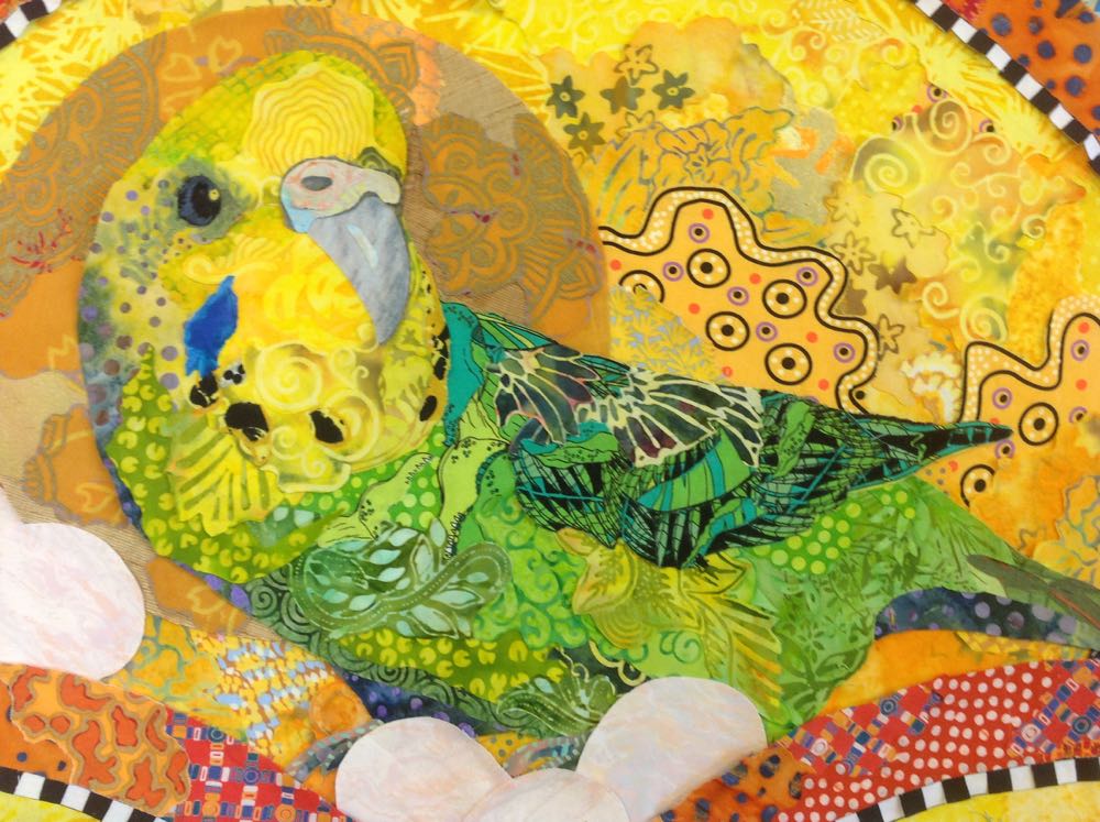
The base fabric for the eggs is a slightly marbleized pastel print. Alone, the eggs, of course, look flat and almost merge together as solid pale lumpy shapes (above). But add a couple layers of sheer printed tulle (below), and voila, budgie eggs.
Just one more of the many ways sheer fabrics add to the effect of your fabric collages—when used in the right sequence. 😉
Dear Susan;
Thank you for these wonderful posts. I enjoy reading them, “hearing” your voice encouraging and explaining in a way that makes perfect sense. I am still working on finishing my first quilt, the machine quilting part for me. Recently retired, I thought this would be fun to learn. Your book sits in a basket next to my design desk, eagerly waiting for me to finish Eleanor’s quilt so I can play! I love your Mom and all the other wonderfully creative people you bring here. I love you Susan. Your “POW FACTOR” is huge for me and I can hardly wait to begin designing art quilts! Thank you for your caring, expertise and for sharing with all of us.
Great post! I am hoping to finish my collage of my granddaughter peaking around a tree that I started in your class in Maine. I have been looking at it and studying it recently and now realize that some of the sections I am unsure of will blend better when I add sheers to it a little later. My mind is running again.
Hello, I am in Australia. What glue do you use please? I haven’t been able to find one that doesn’t soak through ( and so darken) the fabric.
G’day Joy! I use Aleene’s Tacky Glue—Original version. Check out this post, “Why Glue?” for more info: https://susancarlson.com/2017/01/21/why-glue-updated-with-video/ Cheers!
Susan, all you posts are great and this is an especially wonderful offering. Such lovely subjects and great instruction. Sheers and lace, highlights and blending–I love the whole thing!!! XOX Sue
Susan,
After all this time, your before and after pictures of Djinni made me really understand what sheers can do. Wow!
Judy Breneman