
In this post I continue with the third installment of the preview of my online course, currently in development. I’m using an in-progress quilt, Kissin’ Cousins, to demonstrate each of the steps in the process.
As I said previously, the class will have six parts. They will closely resemble something like this:
- Getting Started: Choosing a Subject and Making a Design
- The Fabric Collage Technique: Fabric Selection, Cutting, and Gluing
- Backgrounds: Highlighting Your Image
- Details: Jazzing It Up
- Netting and Tulle: Adding Layers
- Quilting and Finishing
In previous entries I covered the first two steps, Getting Started: Choosing a Subject and Making a Design and The Fabric Collage Technique: Fabric Selection, Cutting, and Gluing. In this post I’ll cover both Step 3: Backgrounds and Step 4: Details.
Backgrounds: Highlighting Your Image
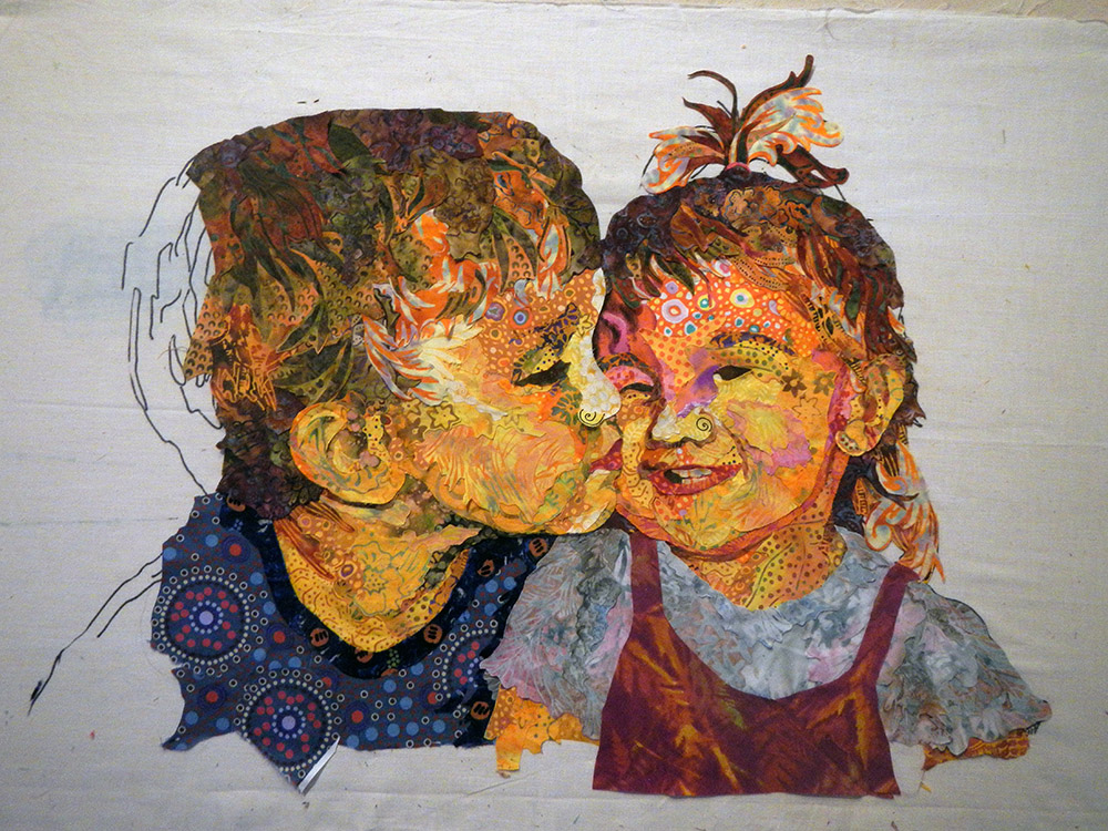
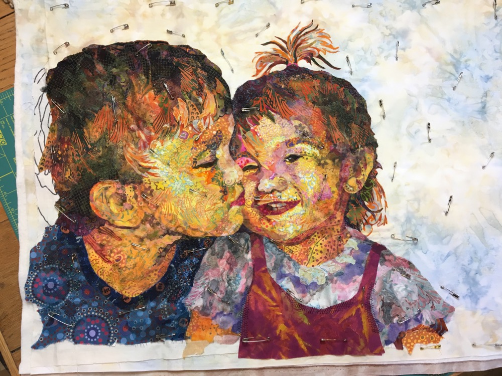
Though it doesn’t matter if backgrounds or details are the last step prior to quilting, I usually do it the way I’m showing on this portrait of the kids. Almost always, the background will influence how the subject will look, so you may as well wait to see how the background works out before finishing it all up.
Here, in the photo below, is where I left off in the previous post with the piecing of Kissin’ Cousins.
Choosing a background can be very daunting. There are so many possibilities. How do you narrow them down? In class, when a student is struggling with this step, I ask them the questions I ask myself in this position: What’s the story you’re trying to tell? What’s the subject? Where is the subject? What is it doing? Why did you choose this subject? What’s important about the subject?
However, for this particular portrait, it was all about their expressions. Plus, I knew I wanted a close cropping of the figures and a smaller finished quilt all around. So, unlike nearly every other quilt of mine, I decided it would be a one-piece-of-fabric background. The challenge faced when trying to use only one piece of fabric as a background is to find the fabric that provides reasonable contrast for the entire image. In this case, it would have to contrast both with the dark value of their hair and the relatively light value of her shirt.
Knowing that all those little pieces of fabric were secured to the foundation fabric, I could cut away that foundation from behind the right and top of the figures. That made it easy to audition potential background fabrics, to see which one would best “highlight” my image and not distract from it. See examples below.


Though I kinda liked the seafoam green of the upper left option, the batik on the lower right became my final choice. The audition process showed me that a lighter color and less contrast in the printed design was probably the best—nothing is absolute. Besides, when asked, my mom replied that her choice was “beige” for the background. I gulped, ’cause I really don’t do beige. But you can’t argue with your mama.
To read more about choosing backgrounds, check out this post: Telling the Story: Fabric Collage Backgrounds.
Now, on to another crucial step: Details.
Details: Jazzing It Up
So, you think you’re (finally) done? Sorry. More is better. There’s always space for more details in the form of slivers of fabric as contour lines, or netting and other translucent fabrics for shadows and highlights, or…. It could go on and on. See an early post of mine where I refer to Anne Lamott’s book, Bird by Bird, and what she refers to as the “dental” or third and final draft of a creation, where you “check every tooth to see if it’s cramped, decayed, or even, God help us, healthy.”
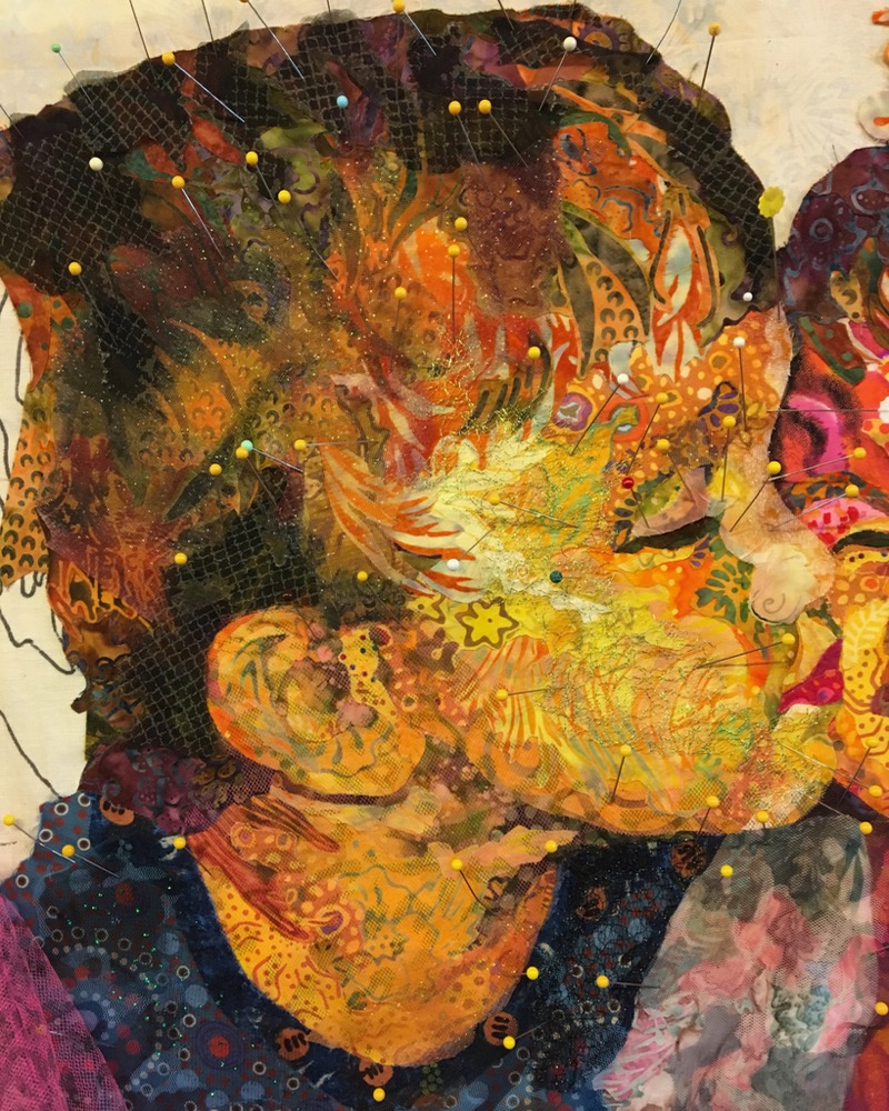
Kissin’ Cousins remained in the state you see above for a long time, like maybe a few years. It wasn’t quite right, but I couldn’t put my finger on it. Then, in putting together a blog post earlier this year about using sheer, netting, and other semi-transparent fabrics, it came to me. Funny thing is, it’s what I would have told a student to try, but do I listen to myself? Anyway, I had a new direction for finishing this piece, so Djinni Cat and I started pulling out some sheer fabrics for some final layers.


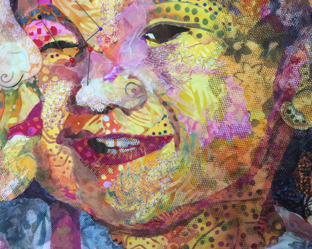
When I started wiggling all the “teeth” of the portraits, one of the things that stood out was Sam’s nose. It looked too bright in value and too flat, with no dimension to it (below left). I took a mottled autumn colored sparkle tulle and laid it onto the portrait (below right). It appeared to be a good bet.


Opening up the sheer fabric (below left) I cut out a palm-sized chunk of it (below right) so I could maneuver it along his nose easier.


I decided the best placement was what you see below. I found an area of the mottling that flowed from his eyebrow to the dip in the bridge of his nose, to the lighter point of his little button nose. I trimmed it to size and glued it in place.

Moving on I found more “loose teeth” in the definition of his neck (below left)—I felt it needed more. So, naturally, I shadowed it with pink and black leopard spotted tulle—fun! (below right). The added pink tone makes the yellow a little more of a peach color—a point that will not be lost on my mom who I believe was a little concerned about the jaundiced color of her grandchildren. What can I say? I like color.


And speaking of color, I thought a little lime green sparkle mesh (below left) was just what Sam’s cheek needed (below right).


I kept going—more is better—with a printed organza for the darks of his hair, and some more of that sparkled mottled tulle to blend and subdue the contrast along the band of lighter hair. Pictured below.
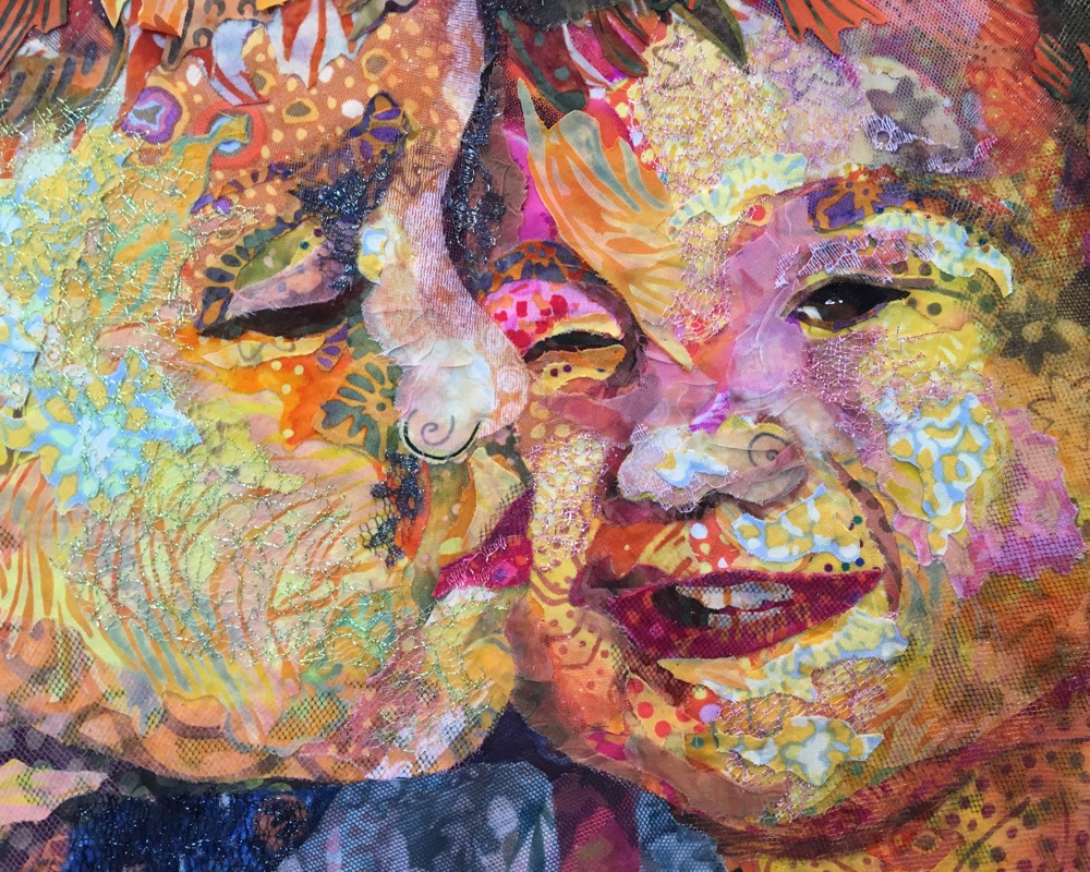
Now came Maia’s turn, wiggling all of her “teeth”—turning her into a porcupine child from left to right below—with all the little bits of tulle and netting and other sheer fabrics being held in place with pins until I got around to gluing them down.


Below, she gets little touches of blush with bits of pink sparkle mesh.
Then, I thought she needed even more of a highlight on her cheek, so I went back to my printed batiks and found a flowery curve to try (below left). When placed on her face (below right), I didn’t like it though.


Back in the fabric pile, I found a print with a nice light and yellowy spot in it (below left). Much better (below right).


And because even more is even better, you can see below where I kept adding more of that print to her nose, upper and lower lip areas, and chinny chin chin.

And then, naturally, I had to go back and re-visit the highlights of Sam’s cheek (below). Do you see where this process can go on forever?
That’s it, I’m done! Deadlines help to make that decision. Tom and I had scheduled this sequence of posts and it had to get done, finally.
Oh wait, shoot, that top-knot of hair… the “client”, my mom, never liked it, and my sister—Maia’s mom—had her doubts about it too. Back to the piecing board.

A few snips to cut into the light and dark chunks of hair, making them a little whisp-ier, adding a few more thin bits (below left), a little glue to hold it all down (below right) and now I’m done.


Quick, get those safety pins in to baste it for quilting before I see something else! Stay tuned for next week’s post to see the final results of Kissin’ Cousins, and the Online Class Preview Part 4.
Good morning…amazing to see the difference that seemingly minute changes can make! And, love the detailed before and after photos in the “jazzing it up” section. It makes such a difference (for me) to see the steps to improve a darling, nearly finished piece!
It has been almost nippy here in the mornings; lovely dog walking weather! We are supposed to have a week of hot weather before returning to our regularly scheduled slate of autumn. Is it beautiful, colorful fall in Harpswell yet? I imagine you enjoying yummy mugs of pumpkin flavored drinks while looking out at colorful landscapes!ðŸ
Thank you so much for sharing your knowledge and warmth. Susan when registration opens for 2018 retreat classes, where do we register?
This week’s blog on Saturday morning will explain everything. How to register, when to register, etc. All of it will be handled online, including taking a $50 deposit.
I’m very interested in signing up for one of your Maine 2018 classes. I see registration opens at 9 am on October 7th. I don’t want to miss the opportunity to try to attend so…I’m wondering how one registers?
This week’s blog on Saturday morning will explain everything. How to register, when to register, etc. All of it will be handled online, including taking a $50 deposit.
Jestem zachwycona pracami coś pięknego marzę aby nauczyć się kolażu więc jestem szczęśliwa że znalazłam twoją lekcję .
Translation from Polish: “I’m delighted to work something beautiful I dream to learn collage so I’m happy to find your lesson.”
Thanks, Jola!
Sue, Question for you. I have made the Sun and the Moon using your Serendipity book.
In looking at your class list the best ones for me say you need to be advanced. Would this qualify me for advanced?
I believe I sent you pics of both and after going through your books pagan by page I think I could keep up.
I am in Europe at the moment but have been fortunate to have had WiFi everyplace we have stayed, I am hopeful that on the 30th I will have Wif and can sign up.
Thanks
Leslie from PT Washington.
Leslie, I think you should probably stick to the all-levels class. The way I teach in class is different than how the book is set up. Taking at least one class, and preferably two is best before tackling the advanced class. -Susan
Thanks Susan, that was what I needed to know. I will try another time frame or another venue.
When can we sign up for the online class.
Rebeccca, you need to read the whole blog! There at the bottom it says that registration will open up on October 7, at 9:00 a.m. eastern time. Also, this week the blog will be all about how and when to register, so make sure you read it.