
Sparkling wishes for a serene and reflective Winter Solstice to those in the Northern Hemisphere, and the same light-filled wishes for the Summer Solstice to those in the Southern Hemisphere. May your hearts and lives have balance and peace.
A couple weeks ago I posted, “Top Tip—Cropping Your Quilt.” Today’s post expands on those ideas of creating visual balance in a finished quilt, with more thoughts about the background and the balance it creates in relation to the subject.
I think one’s first tendency is to place a subject in the center of the background, which is what I presented in the previous post. However, let’s look at another way of placing the subject—creating a triangular balance with the background—as I did in the portrait of “Kissin’ Cousins,” of my son Sam and my niece Maia.


As I was working on the piece, I had already decided to crop off some of Sam’s head—it wasn’t needed to tell “the story.” Even so, Sam had more visual weight than Maia and the composition seemed a little weighty to the left side (photo upper right).
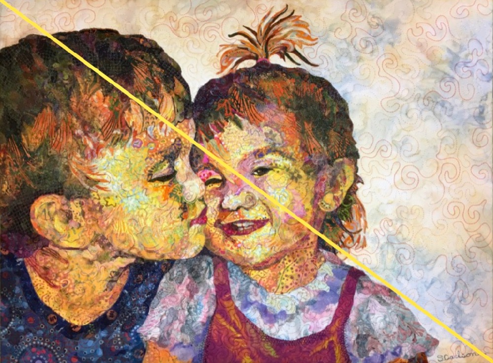
After auditioning a few single-fabric background possibilities, I decided to add extra background fabric to the right. Doing so created a relatively large open upper right corner, bringing out the diagonal movement from Sam’s head to Maia’s shoulder. I liked how that openness balanced all the colors and details concentrated in the lower left.
Top Tip:
To create balance or for a more dynamic composition, consider the diagonals.
Part of the Quilt Story of the portrait of our dog Pippin, is how after I had her collaged, I checked the measurement qualifications to enter the quilt into a competition. The vertical composition I had been thinking would need to be expanded on the sides into more of a square. Since Pippin was a bit triangular already, I just added (glued) additional foundation fabric to the left and began figuring out how to fill the resulting triangular shaped background.


It was a lot of space to fill and needed its own visual weight to balance Pippin, but not overpower her. What began as a re-think ended as a perfect background for my dixie dingo—a big and bold sun. Density of color and high value contrast between dog and sun allowed the separate but equal triangles to balance each other.
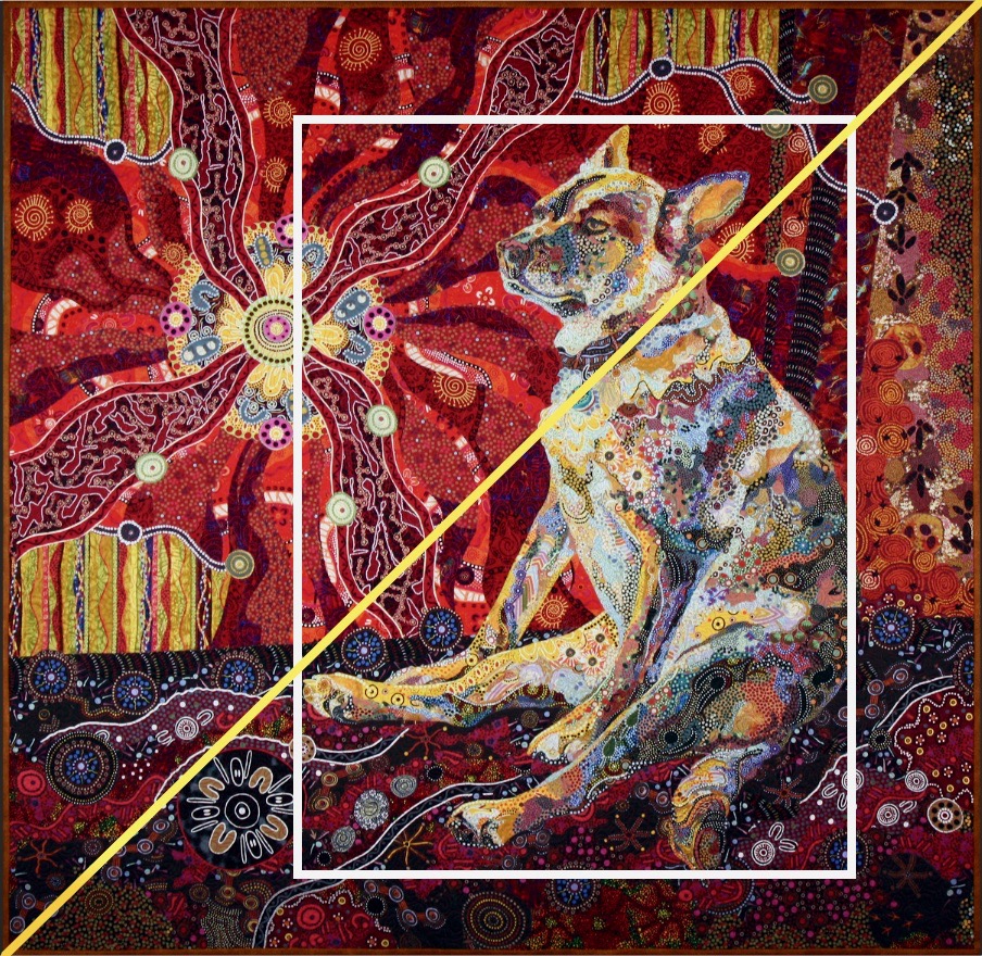
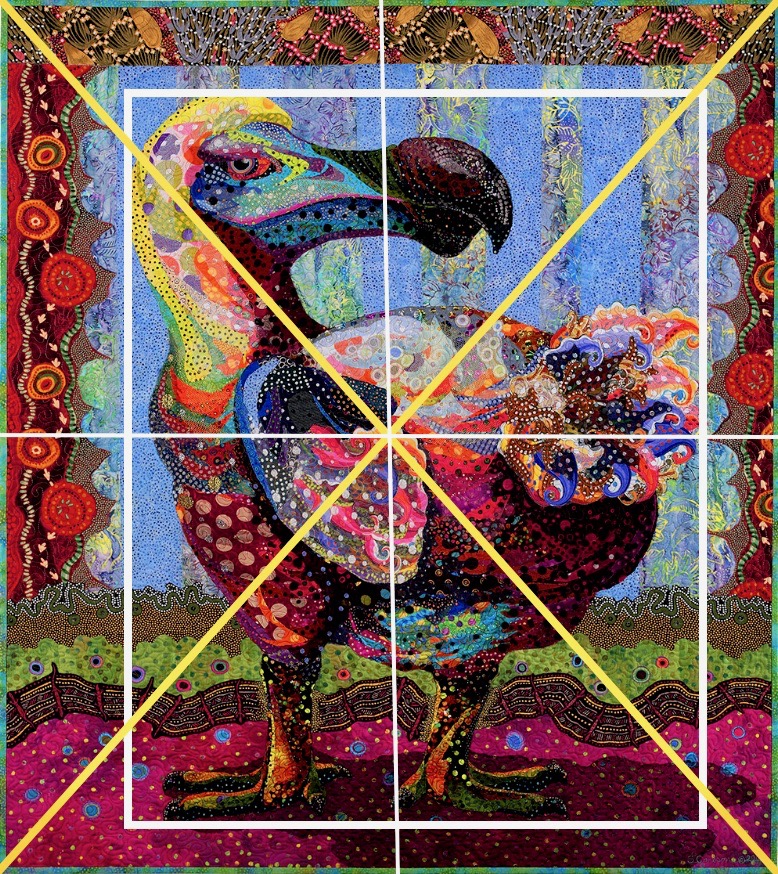
I’ve added the white-line annotations to these examples as a tie-in with the previous “Cropping” post. The frames indicate the extent of the subject’s borders as a comparison to how I ended up cropping the quilts—sides, top, and bottom. However, that is not the topic of this Top Tip, so you will have to view that post to fully understand. 😉
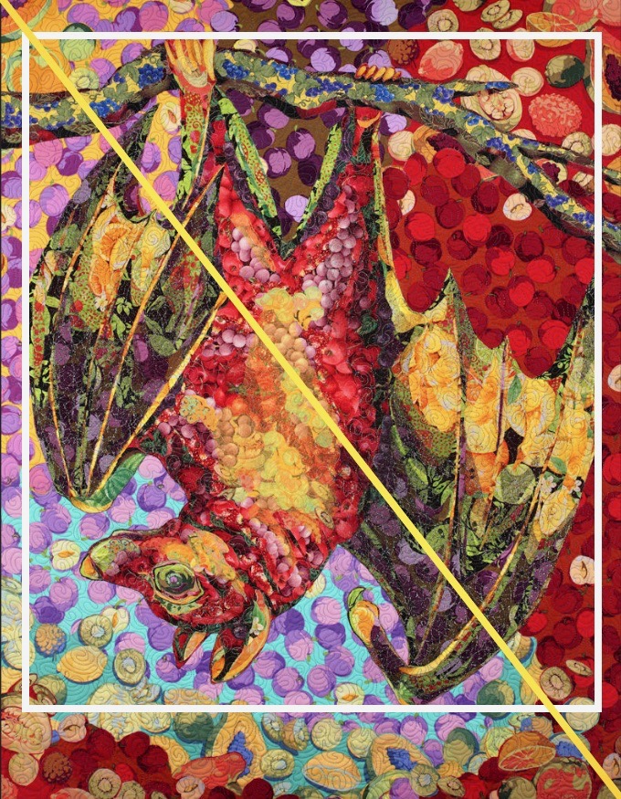
Fructos: darker concentrated colors in right triangle, lighter and “airy” in left triangle—extra space given around head.


Polka Dodo: same idea as Fructos but values reversed—light values and airiness around head to right of diagonal, dark values and heaviness to left.
In above right photo, the darker values of the horizontal background band at bottom, balance the bulk of his body, grounding him and allowing me to trim closer to his feet than I otherwise might have done.
Below, having fun with diagonals and seeing what shows up. Noticing that coincidentally, all lines meet at his heart.
Top Tip:
To create balance or for a more dynamic composition, consider the diagonals.
One Comment