
“What happened to the color?”
You may ask yourself this question as you scroll through this post. My posts tend to be color-rich, as that is what I’m drawn to, images saturated in color.
However, it may surprise you that color often plays second-fiddle to value. It’s certainly best when they play well together, but really, it all comes down to value. As I’ve said before, “color is irrelevant.”
Don’t be mistaken, I love color, the deeper, the more varied, the better. But value is what makes any color work in almost any situation. Of course as I prepare to begin a collage, I make very specific decisions about what colors I’d like to use. But then I become more focussed on value.
Value is the darkness or lightness of a color, irrespective of its hue (red, yellow, green, blue, and so on). In order to get a better understanding of the values of the following fabrics, I’ve turned color photos of my selections into monotones of gray, which is something I encourage students to do as they’re accessing their own fabric choices.
By varying and merging—blending—the values in my fabrics I can create the illusion of form—dimensional features such as noses and the roundness of a face. Lighter values appear to be closer to the viewer, while darker values tend to recede. In fact, as long as I have a good range of values from dark to light, I can create dimension in any image.
Because I see a full range of values in the gray toned fabrics below, I could use this collection of fabrics to create any subject. Their color is irrelevant. Color is fantastic and I love it in just about everything in my life, but for a fabric collage, I can choose any color I want, because of value.
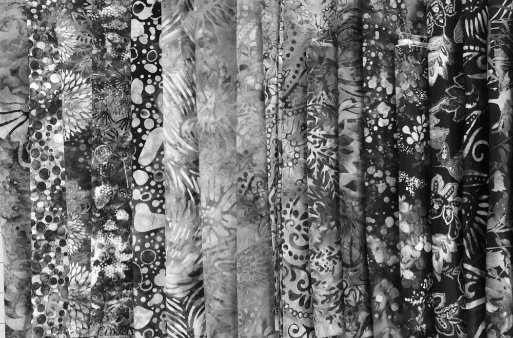
Take for example the fabrics above. They are the initial selection I have chosen for my newest collage, “Sunshine Oma”—an in-progress project for my newest Fly on the Wall series—combining the features of a specific person (my mom) and my Sun Portrait pattern.
What would you guess are the colors of these fabrics? (No fair if you attended the first session of Fly on the Wall two days ago!). Perhaps you would guess yellows since it’s a sun portrait, but then again, I turned my niece green in her portrait.
You might recognize the patterns in the fabrics, and be able to make an educated guess as to their colors. Go ahead and leave guesses—educated or wild—in the comments below, it would be fun to read them. 🙂


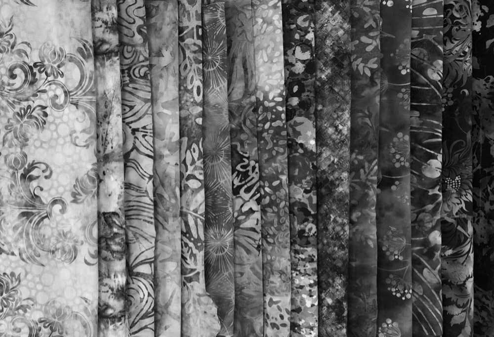
After the basic fabric selection, I create a fabric palette. I open up each fold of fabric and cut out a hand-sized chunk, based on the printed pattern on each (that will be the subject of next week’s post). In the photos above, are 12 folds of fabric on the left and 12 cuts from them on the right. The mono-tone gray starts to show me how my initial fabric choices may work together—value-wise—without the distraction of color.
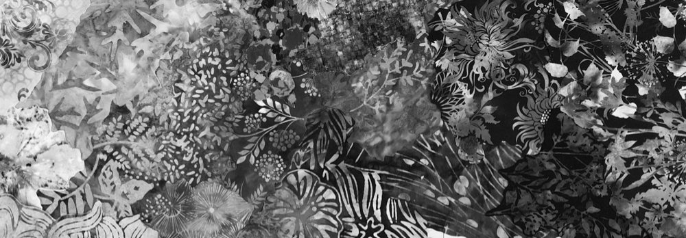
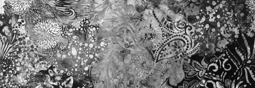
I get a sense of satisfaction—and yes, entertainment—to give just a little thought to arranging and overlapping those separate cuts as I set them down on my work surface. They start to form impromptu shapes of values, and colors, flowing from one to the next. It can also point out gaps of value range that I may need to fill with more or alternate fabrics.
In the abstract arrangements below, you can already see how smoothly many of my fabric choices are blending into each other—a confirmation that my choices were good ones before I’ve even begun the actual collage. Where does one piece of fabric end and the next begin?
So now, when I look at my mom’s photo below, I pick out an area of value on her face—the highlight on the tip of her nose or the medium tone on her cheek or the shadow on her upper lip. Then, when I look at the fabric palette next to her, I see similar values to work with. In that photo are 31 cuts of fabric grouped together. I think I have enough choices to get a good start on my portrait.


Next week, I’ll reveal this fabric palette in all its full-color glory. I’ll also talk about how the prints in the fabrics also factored into this particular selection, and how prints help in deciding how to cut a fabric palette.


To follow along with the development of “Sunshine Oma,” in the new Fly on the Wall Series,
sign up here:
CLICK HERE TO REGISTER
January 5, 12, 19, 26, 2023
$98
Recordings of each session are sent out the next day—for review or to catch up if live sessions are missed.
Oh, the timing of this is so perfect! I am getting ready to ‘run away from home’ (aka retreat) and recreate a black and white photo using the multitude of values of gray! For once I don’t have to get confused by color and I don’t have to edit photos. Looking forward to all I can learn from this endeavor. Your Masterclass will be my companion.
Thank you for this additional comment. I do like a lot of color but I wasn’t doing the values correctly. I was on-line on the first day of your session…being a fly on the wall for your mom’s portrait and I believe my art will be better for it.
I am doing the turtle now and I have added lots of greens with lots of value…light, med. and dark greens (have 54 different of values of green)!! Have trimmed that down…. I have 10 black and whites but not different values so I need to get more batiks for that. I have now a better since of making my art better. Thank you so much!! I can’t wait for your next fly on the wall.