")
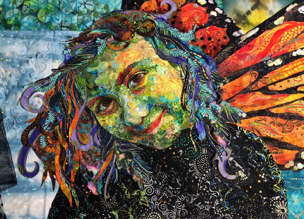
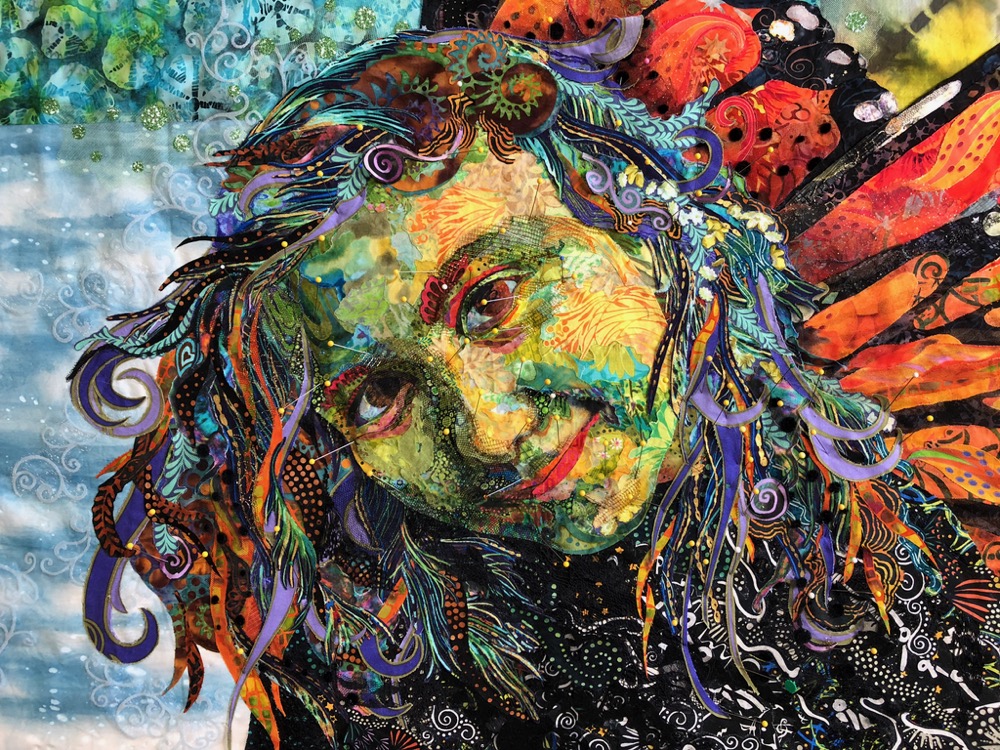
This week’s Thursday Night from My Studio Live! presentation featured my quilt “Monarch Maia,” detail above. Using the Zoom streaming platform, about 70 ladies from around the United States, Scotland, Canada, and Australia tuned in to watch. Thanks to all of you!
I have included the slideshow portion of the presentation as an update to my blog post’s Quilt Story of “Monarch Maia” (see video and original post below). Enjoy. Take care, everyone.
Quilt Stories: “Monarch Maia” (Slideshow Update)
Original Post from August 31, 2019
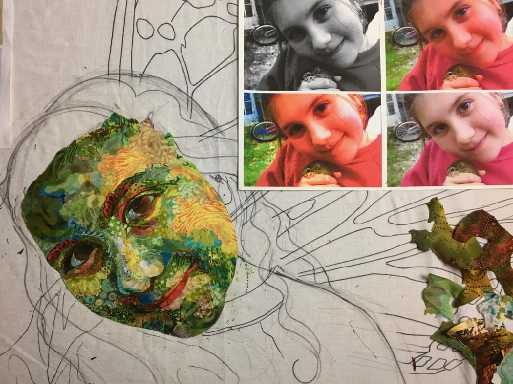
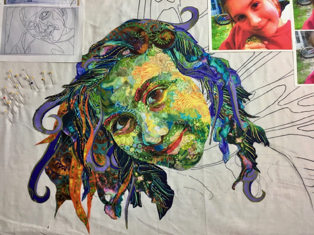
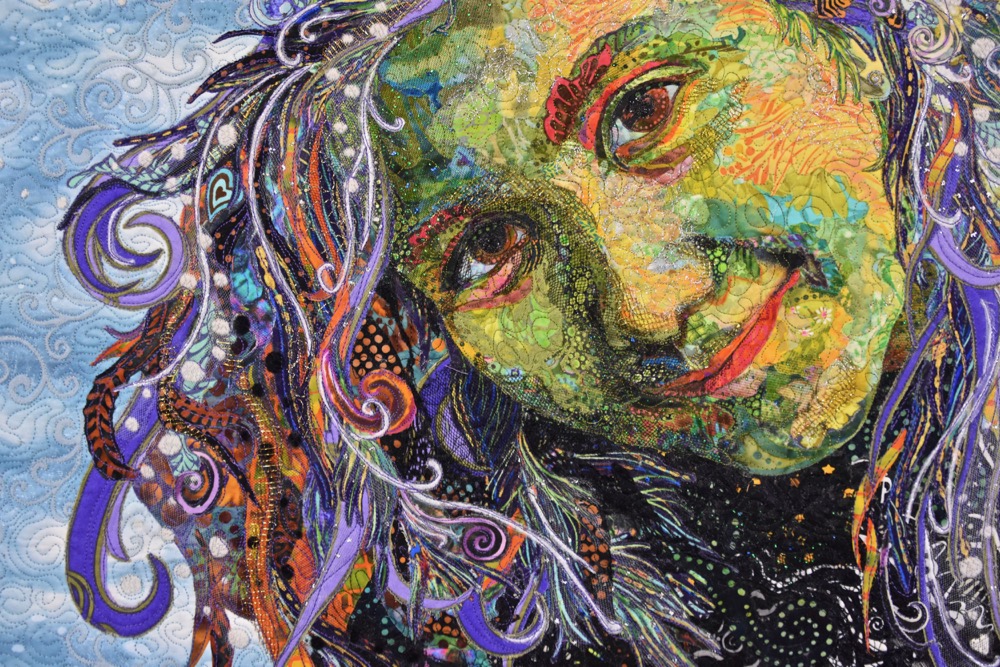
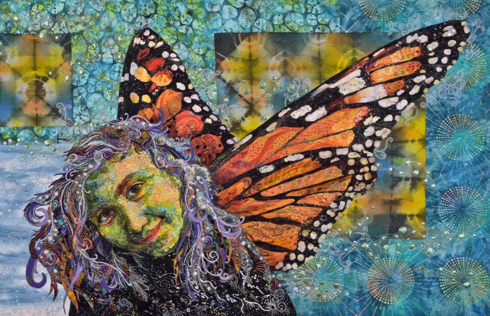
I made “Monarch Maia” as a gift for my sister, Heidi. This portrait of her daughter, my niece, Maia, was started during Heidi’s fiftieth year, and was intended to be her birthday gift. Well, a couple years have passed since then, but here at last it is done.
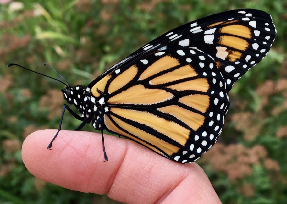
This quilt combines a closeup of Maia at around 8 years old (she’s holding a rescued red squirrel in this photo and is now 20 years old) with a photo of one of the monarch butterflies I have raised. The theme was an obvious one as Heidi’s fiftieth birthday year was the year that Maia headed off for college. The idea of change, growth, and rebirth (not to mention flight) is all evident in the life cycle of the monarch butterfly.


Also, when they were kids both Maia and my son Sam, helped raise and release monarch butterflies (for more of this activity see my summertime blog post here), often letting the new butterflies crawl all over them as the insects prepared for their first flights. So it’s kind of a memory quilt as well.
The Design
Once I had the theme, the first step was to make the design or pattern. One key was finding a butterfly photo with the wings in just the right position to make it look believable that they are attached to Maia. I have lots of butterfly photos. Though the kids long ago lost interest in hatching monarchs, I continue to collect the caterpillars from the milkweed in our yard and raise them to butterflies. I try to take a picture of each butterfly as it is released, so I had literally hundreds to choose from.
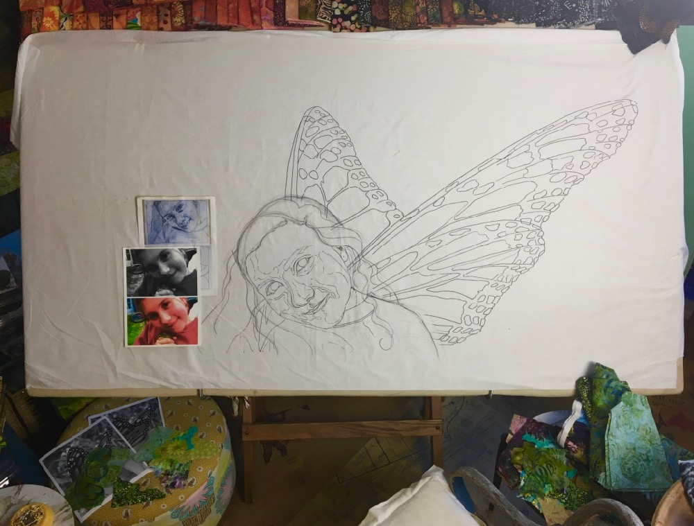
I won’t go into the details of how to make a pattern. You can find that here. But the overview is that once I found the photos I enlarged them so they would fit proportionally on a letter-sized piece of paper, made a tracing of the images at that size, then enlarged the tracing to the finished size. I slipped the enlarged pattern under a piece of thin muslin and used a Sharpie marker to trace the image onto the foundation fabric.
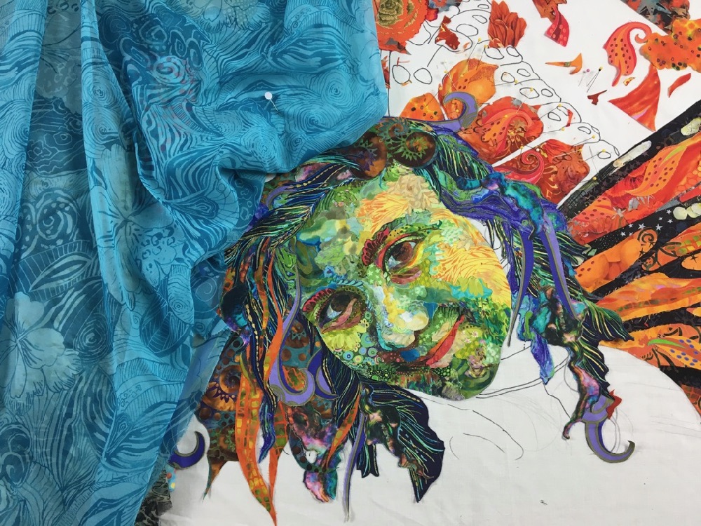
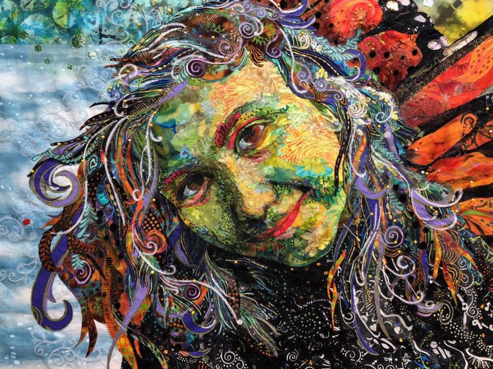
Some of you might notice that this image of Maia’s face is the same one I use in my eye-making blog post, “An Eye for an Eye.” You might also notice that the photo of Maia crops out much of her head and hair. Two years ago I had Maia pose for me with her head tilted in a similar way and her hair draped over her shoulders in order to “fill out” the rest of the drawing for this idea of mine.
The Face
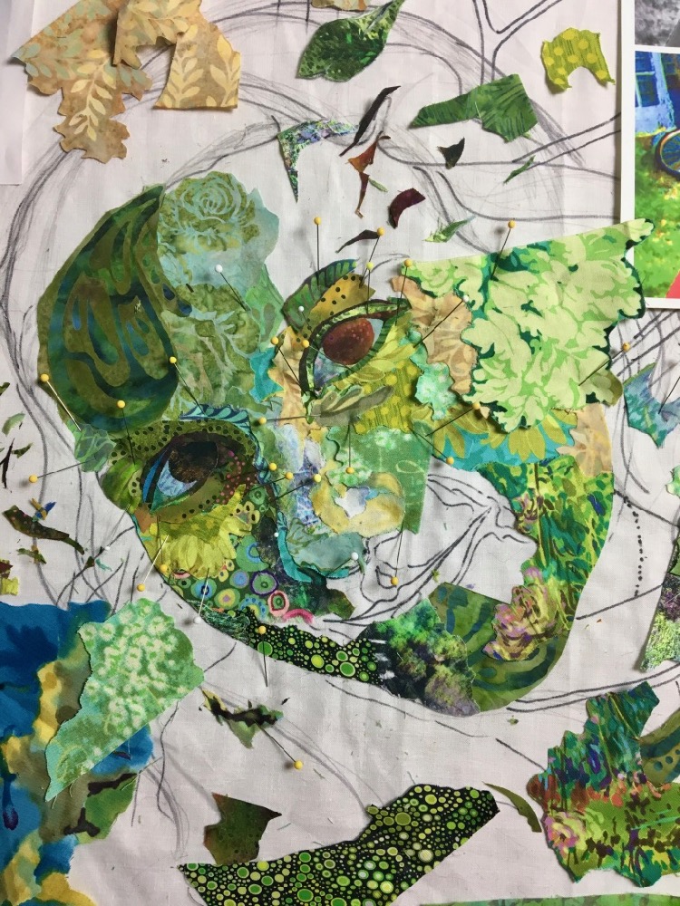
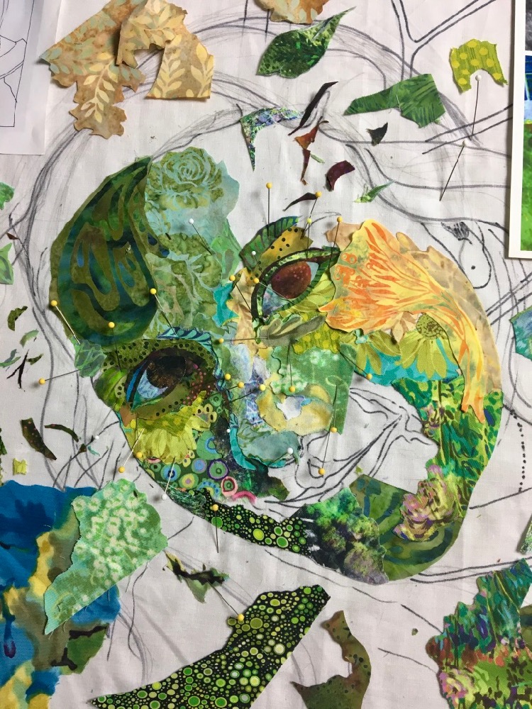
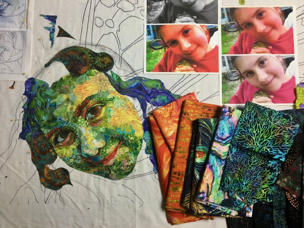
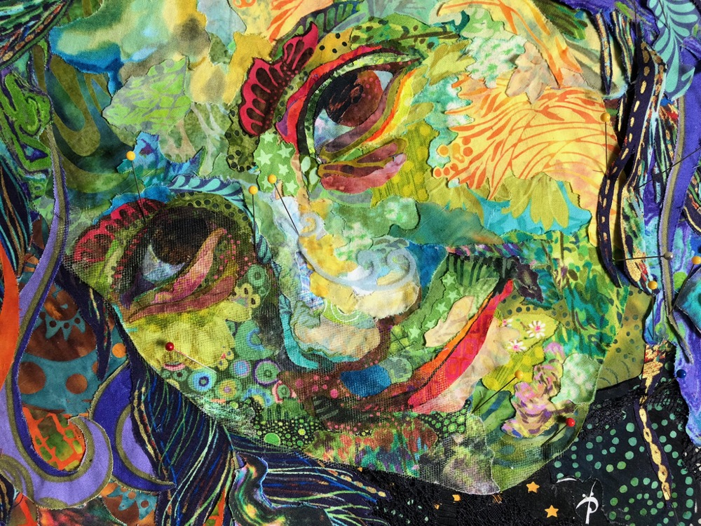
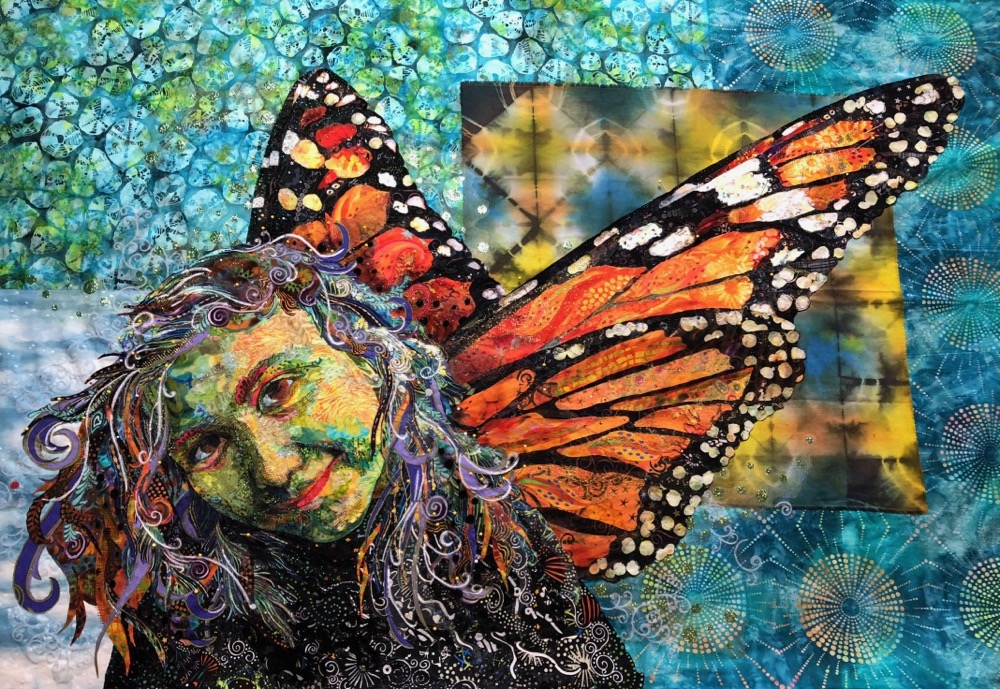
Of course, a portrait is all about the face, and it’s a good place to start—but what fabrics to use? I chose to work in greens. If you’ve been following my posts for a while it won’t surprise you that I chose to work in non-realistic colors. I checked with Heidi first and she approved my choice. Oranges and blacks for the wings were a given, seeing as I wanted it recognizable as Monarch butterfly wings, so that helped guide my decision. I figured a green face would work well with the orange and black wings.
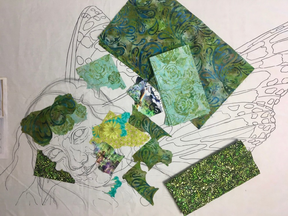
Above you can see some of the first fabrics I selected. I’ve cut out approximately hand-sized pieces to work with, using the print in the fabric to guide my cutting. I chose fabrics based on the “movement” of their prints. I wanted prints with curves in them. Not only that but curves of a particular scale that worked with the size of her face. I pictured the curve of her cheek or chin and chose fabrics with curves in them that could work in those places.
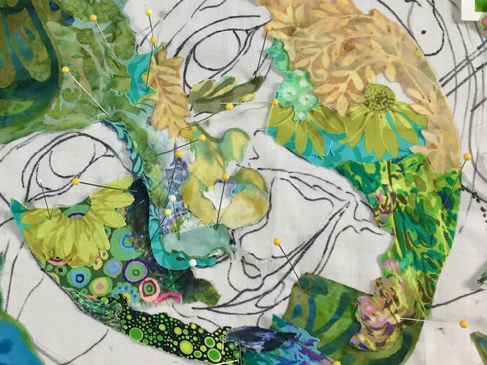
I was so excited about those wonderful curves that I kinda got ahead of myself. I usually start with the features—eyes, nose, mouth—but here I have started by defining the outline of her jaw and cheeks. You can see I’ve already started defining the shape of her face by using darker fabrics on the left and lighter value fabrics on the right. Same with her nose, darker on left, lighter on right.
In the next series of photos, you can see me trying to further define the right side of her face with light value fabrics. In this first choice I tried to stick religiously to my greens, but that didn’t appeal to me, maybe a little too monochromatic.
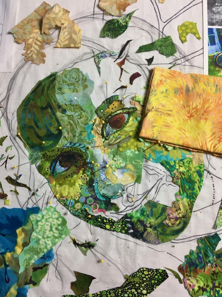
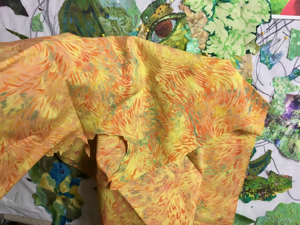
So I broadened my search to some yellows. I had thought my greens would stay more to the aqua-blue side of the spectrum, but more and more yellow-greens were creeping in, so yellow was not a bad choice as the highlight on her cheek. I used the yellow batik fabric below in my portrait of Sam and Maia, “Kissin’ Cousins,” so I knew it was likely to work for me in this portrait as well.
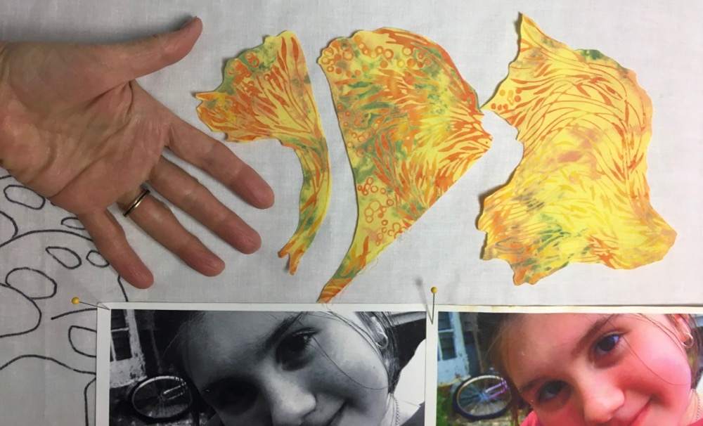
Below I’ve cut out several hand-sized pieces from the full piece above. I cut each one differently, relying on the print in the fabric to guide my cutting, looking for changes in colors and values.
Below I tried one of the cut pieces as a way to highlight the cheek and give form to the curve of her face. I liked the color and curve, but it didn’t quite fill the space the way I hoped.
So I chose one of the bigger cuts, one that overlapped the side of her cheek, as it’s drawn on the design.
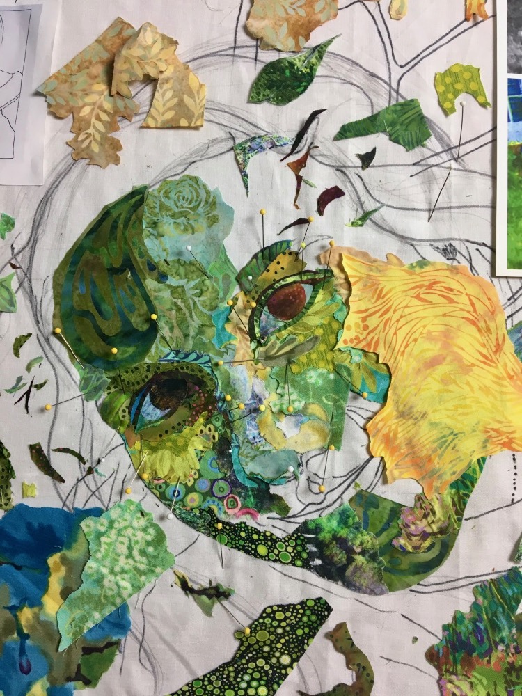
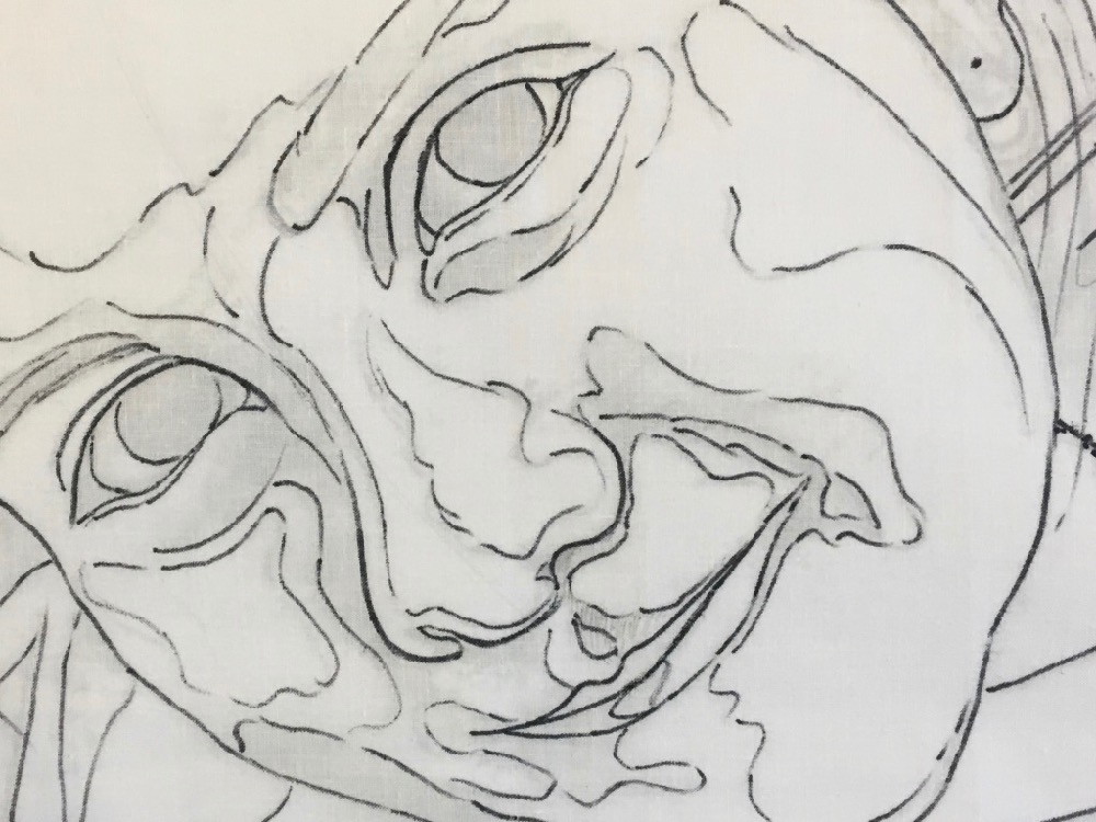
When trimmed to the correct size it worked just as I’d hoped. This is a critical idea to keep in mind. There are certain lines on your image which are there mostly as guidelines or suggestions. The drawing of the hair in this case, is mostly indicating the volume and movement of Maia’s hair. You’ll see later that I largely ignore any details I’ve drawn into the hair. However, there are other lines that must be strictly followed if you want your portrait to be recognizable as a particular person. The outline-shape of the face and the features—eyes, nose, and mouth—must be reproduced just as you’ve drawn them. You must trim your fabric right to those lines. Being only a fraction of an inch off could change the look of the person. The person may still be recognizable, but something will be “not right.” It would be distracting and bothersome.
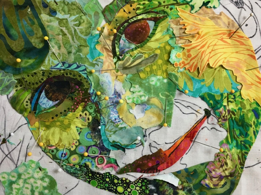
I continued to work in this way, cutting, trimming, pinning and gluing, to reach a “first-draft” of the face, below. Notice how the eyebrows changed. That made a huge difference in giving her face dimension—and a bit of unique (fanciful) interest.
Hair
Once the first draft of the face was complete, it was time to work on her hair. In an upcoming bog post, I’ll talk in more detail about how to handle hair in fabric collage, but for “Monarch Maia” again the starting point is choosing fabric.
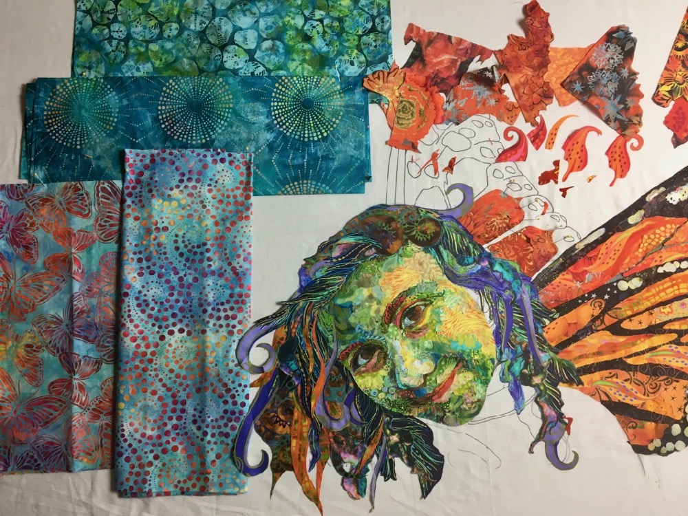
Below I’ve gathered a selection of fabrics with longer, more flowing curves than those I’ve chosen for the face. Of course the color is different as well. Her hair is dark, but notice I’ve chosen some oranges for the light values of highlights, to reflect the orange that is going to appear in her wings.
The technique is the same. I’ve allowed the prints in the fabrics to dictate how I cut out hand-sized chunks to work with. I have no idea at this point where or even if I’m going to use these pieces. I’m only creating a palette of shapes and colors to work with.
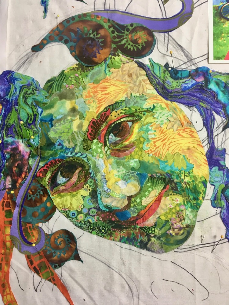
As you’ll read in the upcoming post on hair, I like to get the hair mostly blocked in, but save the wispy details of the hair for later. In this fanciful portrait, I figured I’d use a bit of sparkly tulle and netting for the details. First draft of hair? Check.
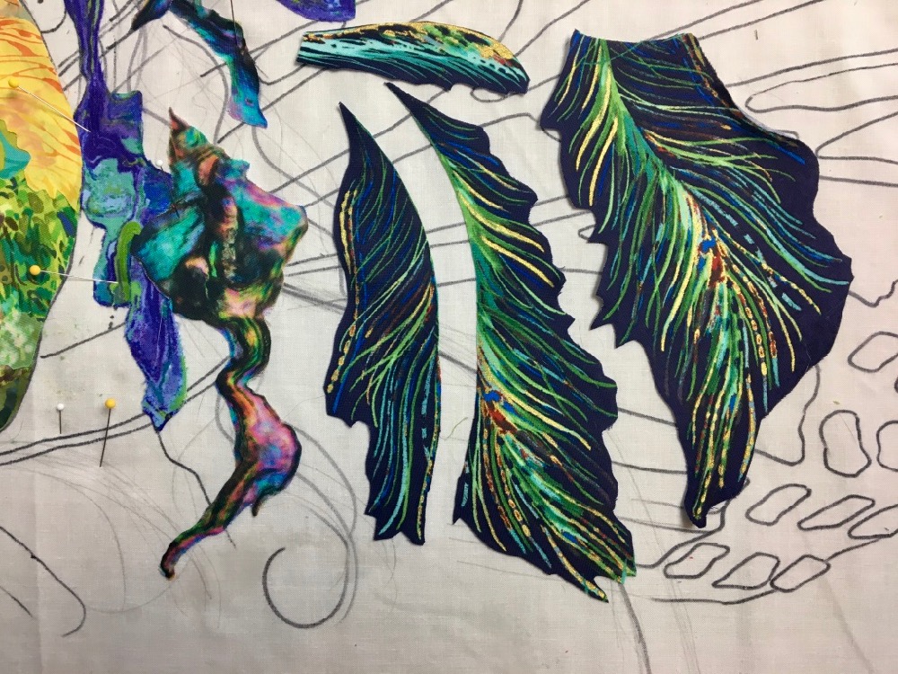
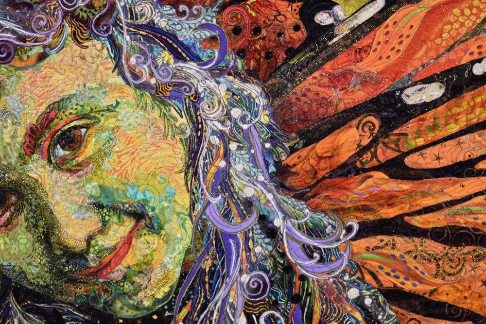
Giving Her Wings
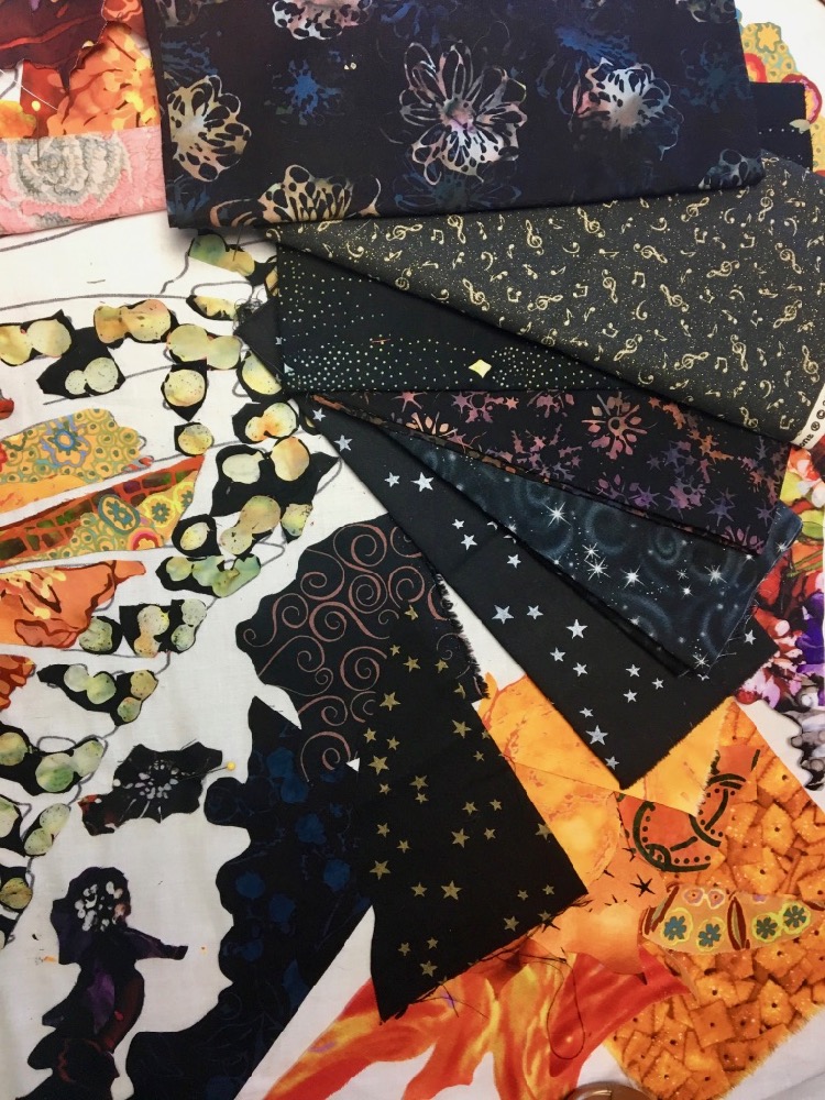
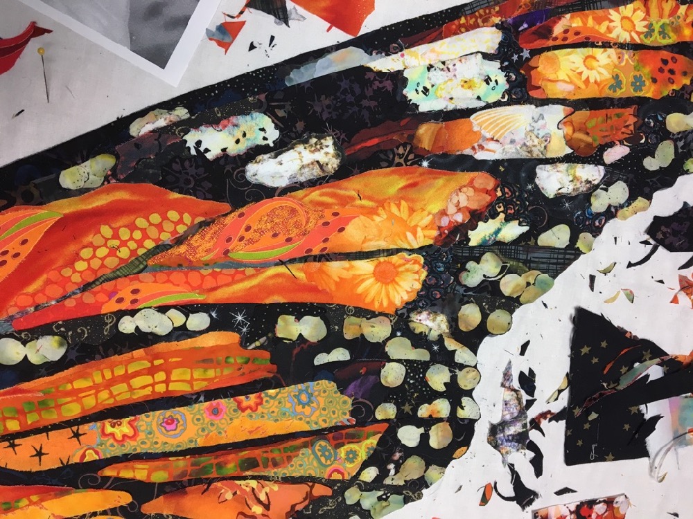
As I said, there was no choice as to color for the wings. They were going to be Monarch orange and black. I happened to have a good selection of orange to choose from!
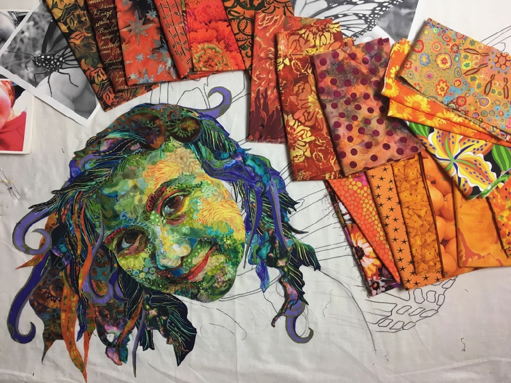
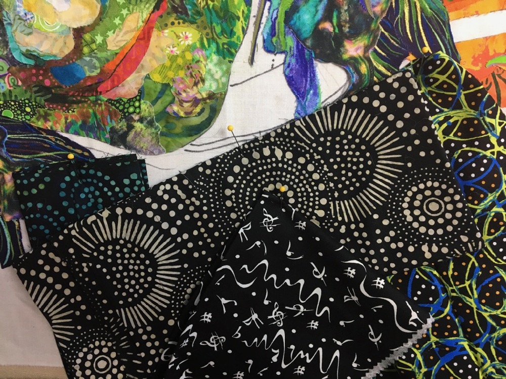
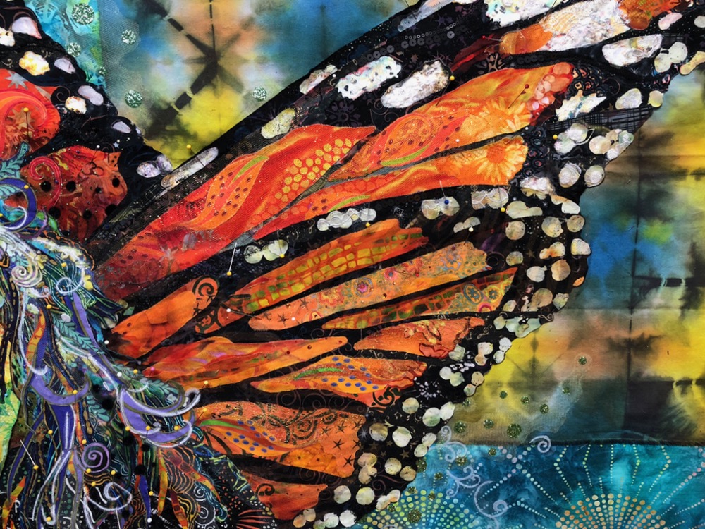
And it’s not just cotton fabrics that I can use in fabric collage. Here’s a closeup below, that shows the variety of fabrics I threw into the portrait— cotton prints and batiks, printed chiffon and silk, and a shiny looser-woven rayon.
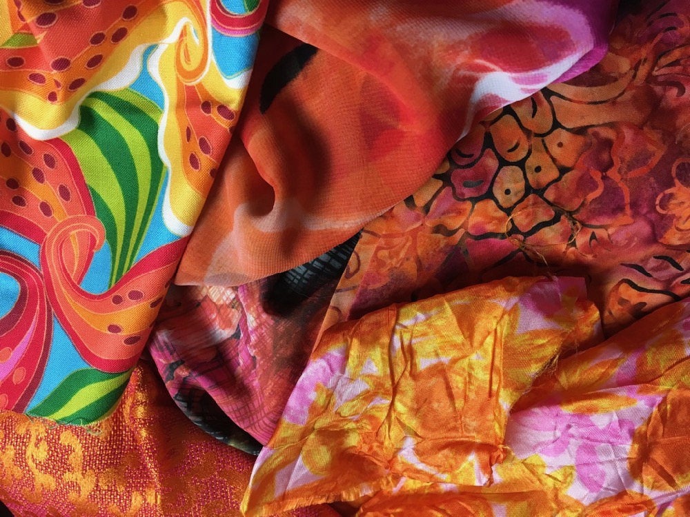
Below I’ve hacked into the beautiful fabrics to create my working palette. This is a step that gives pause to many beginners, it seems like such a shame to cut into these perfect fabrics when you don’t even know if they’ll be used. But you need to do it. You need to be able to move those fabrics around, hold them up, see where they might work. The variety is necessary because if you look at the original picture of the butterfly, you’ll see that the wings are a variety of shades, from near yellow to rusty orange. Notice I’m not afraid of throwing in some novelty fabrics. At the lower right are some oranges—as in the fruit—and some printed Cheez-Its.
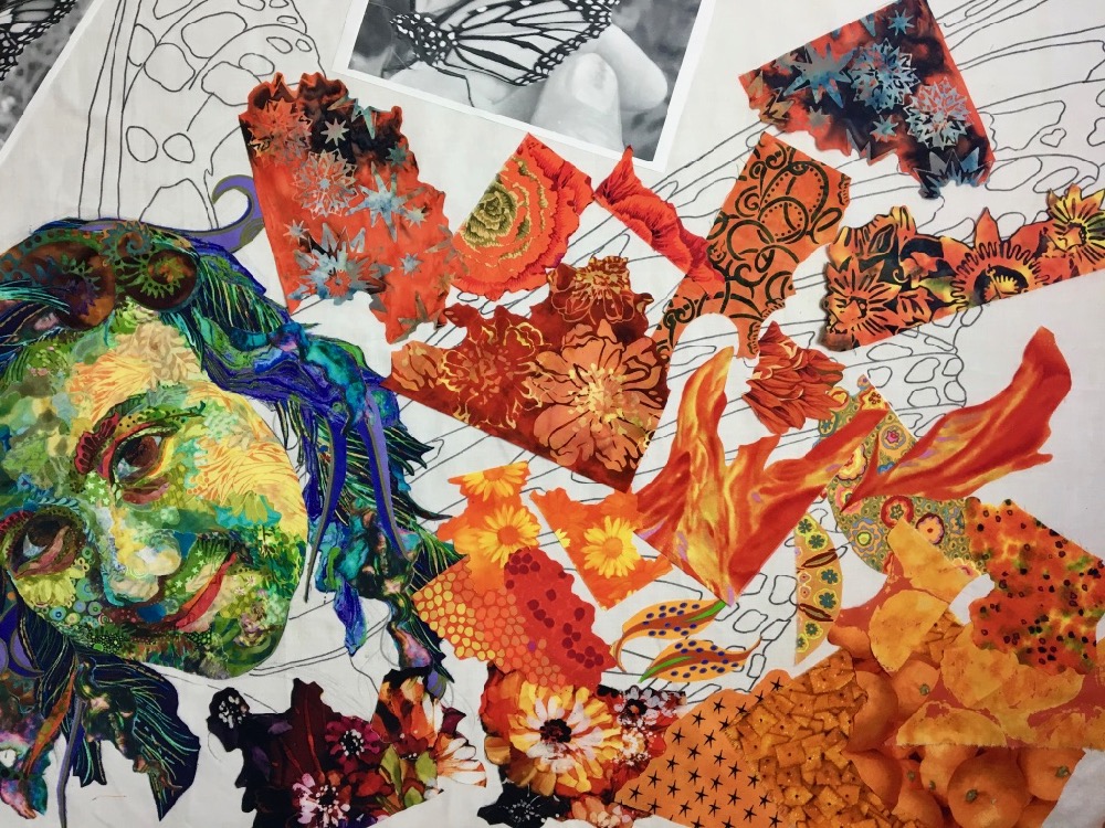
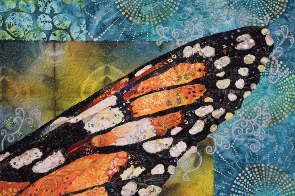
The sections of orange in the wings are reminiscent of stained glass in a window, so I’ll refer to each individual section as a “pane.”
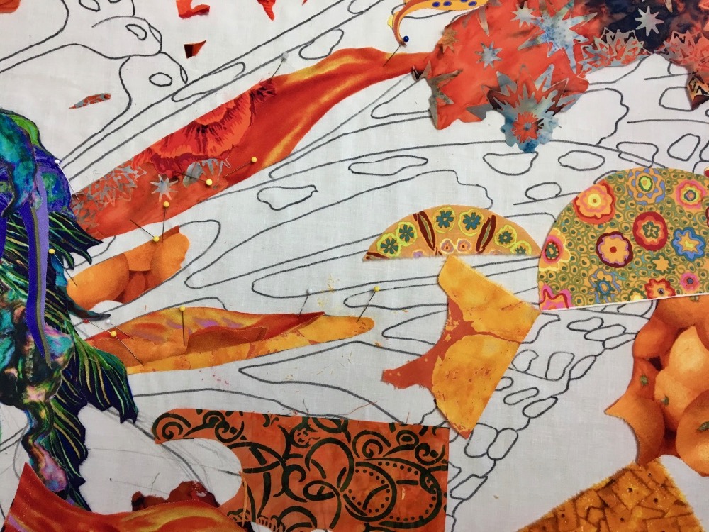
I do have some nice orange fabrics in my stash to work with. I might have easily and successfully used one piece for each pane. But that’s not my style. Each pane uses multiple pieces of fabric, which to me is much more interesting and visually rich.
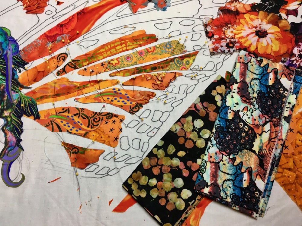
I had a good drawing for the wings, so I stuck closely to the shapes I drew for each pane. Once the orange shapes were filled in as a first draft (though by no means done), I pulled some “whites” for the dots along the edges of the wings, saving the black outlines for last. I put “white” in quotes because pure white would be pretty flat and uninteresting (in my opinion). Instead, I looked for printed fabrics with whitish areas within them. I found some interesting possibilities, mostly with warm accents that reflect the orange of the panes.
Once I had these spots cut out, I started laying them in place. This was a case where I didn’t need to match the shapes I had drawn exactly. Instead I let the shapes in the fabric do the talking for me. Notice that because the dots will be surrounded by black on the wings, I don’t have to trim the black on the fabric away.
Just as white is not just white, black is not just black. Here’s a selection of blacks I chose for the edges of the wings and lines between the panes.
Again, I cut down the larger fabric yardage into hand sized shapes for my working palette.
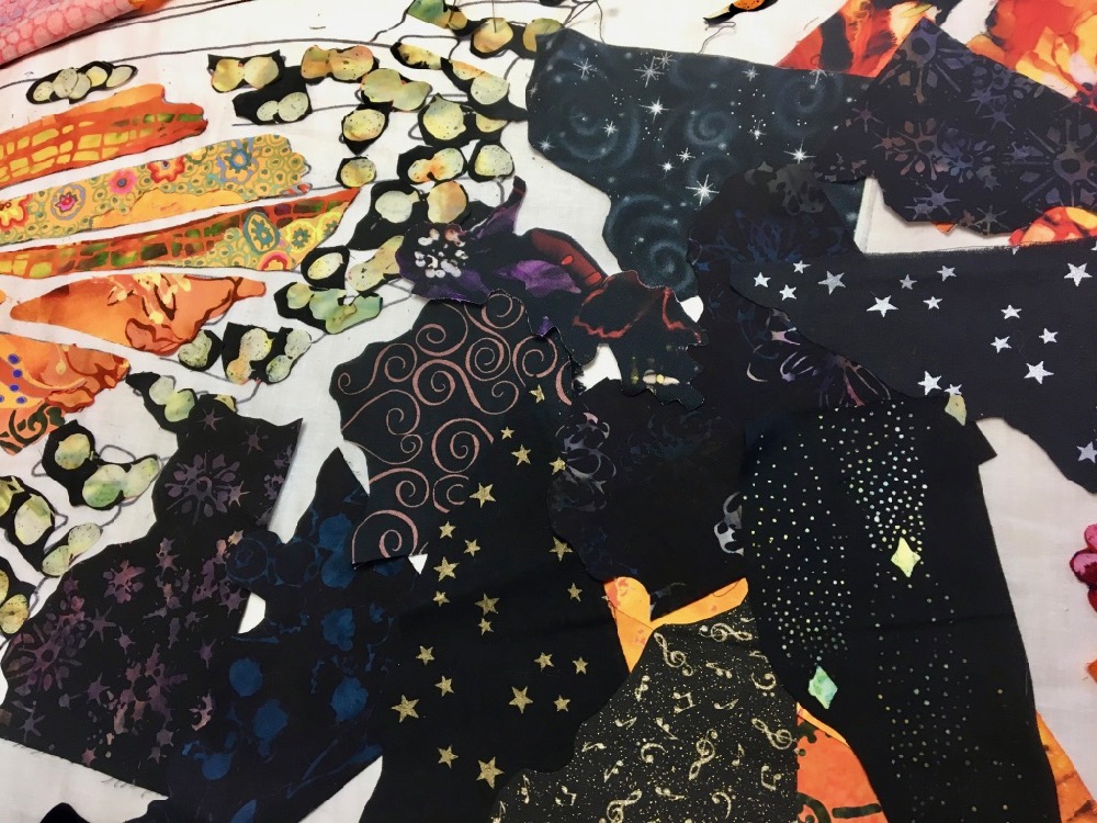
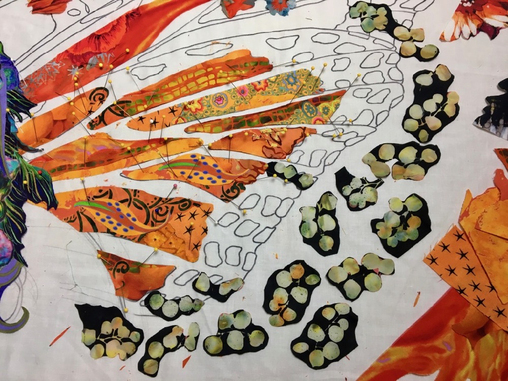
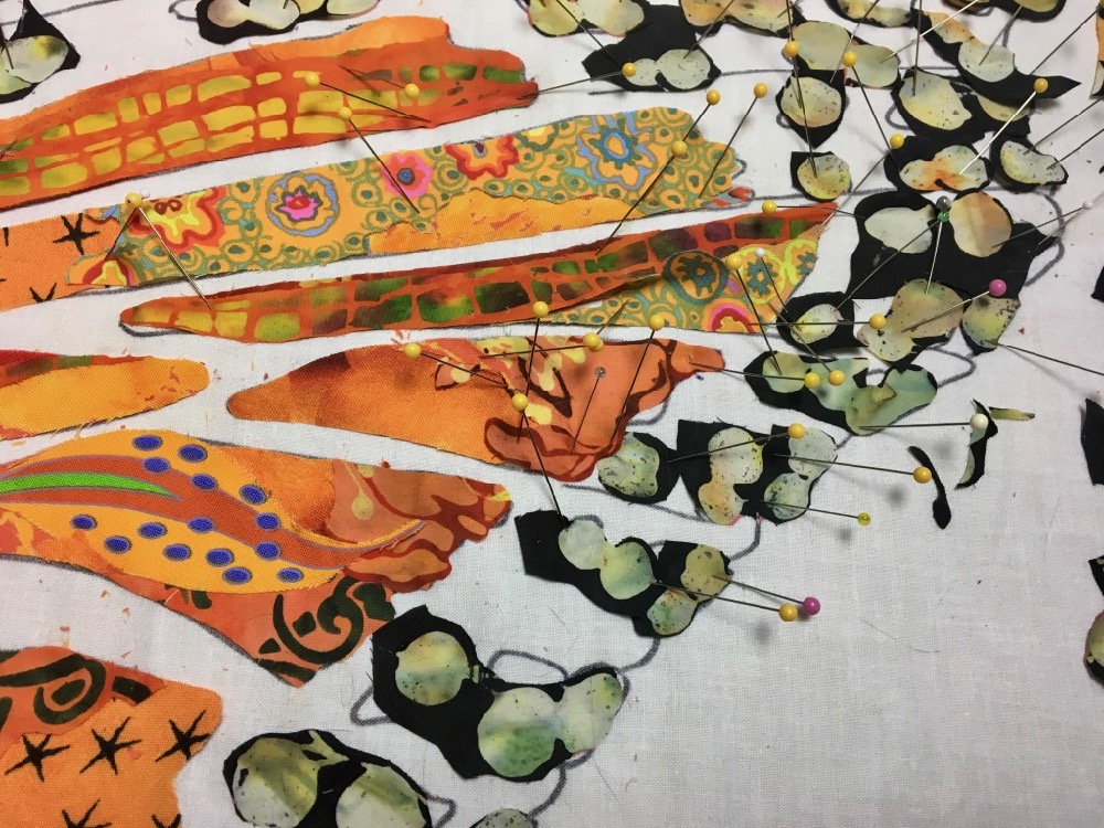
Because I cut the orange panes to fill the drawn shapes, and because I kept the outside edges of each shape loose, I could slip pieces of the black fabrics under the existing panes and dots.
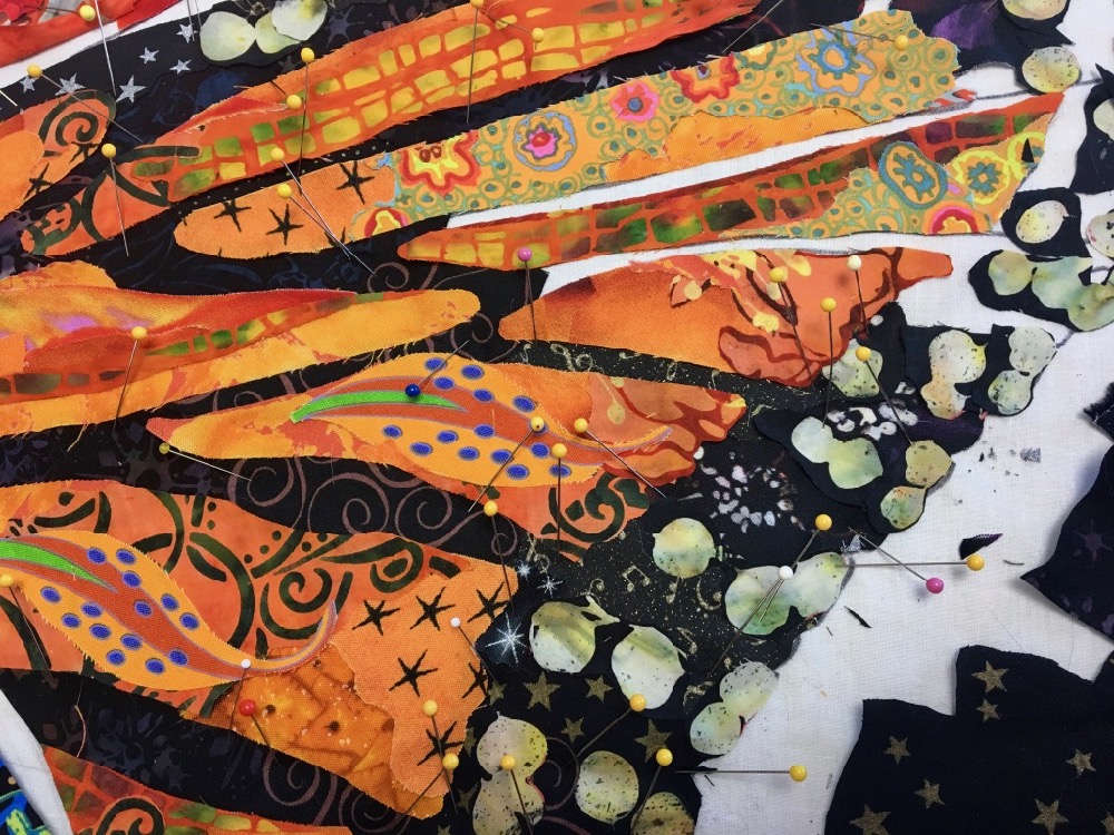
In the completed first draft of the lower wing, you can see how I used a wide variety of blacks to fill in the “background”—the variety gives interest to a potentially uninteresting area.
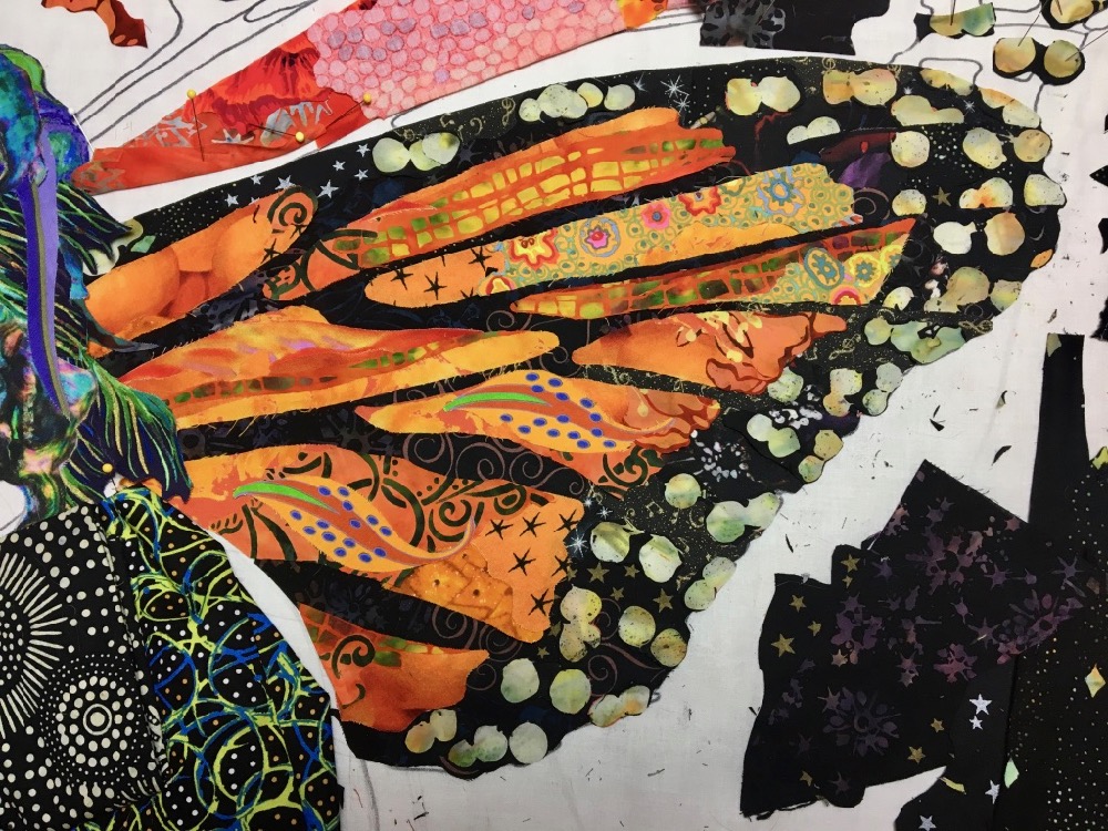
I then moved on to the upper part of the wing. A monarch wing is orange, black, and white, right? Look at the variety of fabric prints I could use within those basic colors, the richness of visual texture.
I work with what’s in front first, so the back wing was the last part of the portrait to work on.
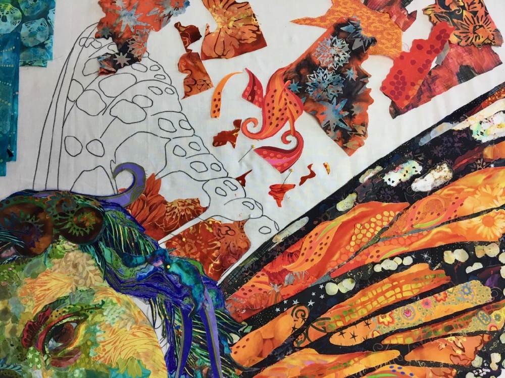
And here’s a first draft of the wings. Later, you’ll see how I come back to it with sparkly tulle and netting to add the final details.
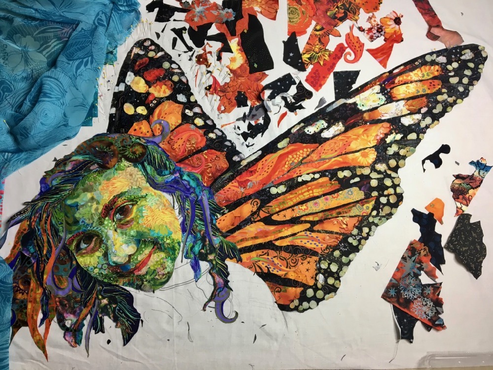
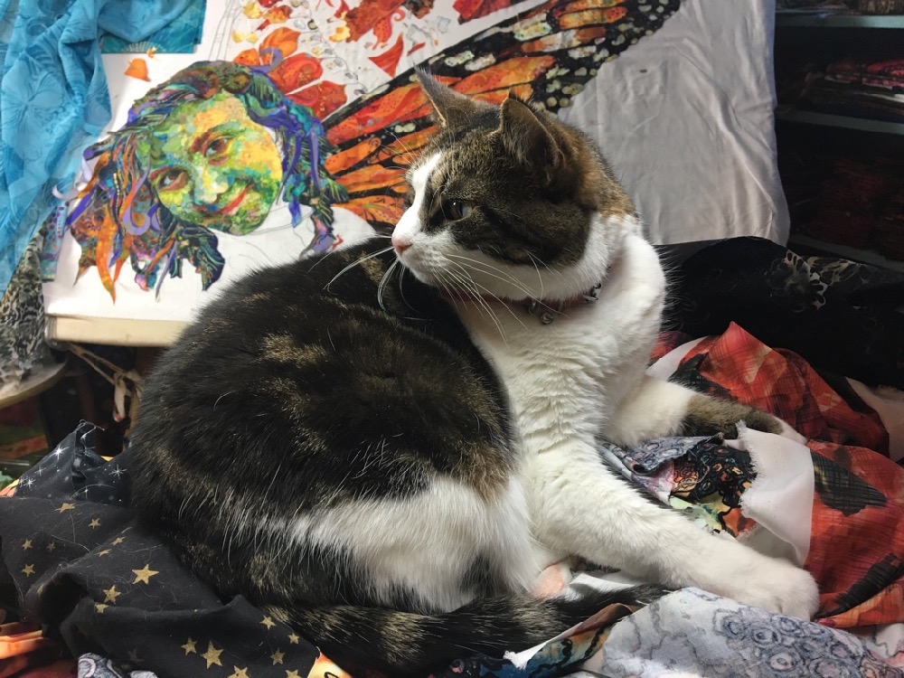
Djinni cat helps out as much as she can, adding cat hair and creases to my assortment of fabric.


Background(s)
Before I’d even finished the first draft of the piece, I started looking at fabrics for the background. The obvious choice was blues to represent the sky.
My first (possible) selection was a blue sheer.
It was a short-lived choice, but it helped solidify my choice of blues for the background. Of course there are lots of “blues” to choose from. And since I like density of color and pattern, a solid blue was never going to work for me.
Above are fabrics I had set aside as potential background ideas.
But I considered many others. Since the collage is glued onto a foundation fabric, I could cut the extra fabric away, allowing me to see exactly how it would look against a variety of background options. As luck and timing would have it, I had some fun trying the portrait with a bunch of handpainted fabrics by Mickey Lawler—see the different looks the different backgrounds give in the slideshow below. These are all from a collection of Mickey’s “SkyDye” fabrics.
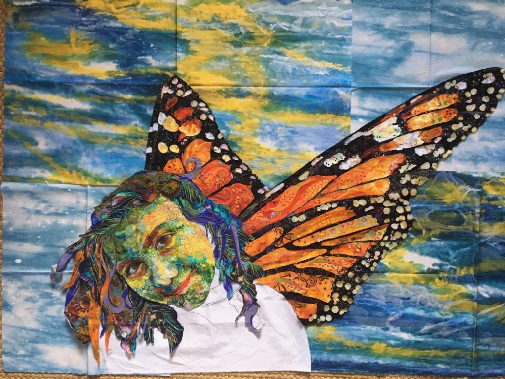
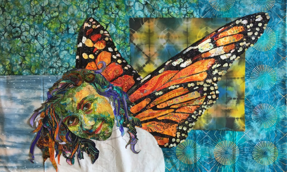
Once I had the quilt to this point (above) I invited my sister Heidi over for her opinion on the sky. The design we eventually settled on (below) shows how much back and forth we went through. Her comment, which I think was a good one, was that the strong yellow and blue of the painted sky fabrics isolated (instead of complementing) the greens of the face.
The only fabric that remained from my first choice was the lower left. The dyed panel behind the wings below, reminded Heidi of the windows in their home—can’t argue with that.
In the end, both backgrounds could have worked. The point is that backgrounds are tough just because there are so many possibilities. Many different backgrounds can work and it depends a lot on what your preferences are. I am just as happy with Heidi’s version as I was with my original choice.
The Body
Look at the body of this butterfly. It’s black and white, so I decided to continue with the monarch theme and make Maia’s shirt black and white.
I pulled out some black and white prints with strong, graphic designs. The high contrast of these prints would make them come to the foreground of the image.
Below is the first draft of the shirt. In this case, it was only necessary to suggest the shape of shoulders and torso. It didn’t need to be too detailed. I did, however, stay true to the light source coming from right to left. So I used the lower contrast darks to the left and where the shirt would be shadowed by the hair. The higher contrast fabric prints are placed where highlights would be.
Finetuning
Fine tooth comb time. I usually make a list of little things that need to get fixed and cross them off one by one.
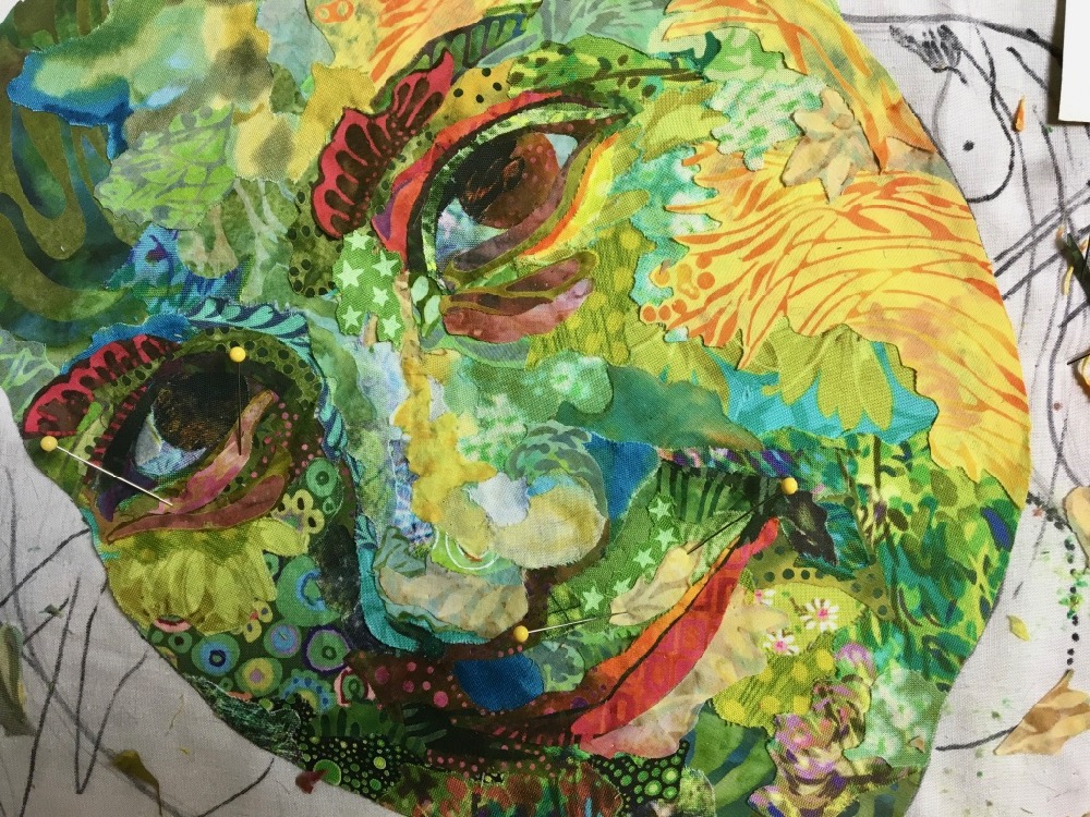
I use sheers of different colors to add a final layer of detail to most of my pieces. I use the sheers for a couple purposes. In the photo below, if you look closely you’ll see I’ve added a layer of darker netting over the left side of her face, pushing it a touch further into shadow, adding dimension.
After consulting with Heidi and Maia at this point, we agreed the nose was a little thick. Nobody wants a big nose on their portrait. Afterward I double-checked and the nose was the correct size compared to the original photo. I think our vision was skewed by being so familiar with how Maia looks now—more than a decade later—when her features have changed.
So I reworked the nose, narrowing it a bit and worked more on the shadow on left side of face, helping to further define the nose and give the whole face extra dimension.
Maia also suggested I could give more curls to her hair. I happened to find a white sheer with glittered curly-cues in it. I cut these out and added them as details where there would naturally be highlights in the hair. These helped to give further dimension to the portrait, adding to the illusion of the highlighted hair falling forward over her forehead and cheeks.
And then, of course, more sheers needed to be added to the wings and background as well—using a different spiral sheer as well as glittered green polka-dots—among other bling. Fantasy is fun.
Sheer sparkle fabric doesn’t come across well in a photograph, but if you look close in the photo below, there’s gold sparkle sheer placed over the panes. Aside from being fun, it does help to blend together the different pieces of fabric within the panes. When I put tulle over the top, it blended the variety of orange fabrics together, making the raw cut edges less obvious. But mostly it’s for the implication of magic that the sparkle imparts.
Ending
Sometimes ending is as hard as beginning. A deadline is helpful. If I have to finish a quilt for a show, I’ll work right up to the deadline, and that’s when “it’s done.” In the case of “Monarch Maia,” I overlooked several self-imposed deadlines. The problem was that each deadline was arbitrary, until I decided to schedule this Quilt Story blog post and the update to the Fabric Collage Master Class Manual, where I have included videos of the different steps along the way to making this portrait quilt.
As I got closer to the end, I found more things to “fix.” A bit in the cheek here, a strand of hair there. But such nit-picking can go on forever. It has to end, so I made a decision and it was done.
I was ready. I had worked on this piece for a long time (a.k.a. two years). It needed to be off my board so I can start on the next big project, whatever that’s going to be.
Presenting “Monarch Maia”
Hi Susan: I really enjoyed the slide show on Thursday night. I was very happy you touched on the background too. It’s a stinker to deal with. Having you go through the process chronologically was very helpful. Overall, a confidence builder, and informative too. I look forward to the next two Thursday nights! Thanks much-Mary
As I am currently away from home and my studio while I shelter in place with my daughter, a veterinarian, who continues to work long hours, I found myself without a new quilting project or the ability to visit a fabric store in search of one. Having just finished a project that I had brought thinking I would only be here for a few weeks, I dug out all of my scraps and decided to try your spiral project which I had read about in your Serendipity book but was currently in my studio back in Massachusetts. I searched several of your posts for a visual reminder, drew a spiral and began. I have always been a bit intimidated by your process but have always wanted to embrace it! Here was my chance! I must admit I LOVED it! Now I can’t wait to get home to work on the background and to take on another Susan Carlson inspired project. I enjoy your blog posts tremendously, especially during these trying times. Thank you for your positivity and inspiration!