
So you want to make a fabric collage quilt. Great!
After choosing an image to work from, the next step in creating a fabric collage quilt is making a simple pattern. This is a critical step, one that even beginning students sense has an enormous influence on the success of their finished product. Knowing how much is riding on creating a suitable pattern makes this a daunting task to the beginner.
It doesn’t need to be scary.
The basic steps are simple:
- Enlarge selected image to letter size: 8½ x 11 inches.
- Use tracing paper to outline shapes based on value.
- Enlarge tracing to desired size of completed quilt.
- Transfer outline to foundation fabric.
Okay, so you can go deeper than that, but that’s the basics. Let me elaborate by using a few of my own quilts as examples.
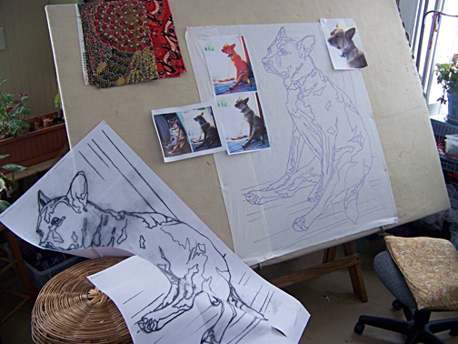
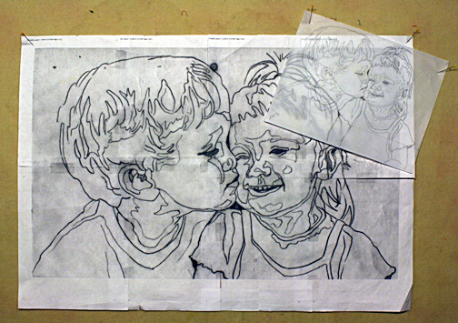
To see final versions of the quilts: “Kissing Cousins” is featured in a previous blog post: A Christmas Gift that Keeps on Giving. “Peace, Love, Tie-Dye, Save the Whales” is featured in my blog post on value: Why Color Is Irrelevant. “Dixie Dingo Dreaming” can be viewed on my website.
Step One: Enlarge selected image to letter size: 8½ x 11 inches.
Letter size is nice because it’s convenient. Most people have home printers nowadays, so it’s easy to print out an image as big as will fit on a regular piece of paper.

Why not bigger? Why not print out the image at the finished size? That seems logical. The bigger you print it out the easier it is to see details, right? That might be true if you have an extremely high resolution image. But the resolution on most personal and cellphone cameras just isn’t that great. If you blow up an image too much, you’ll actually lose detail.
Keep the original handy. You’ll be referring to it during the piecing process.
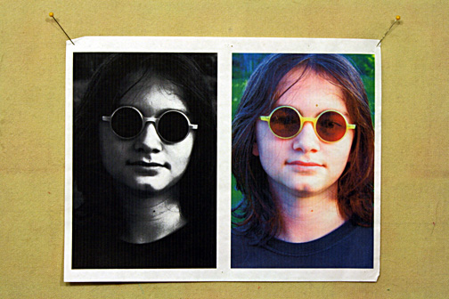
Extra credit: In order to draw out the differences between shades of value, you might try tweaking the brightness and contrast in a image manipulation program such as Photoshop before printing out your image. You could also try turning it black and white, posterizing it, or playing with changing its colors. These all may help you see the image as a collection of values.
Step Two: Use tracing paper to outline shapes based on value.
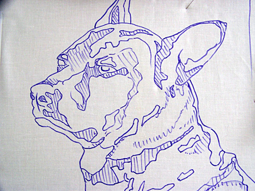
Tracing vellum is nice and transparent, if you can find some, but regular old tracing paper will do if that’s what you have. Using a nice, sharp pencil (I like mechanical pencils for this), start outlining the larger shapes based not on, say, parts of a face—nose, mouth, eyes—but in terms of value. A nose will be made up of several shapes—dark, medium, and light areas. If you need a refresher on value, visit my blog post “Why Color Is Irrelevant.”


Resist the urge to be extremely detailed. It will simply be too confusing. Also, as you will see in the example of “Dixie Dingo” (below), the pattern will get covered up quite quickly, making all those details a waste of time. If it starts looking like a crazy paint-by-number drawing, then you probably have too much detail. Look for lightest areas and darkest areas to draw around. The middle values get filled in as the piecing process progresses.

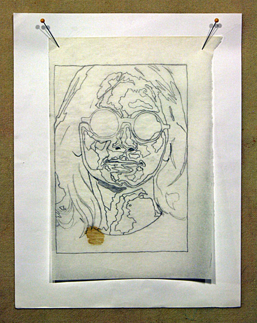


Extra Credit: Do simple shading in the darkest shapes to indicate shadows. A lighter shading can be added to shapes where the value is in the mid-tones. Leave the highlights white. This drawing, after you transfer it to the foundation fabric, can serve as a “cheat-sheet” of sorts and help you keep track of what values go in what shapes.
Step Three: Enlarge tracing to desired size of completed quilt.
When in doubt, go big. How big? One rule of thumb: a face should generally be at least 10 to 12 inches top to bottom. Even bigger is better. Imagine trying to create an eye the size of your pinkie nail. Now imagine it the size of a golfball. Make it easy on yourself and go bigger.
The easiest way to get your tracing enlarged is to take it to a local copy shop. Most big box business supply stores have a copy center. Tell them how big you want the finished pattern to be and let them do the math.
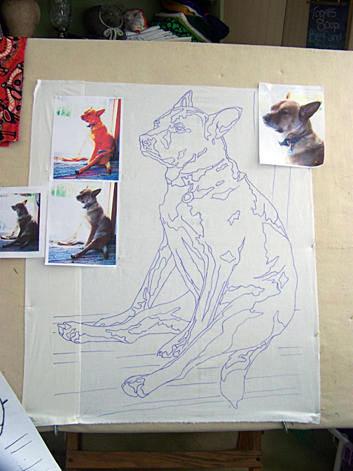
Another method is to enlarge it at home. This will require you to scan your tracing, then print it out at whatever percentage you desire. This will probably require you to “tile” the image together in several pieces. I do this with all my designs (see photo above and”Dixie Dingo” photo at beginning) since I have in-house copy service, a.k.a. Tom, my husband.
So how do you figure out what percentage to use? Simply divide the finished size by the original size then multiply by 100. It doesn’t matter which dimension, height or width, you use as long as you choose the same on both finished and original. Another way to figure out your enlargement is to use a proportion scale. And of course there are apps for that.
Step Four: Transfer outline to foundation fabric.
Choose a plain, regular weight fabric for the foundation that you’ll be gluing to. Muslin, or another inexpensive neutral colored fabric, works well. Cut a piece slightly bigger than your paper pattern. When you slip the pattern behind the fabric, you should be able to see it well enough to use a permanent marker (such as a Sharpie) to trace the image onto this foundation. You want a nice solid, definitive line. This is your guide and reference. There are no templates in the way I work.
Extra Credit: If you shaded in the darker areas on your pattern, transfer those to the fabric as well.

Final Exam
Students are often impatient to start creating their image in fabric, but don’t rush your pattern. Take your time. Maybe you’ll have to make a second draft, as I did with “Peace, Love, Tie-Dye, Save the Whales.” It’s well worth the effort at this stage to create an accurate pattern. As you move on to the the next step in the process—fabric collage piecing—a good pattern will ____________.
a. be the foundation on which your fabulous quilt will be built.
b. be your best friend.
c. give you extra confidence.
d. all of the above.
This is a fabulous tutorial of your drawing process.
Thanks Susan!
Thank you for the insight on how these are made….. Maybe someday….Sure looks nice.
Shirley–I will be creating an online course to be available this fall. Perhaps that will be something you can use to get you started. Stay tuned.
I am planning to make a quilt and didn’t know how, thanks for getting hold of your website. Will be in touch soon before I start.
Regards
Dudu
I’ve been wanting to try this for quite a while. Thank you for the great instruction on making the pattern! I will be watching for the online course!
Hi Susan, Loved your tutoriel. This is how I do picture quilts. You exsplained it so well. Linda Long
Do you glue fabric pieces to muslin? How do you get precise shapes to fit on pattern. Thank you
Randy, the answers to your questions are a little involved to answer here. I suggest you start by reading my blog post “Why Glue?” Other posts will give you more
insight into how I work. Fabric is cut freehand.
You are brilliant. I definitely will. Gorgeous work.
This is amazing!! Do you use the enlarged paper image to cut the pieces or do you just eyeball it?
What a fantastic step-by-step! I’ve been wondering how to start. I will need to check out some of your links for more information on value. So glad I found you on Pinterest!
Thank you very much for this tuition it is clear and inspirational – I have been trying to do one of these for ages – I am so glad I have found you – Max
Thank you very much for this tuition it is clear and inspirational – I have been trying to do one of these for ages – I am so glad I have found you – Max
Re: “what’s next” I recently saw a picture of a Pangolin in an email from NRDC and instantly thought of you and your technique when I saw it’s scales – somehow just looked like a subject that would be fun to explore this way. I, too, have always been in love with Tickled Pink and Polka Dodo.
Re: “what’s next” I recently saw a picture of a Pangolin in an email from NRDC and instantly thought of you and your technique when I saw it’s scales – somehow just looked like a subject that would be fun to explore this way. I, too, have always been in love with Tickled Pink and Polka Dodo.
Hi Susan great fan of your work. I find it fascinating. I have tried to find a place where I can buy some of your fish patterns, but with no luck. Could you tell me how I can purchase them. Thank you Barbara
Right on my website, Barb. Look under the Market menu at the top of the website.
I’ve used a method like this working with an artist/interior designer. But it was more abstract using her drawings of scenery & less intricate objects. I fused pieces on fabric for window treatments, mostly valances & some wall hangings. They were custom & quite unique. I’ve always wanted to do portraits & I’m so glad I found your site as a starting point. Grandkids & dog will be first.