
Creating a pattern is a critical early step for creating a fabric collage quilt. Because it’s so important, describing how to make a pattern was one of the first “how to” blog posts I published way back in April 2016 (included below). Two years later I did an update adding video of me tracing an image as an example. One goal of that video is to show how I make decisions on how much detail to include in my tracing. I’m using my experience to decide what features need to be clearly defined by my pattern, and which areas can be “fudged”, a critical distinction.
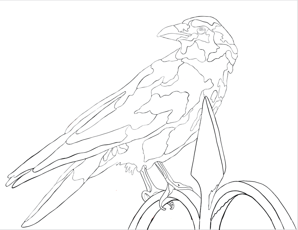
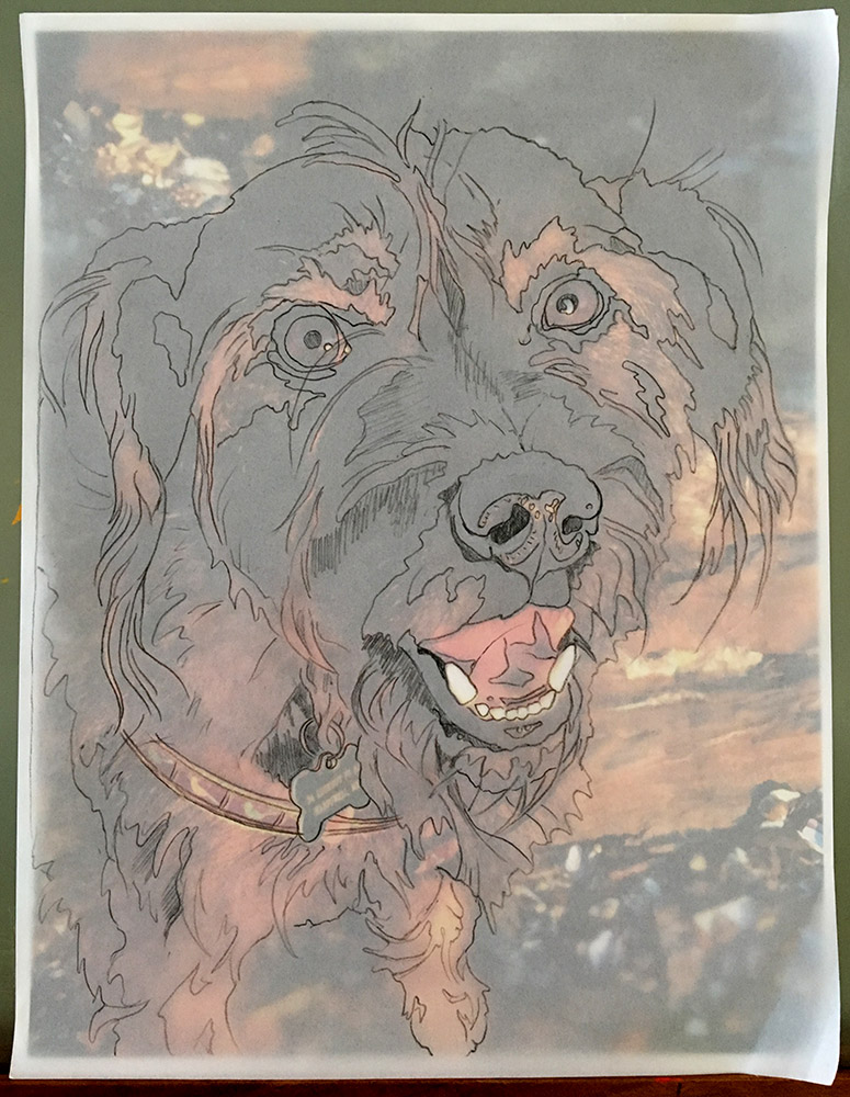
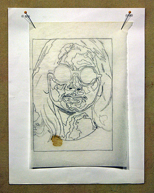
It’s been almost five years since I visited this post. Recently in a class in Tucson, I was reminded by my students of one shortcut some use when making their patterns: using an app. There were three students who were working from images that had been altered by apps, though the crow image, below, was the only one that I know was used to create the line drawing used for the collage.
If you click on either of the crow photos below they will appear larger on your screen. You can then click back and forth to compare the difference between original photo and altered in app version.


There are many apps that break down an image into a defined range of values, sometimes called posterization. This is in essence, a shortcut to defining areas of value by eye when tracing your image to create a pattern. The app that Deb Deaton used was the free version of Vector Q. Deb’s example is quite tame compared to other versions I’ve seen of altered photos. In one class, the values were simplified to a point where a nose on a face was almost entirely lost!
From Deb about the app she used:
It was helpful in reducing the “clutter” of a photo and separating out values. However, I would recommend combining this with actually drawing at least the main shapes of your subject.
And maybe that’s the good part of apps for collage—it can help to train your eyes to separate out values. But in Deb’s second sentence, she expressed her wish that she had traced the crow by what she saw as well.
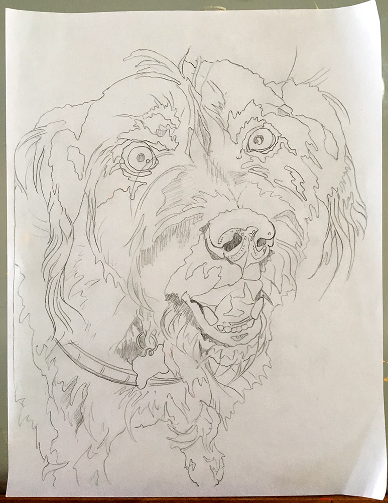
And this relates to what I believe, that the more we look at an image the more we will see in that image. I’ve talked about this before, looking versus seeing—it’s something we need to train our eyes and brains to do—then transfer the observations to our hands, creating the image as we see it.
For Deb, it worked out all right. Somewhere around day two of class, she was already seeing the parts of her line drawing that she wished she had traced from the original photo and not the altered version. These were distinctions that I was glad she was picking up on, but I didn’t let her stop to make a new tracing. What she had was more than fine for a first collage—she could make adjustments as she went along, as her eyes were learning what to look for.
I know that Deb’s collage will have a happy ending, and honestly, so will most others that are generated from app altered images. But I do think that those students will have missed out on (or maybe just delayed) a worthwhile learning experience, they’re more apt to struggle with what they see, at least for awhile, and I’m not a fan of apps for that reason.
It’s not just learning how to see and draw the shapes and lights and darks in your photographic image, but what you learn in the act of drawing can also affect how you look at your fabrics—how to see patterns, values and colors that will help you re-interpret your photo into a fabric collage. And just like I wouldn’t want an app to pick out fabrics for me, I don’t want an app to decide how how I draw my design.
Don’t get me wrong, I’m not a luddite (a fun word to use: meaning someone who dislikes technology), but you can call me old-fashioned on this. I enjoy the act of hand drawing my designs—of feeling my (favorite) pencil on my (favorite velum) tracing paper—of seeing my design appear. With every drawing, every erasing and correction, every double check, I observe and learn more about my subject.
These have been further thoughts on drawing a design for fabric collage, below are my first and second thoughts on the subject. The basics are contained there.
But before I leave you to read up or refresh your knowledge there, here are words of pattern wisdom from a couple recent and experienced students of mine:
From Mary McKay—”Use really good tracing paper. Pick up your pencil often, lay it down, look, think, pick pencil up again, repeat. Keep it simple.”
From Grace Crocker—”The one thing that has really helped me: when enlarging my line drawing [from letter-sized drawing—see posts below], I also have an enlarged black and white copy of my photo made at the same time. Not on color photo paper, it’s too expensive, but a large size b&w on regular paper allows me to see many of the fine details when working on my collage later.”
Making a Pattern for Fabric Collage Update
Update published February 18, 2018
Visit this version to see original comments on post.
As promised, I’m selecting some of the most popular posts from my blog and updating them with video—something that elaborates on or shows more detail in the fabric collage technique. Starting with the most popular posts—the ones that have been viewed, shared, and commented on the most—this is now the second installment of the “Update Series.”
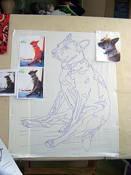
This particular post originally began and ended with drawings of a past pup of ours (Pippin), so I choose an image of a current pup, Felix, to demonstrate via video the pattern drawing process.
Felix is a dark dog–an easy description would be dark grey–not an easy subject to photograph. Add to that his camera shyness and we have many pics of him as a dark blur. So imagine my delight when a beautiful sunset walk at the end of the peninsula we live on yielded a sun-soaked photo of our wonderfully shaggy three-legged happy dog.
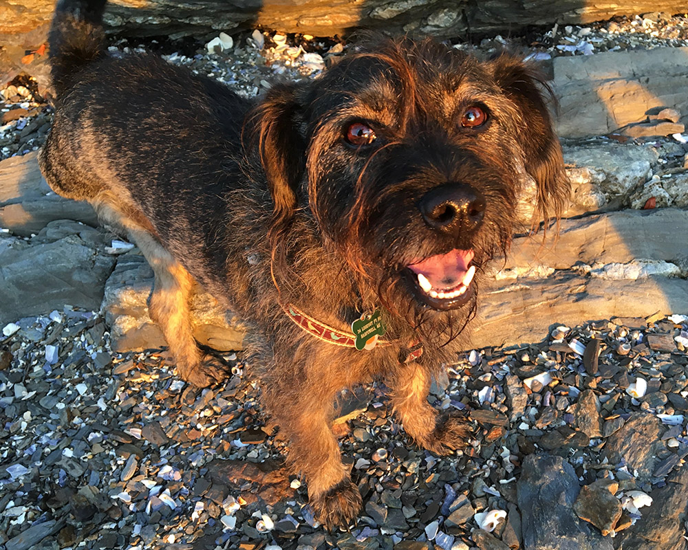
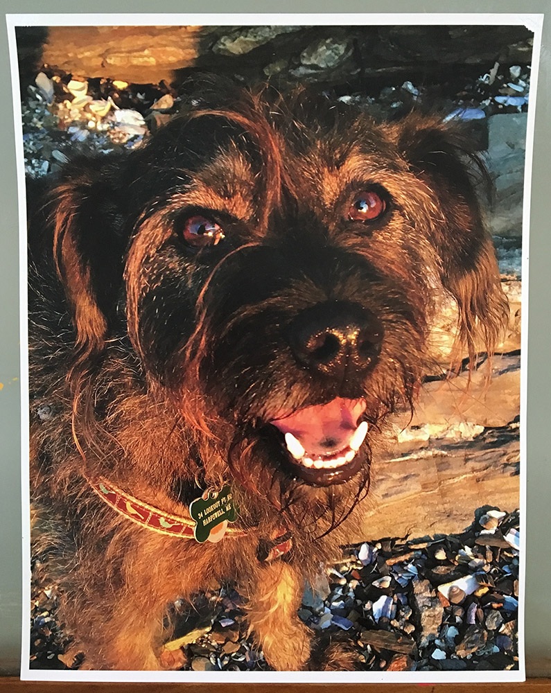
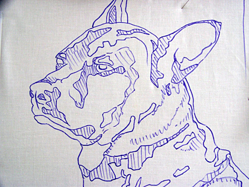
This photo accented the few browns on his face and gave me the highlights and shadows I would need in creating the line-drawing for the pattern, as well as definition to his face and body to guide me later in the collage process itself.
As I say in the original post, in creating a line drawing, I begin by looking for the lights and darks of the image. I outline those areas, taking care to be as accurate as I can. This might take me a while, but I find that time spent looking at, drawing, and generally familiarizing myself with my subject is in no way wasted. The more ways I can put the image into my brain, the better. I think it helps all along—from design to fabric selection to the collage process itself.
And here—tah dah!—is your video. Enjoy.
Making a Pattern for a Fabric Collage Quilt
Originally published April 2, 2016
Visit this version to see original comments on post.
So you want to make a fabric collage quilt. Great!
After choosing an image to work from, the next step in creating a fabric collage quilt is making a simple pattern. This is a critical step, one that even beginning students sense has an enormous influence on the success of their finished product. Knowing how much is riding on creating a suitable pattern makes this a daunting task to the beginner.
It doesn’t need to be scary.
The basic steps are simple:
- Enlarge selected image to letter size: 8½ x 11 inches.
- Use tracing paper to outline shapes based on value.
- Enlarge tracing to desired size of completed quilt.
- Transfer outline to foundation fabric.
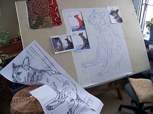
Okay, so you can go deeper than that, but that’s the basics. Let me elaborate by using a few of my own quilts as examples.
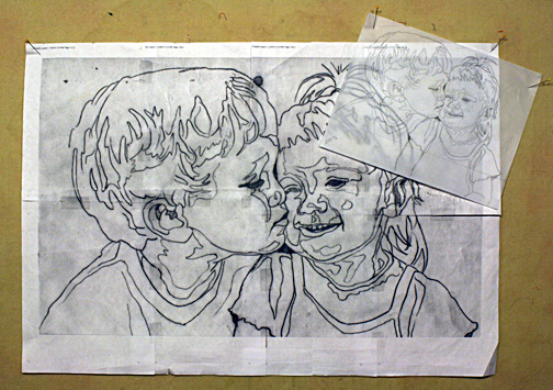
To see final versions of the quilts: “Kissing Cousins” is featured in a previous blog post: A Christmas Gift that Keeps on Giving. “Peace, Love, Tie-Dye, Save the Whales” is featured in my blog post on value: Why Color Is Irrelevant. “Dixie Dingo Dreaming” can be viewed on my website.
Step One: Enlarge selected image to letter size: 8½ x 11 inches.
Letter size is nice because it’s convenient. Most people have home printers nowadays, so it’s easy to print out an image as big as will fit on a regular piece of paper.

Why not bigger? Why not print out the image at the finished size? That seems logical. The bigger you print it out the easier it is to see details, right? That might be true if you have an extremely high resolution image. But the resolution on most personal and cellphone cameras just isn’t that great. If you blow up an image too much, you’ll actually lose detail.
Keep the original handy. You’ll be referring to it during the piecing process.
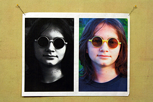
Extra credit: In order to draw out the differences between shades of value, you might try tweaking the brightness and contrast in a image manipulation program such as Photoshop before printing out your image. You could also try turning it black and white, posterizing it, or playing with changing its colors. These all may help you see the image as a collection of values.
Step Two: Use tracing paper to outline shapes based on value.
Tracing vellum is nice and transparent, if you can find some, but regular old tracing paper will do if that’s what you have. Using a nice, sharp pencil (I like mechanical pencils for this), start outlining the larger shapes based not on, say, parts of a face—nose, mouth, eyes—but in terms of value. A nose will be made up of several shapes—dark, medium, and light areas. If you need a refresher on value, visit my blog post “Why Color Is Irrelevant.”


Resist the urge to be extremely detailed. It will simply be too confusing. Also, as you will see in the example of “Dixie Dingo” (below), the pattern will get covered up quite quickly, making all those details a waste of time. If it starts looking like a crazy paint-by-number drawing, then you probably have too much detail. Look for lightest areas and darkest areas to draw around. The middle values get filled in as the piecing process progresses.


Extra Credit: Do simple shading in the darkest shapes to indicate shadows. A lighter shading can be added to shapes where the value is in the mid-tones. Leave the highlights white. This drawing, after you transfer it to the foundation fabric, can serve as a “cheat-sheet” of sorts and help you keep track of what values go in what shapes.
Step Three: Enlarge tracing to desired size of completed quilt.
When in doubt, go big. How big? One rule of thumb: a face should generally be at least 10 to 12 inches top to bottom. Even bigger is better. Imagine trying to create an eye the size of your pinkie nail. Now imagine it the size of a golfball. Make it easy on yourself and go bigger.
The easiest way to get your tracing enlarged is to take it to a local copy shop. Most big box business supply stores have a copy center. Tell them how big you want the finished pattern to be and let them do the math.
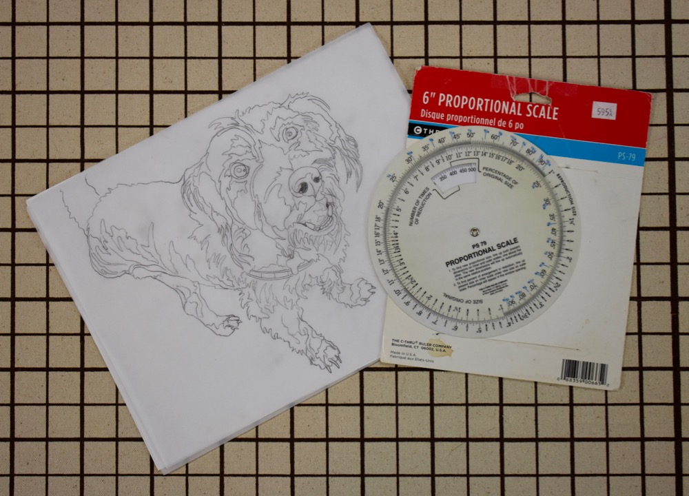
Another method is to enlarge it at home. This will require you to scan your tracing, then print it out at whatever percentage you desire. This will probably require you to “tile” the image together in several pieces. I do this with all my designs (see photo above and”Dixie Dingo” photo at beginning) since I have in-house copy service, a.k.a. Tom, my husband.
So how do you figure out what percentage to use? Simply divide the finished size by the original size then multiply by 100. It doesn’t matter which dimension, height or width, you use as long as you choose the same on both finished and original. Another way to figure out your enlargement is to use a proportion scale. And of course there are apps for that.
Step Four: Transfer outline to foundation fabric.
Choose a plain, regular weight fabric for the foundation that you’ll be gluing to. Muslin, or another inexpensive neutral colored fabric, works well. Cut a piece slightly bigger than your paper pattern. When you slip the pattern behind the fabric, you should be able to see it well enough to use a permanent marker (such as a Sharpie) to trace the image onto this foundation. You want a nice solid, definitive line. This is your guide and reference. There are no templates in the way I work.
Extra Credit: If you shaded in the darker areas on your pattern, transfer those to the fabric as well.

Final Exam
Students are often impatient to start creating their image in fabric, but don’t rush your pattern. Take your time. Maybe you’ll have to make a second draft, as I did with “Peace, Love, Tie-Dye, Save the Whales.” It’s well worth the effort at this stage to create an accurate pattern. As you move on to the the next step in the process—fabric collage piecing—a good pattern will ____________.
a. be the foundation on which your fabulous quilt will be built.
b. be your best friend.
c. give you extra confidence.
d. all of the above.
I understand that apps can be a security blanket and you a trusted place to start. Value is one of the hardest color concepts to firmly grasp. I think that’s why folk stick mostly with “natural” colorations. They can match two values of brown, but have more trouble using purple for one of the values and orange for the other. But my observation is that many folk starting with posterized images biggest issue is knowing how to gradate between the the values they have chosen so their collages end up looking very unnatural with harsh lines between the values. You’re right. It’s important to use the original image as the visual rather than slavishly sticking to guidelines of the posterized image.
Thank your Susan