
If you’ve been following my blog, you must know by now that I love color. You may have also heard me say that “Color Is Irrelevant.” These two ideas are not as contradictory as they sound. When I say that color is irrelevant, I mean that as long as you have the values right, any color you choose will do.
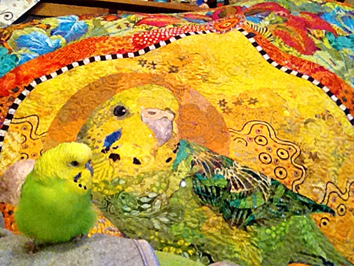
Choosing overall colors and fabrics for subjects that are naturally colorful—a bird or lizard, for example—is a straight-forward choice. Even if you’d like to substitute one bright color for another, like turning my yellow and green budgie Kiiora (above), into an orange and blue version, doesn’t seem like a huge color leap.
But what about when your subject is black, white, or even black and white—such as Kali Dog or Djinni Cat (below)—and I want them to look white and black, but not be white and black?
Click on any of the smaller photos in a photo gallery to see them larger and to scroll through the gallery.


Along with these two featured in my quilt Golden Temple of the Good Girls, plenty of other black and white animal subjects have been seen in my classrooms. Black labs, penguins, pandas, gorillas, pure white cats—interpreted to one degree or another, with fabrics that were colors and shades of neither black nor white.
How is this best done, you may ask?
Introducing Top Tips
Top Tips are something that Tom introduced me to from his world of sea kayaking. A Top Tip is a hint or suggestion that often simplifies a complex idea to its essence and can be delivered in one or two sentences.
For example, Tom might say to a fellow paddler who is having trouble turning their kayak, “Start a bow draw with a sweep stroke.” I have no idea what this means, but he says it is a very helpful suggestion.
Recently, I was able to give a fabric collage student of mine, LeahGrace Kayler, a helpful Fabric Collage Top Tip. I say student, though LeahGrace has become an accomplished fabric collage artist working independently much of the time.
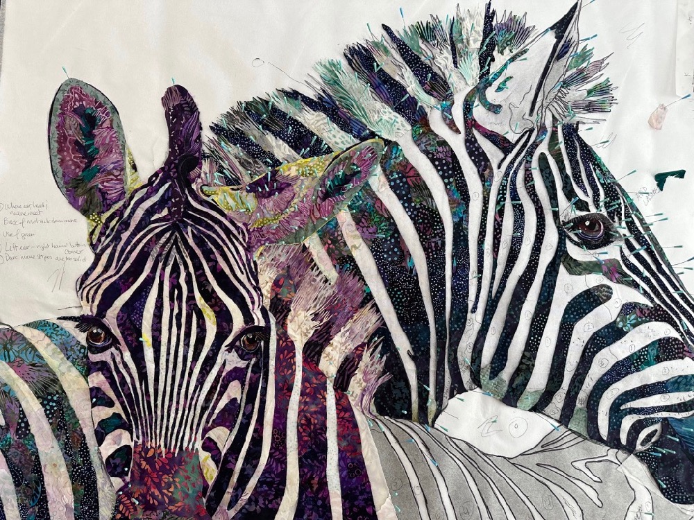
This summer LeahGrace has been checking in with me regularly for coaching with her current collage of two zebras—a classic black and white subject. She chose to differentiate the male from the female by choosing (generally) purple/teal for him and purple/pink for her, with touches of aqua and chartreuse.


At one point, LeahGrace was working on defining the edge of the female’s face from the male’s back. She felt there was something out-of-place with the black stripes on his back—so I focused on them to see if I could help.
Looking closely at his black stripes (to the left, in photos above—remember you can click on them to enlarge), I noted that LeahGrace had mostly constructed them with fabrics that had small patterns on black fabric backgrounds—except for one fabric. The fabric catching my eye was indeed a dark value but didn’t have the black background, and therefore stood out among the other fabrics—as if it had a different visual texture. It can be seen in the middle of the two stripes, far left in photos above.


I mentioned this to LeahGrace and she grasped the idea immediately. You can see the adjustments she made on his stripes, above photos.
When she told me that she was thinking to make his nose blue, I suggested she try using the “mismatched” dark value fabric in the nose instead, since both the fabric and nose have softer, smoother contours to them. In the photos above, she did just that, adding another flowy fabric to help separate the dark of his nose from the colored patterns on the black backgrounds of his stripes.
So here’s this week’s Top Tip:
When introducing color into black or white subjects, find fabrics that have your chosen color in the print—but with a black or white background fabric. The print carries the color, the background fabric ties them together.
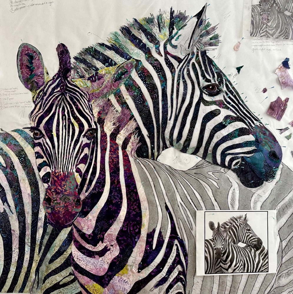
As you can see, LeahGrace has successfully worked color into both the black areas and the white areas of this zebra pair. She told me the next week how much that one little tip about backgrounds—what’s behind the print—helped her move ahead on his stripes. Which she did beautifully.
Golden Temple of the Good Girls
And now to end where we started—with Golden Temple of the Good Girls.
Now that you’re, hopefully, grasping the idea of how to look for color in your black and white fabrics, you can apply those ideas as I show you detail photos of the “black and white” good girls, Kali and Djinni.


Following this Top Tip for myself:
When I introduced color into the black and white subjects of my collage quilt, I found fabrics that had my chosen colors in the prints—with a black/blue background for Kali (above), or dark purple/red background for Djinni (below), for their dark values.
I chose light blue or green prints for Kali, or light pink or green prints for Djinni, on white background fabrics for both of them, for their light values.
The print carries the color, the background ties them together.


What a great tip!!! I never looked at my fabric selections quite this way. It makes so much sense and is so simple. This has been a real aha moment . You never cease to amaze me with your wisdom ..
Thanks for the smile, Marilyn! Coming from you this is quite the compliment – you are another very accomplished fabric collage artist, and to be able to give you (and LeahGrace) new aha moments is quite an accomplishment for me! 😉