
In last week’s post I showed how I reacquainted myself with my cicada collage begun almost a year ago, and then set aside for awhile. What was helpful is that before it went back into hibernation, I had completed the first draft and dabbled a bit into the second draft.
I like to use the idea of drafts as steps to make the process more approachable and manageable—helping to take away the potential overwhelm of the project as a whole. The first draft is usually the most time consuming since the idea is that the foundation fabric—including subject and background—is covered up with the first layer of fabric pieces. So depending on subject and background, that might take awhile.
Last week I trimmed and adjusted the background of my cicada, tacked the first draft fabric pieces in place–with my (now) handy dandy Tacky Glue, removed the pins, and gave a sigh of accomplishment. The first draft (see photo above) is done. Is there more to do? Of course! After all, my motto is “more is better.”
The second draft is where I take note of what I especially like about the in-progress work, but also what might be standing out in a way I’m not so happy with. Is there anything that I’d like to add “more” of? Anything to be edited, covered up, or removed?
Today I’ll demonstrate how I analyze my collage for the second draft through Zoom annotation tools and a YouTube video, below:
Camera Shots of Selected Points in Video
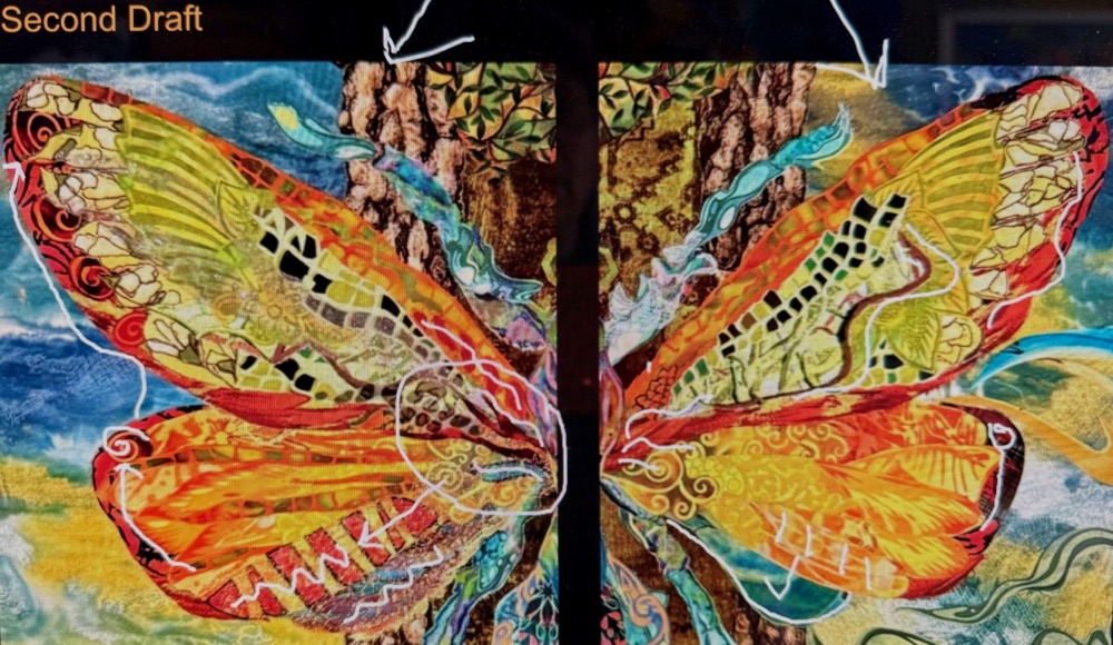
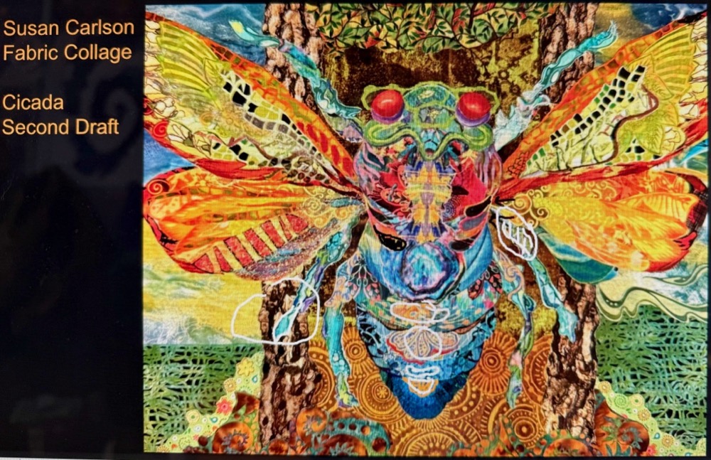
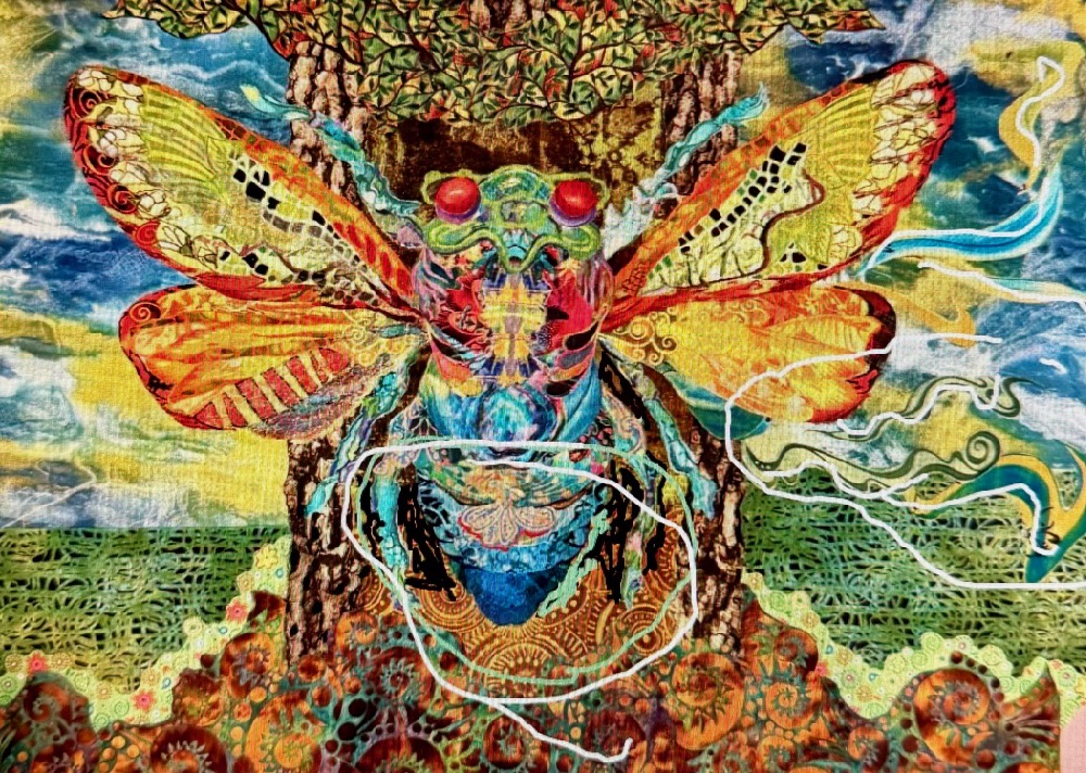
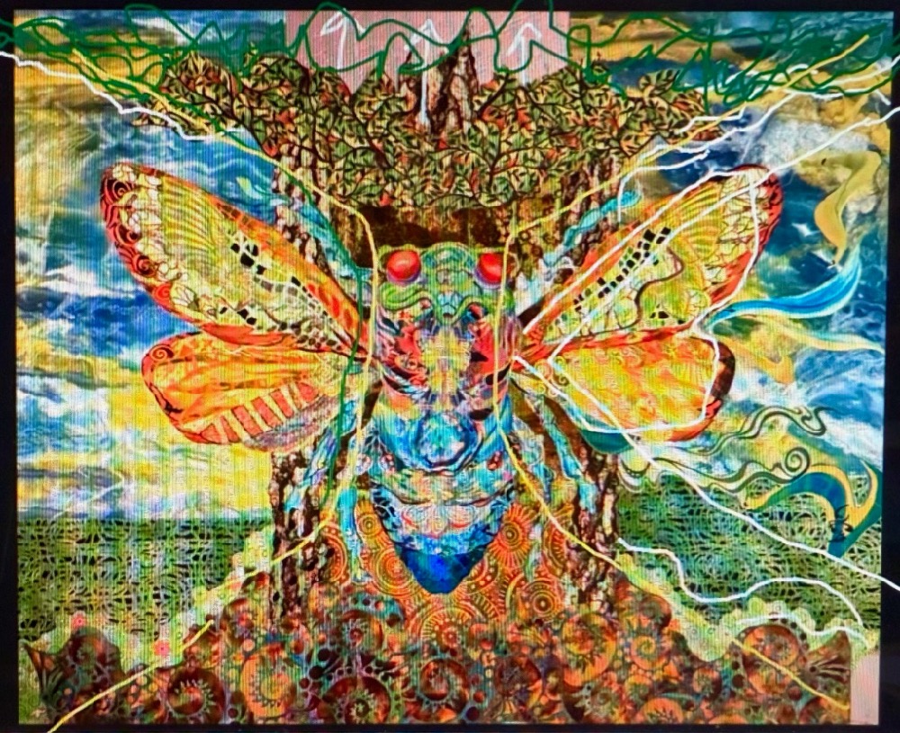
When I teach online and annotate photos as I talk with my students, a tip I learned from them (especially from Grace Crocker and a few others) is to print out the annotated photos as a reference, or checklist, to work from. That’s a pretty good idea as I get back to my own pinning board and put these second draft ideas to work. See you next week!
I think that is the best explanation of how to do and what is involved in a second draft that I have heard anywhere! Thank you.
Thank you, Mary! Glad it hit a chord—especially since you know what I’m talking about—you’ve been through quite a few second drafts! 😉
I was in the Cicada class last September. Loved it and just finished my cicada (finally LOL). I’ll try to find a way to send you a pic. I added extra layers of batting to make the cicada ‘pop’ out :).
Hi Julie! No worries—obviously you’re ahead of me with finishing the cicada! I’d love to see it, please do send a photo. May we put it in a future Finish Line post? Sounds like the way you “rounded it out” would be great to share with others as well. If so, here’s the easiest way to send photo and info: https://susancarlson.com/submit-a-finish-line-quilt/
Thank you!