During my January 2021 Patreon Show and Share, I gave feedback to one of my patrons who was working on a father and daughter portrait. She was having trouble with the little girl’s nose. At some point I referred to how the nose is the high point like a ridge and it dips down the sides into a valley then rises up again onto the plain of the cheek.
“You know, like a topographical map,” I said.
That got me thinking again about using the landscape of the face as an analogy for teaching how to make a face in fabric collage.
Our brains pretty quickly catch on to topographical maps. Look at this map of a familiar face.
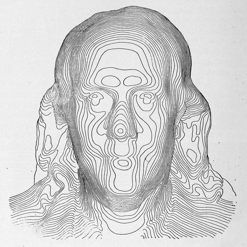
We understand that when the lines that make up such a map are closer together it is a steeper area. When the lines are farther apart it’s a flatter spot.
Now I don’t want you to drop what you’re doing and try to create a topographical map of the face you are working on. But I think it is helpful to think of the face in this way: as having ridges and valleys, steep places and flat places.
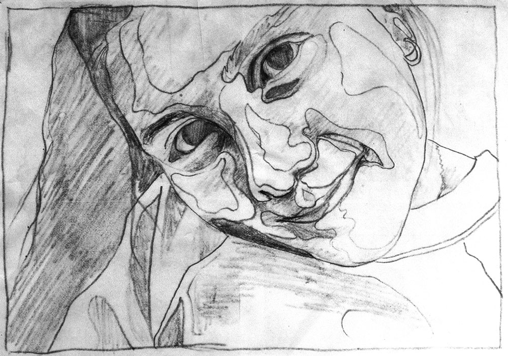
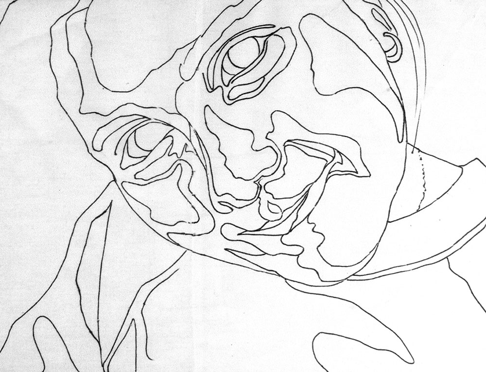
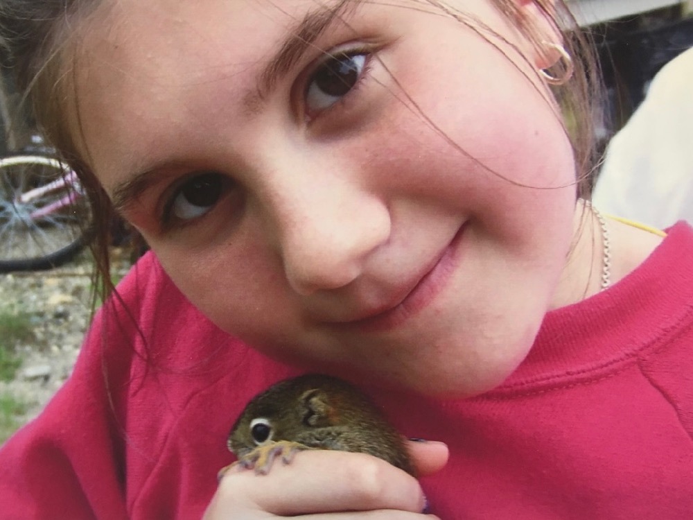
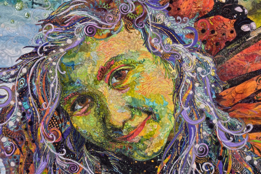
The pattern made for a fabric collage portrait may look similar to a contour map but is based on a different set of information. Look at the pattern of my niece Maia’s face that I drew for my quilt “Monarch Maia.” The lines here define areas of value—dark areas and light areas.
However, similarly, where the lines are closer together tend to be parts of the face that are “sloping away” from the viewer, and where the lines are spaced farther apart are the open areas of the face with gentle slopes such as the forehead, nose, cheeks, and chin. So it’s not a big stretch of the imagination to see how thinking topographically could help in drawing, and later collaging, a face.
Ideally, when making your pattern I would have you thinking about topography, but what you should be looking for and seeing is value. Thinking about the landscape of a face can help you see the values, because you’ll know where to look for them. If you’re aware of the “valley” between the nose and the cheek, you may see that it’s darker there. When you know that the brow and nose and cheek are the highest points of the face, you’ll see that they are usually the lightest areas.
Of course this way of thinking can be applied to almost any subject. When you are attempting to give the illusion of 3-D form when working in only two dimensions—whether it’s a person, a pet, or inanimate object—thinking of your subject as a landscape of ridges, valleys, and rolling hills may help you find the values you need to complete that illusion.
Update to this week’s Throwback Thursday “addendum post” about my mom’s newest batch of her stuffed Valentine pumpkins. At the end of that post I tacked on a few photos of her blueberry pound cake birthday cake—a baking specialty of my husband Tom’s that my mom savors every time he makes it and will hide it from my dad as it starts getting eaten up.
A couple people asked about the recipe and here it is, Blueberry Pound Cake recipe, straight from the website of Molly Katzen, the author of many cookbooks (of which we have a few), including the well-known Moosewood series of cookbooks. Our copy of Moosewood Cookbook is probably one of the first cookbooks we owned together (25+years old?) and is certainly “well loved.”
A thank you to those who sent birthday greetings to my mom (88 years old!), she loved them. And to those who cleaned out her Oma’s Pumpkin Patch Etsy shop within hours of posting—Wow! She couldn’t believe that she had to get back to work again! 😉


Great post! So informative. I plan to do (maybe just start) a portrait quilt of one my grandsons this year so this was very timely.
J’aimerais acheter un livre sur le collage de tissus, la technique en francais, est-ce possible?
Luce
I’m sorry. My fabric collage learning resources are not available in French.