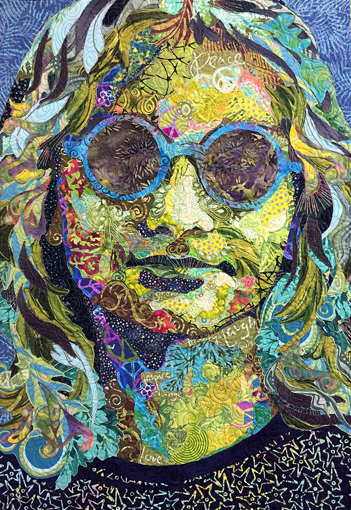
This week, as I finish up my travel for the season (no more security lines until September!), I handed off Saturday’s blog post to Tom. He had an idea for a blog post based on an email I received from Cindee Andres. Her extended reply—an essay really—is in response to my blog post “Why Color Is Irrelevant.” In turn, her essay inspired another blog post for us. I love this sort of creative synergy!
Anyway, what better post to choose for this week’s Throwback Thursday than “Why Color Is Irrelevant”? Don’t get me wrong, I love color—the more the better! This blog post is about value. Understanding and recognizing the darks and lights in an image is how one creates form, which is of course very important for the type of quilting I do and teach.
So refresh your familiarity with this post, and then this Saturday, see how Cindee took it in an unexpected direction, inspiring Tom’s response.
For More on Value
The Fabric Collage Online Master Class Manual places a strong emphasis on value. Over the course of the Master Class Manual, value is approached from different angles, including in a easy, beginner-level spiral exercise, building the understanding and recognition of this important idea.

Color takes the credit and value does the work.
This post is very informative – I love the images that prove the text! I’d like to share this post on the SAQA Seminar page. It’s on Visual Design and value is so important to design.
Please let me know if you give permission. Thank you!
PS. The contact feature on the website doesn’t work. I’ve been trying to use it for a week. The message doesn’t get sent.
Go ahead Jeanne!
Thank you so much!