
To create my fabric collage quilts, I work in two similar but distinct ways. Most often, I will hunt for and cut out fabric shapes from larger pieces. This is the method I teach in class. Every once in a while, however, I take the bushels of leftover scraps (stored in vintage suitcases) that I have accumulated and use them as is, with as little cutting as possible, arranging the existing colors and shapes in a very serendipitous way within my design.
I first used this technique in “Samuelsaurus Rex” a portrait of my son, Sam. Most recently I worked this way to create “Kaloli Moondance,” a portrait of a marabou stork. Another quilt created this way is “Not-So-Goldfish.”
This quilt was an experiment of sorts. Early in my career I made hundreds of small fish quilts, making them by cutting and layering larger shapes cut from larger pieces of fabric. While they were often not realistic, they were very controlled. When I discovered this new, looser way of working I decided I would like to see if I could apply this scrappy technique to my old standby subject: a fish.
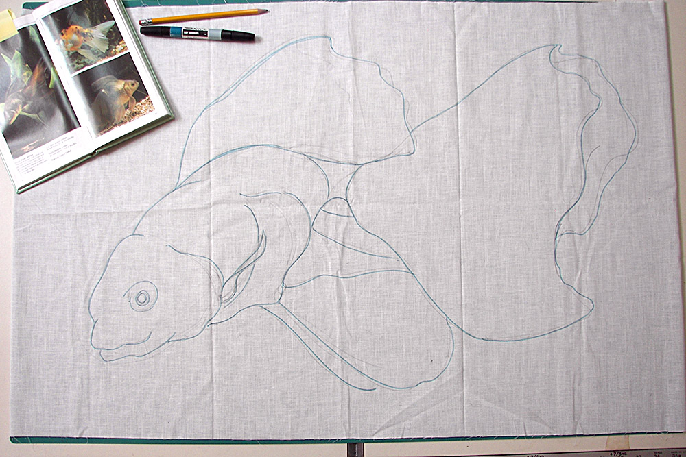
I had done goldfish before, so I decided to do a bigger, looser goldfish. With an inspirational book of fish open, I created a Franken-fish, free-hand sketching a design onto muslin that was inspired by the puckery mouths, the round bellies, and the flowy tails I saw—all features that to me said “goldfish.”
Now it was time to dip into my stash of scraps. First I pulled out goldfishy colors: yellows for highlights, oranges for midtones, reds for shadows. Laying them out in an intuitive way, I ran out of those colors quite quickly. I was having fun working with shapes that I found, so rather than retreat into using my usual (reach for the pretty stacks of folded fabrics) way of working, I turned to expanding my color selection. When I ran out of red, I chose another dark color value. More and more different colors worked their ways in. I also considered the given shape of that piece of scrap fabric. If it was curvy it found its way into the belly. If it was straight it joined the other fin fabrics. If it was flowy I used it in the tail.
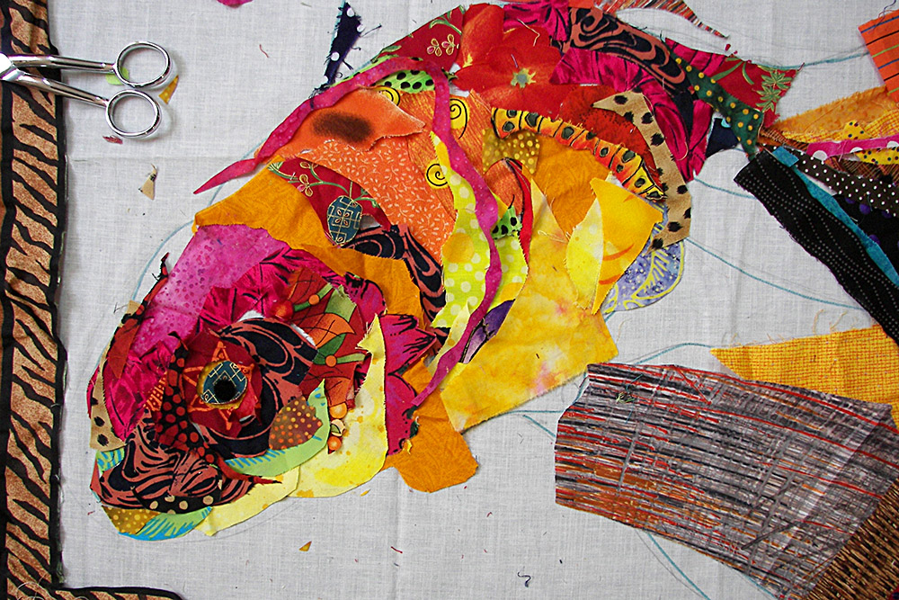
Because I was using so many “non-goldfish” colors, I decided that the name would reflect that, thus: “Not-So-Goldfish.”
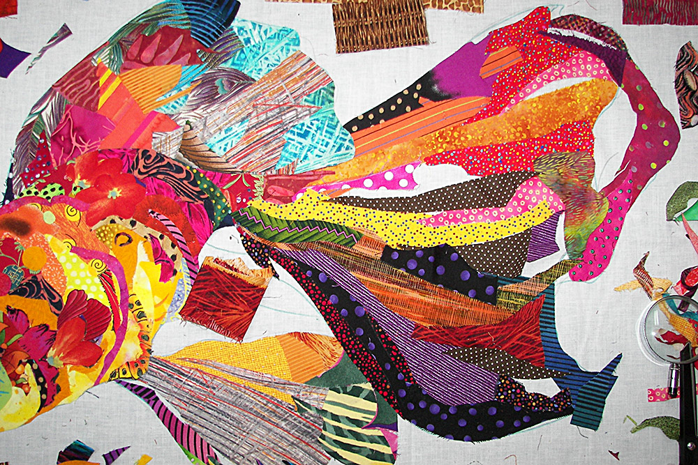
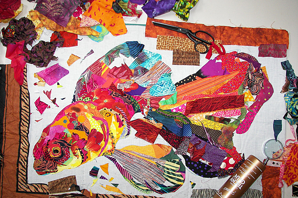
Once I had finished the body of the fish, I continued using the same scrap-only technique for the background. In most of those previous hundreds of fish, the goal had usually been to create a quilter-style “trophy” fish, fish like you see stuffed and mounted on a board, only my trophies were created from wonderfully colorful and patterned fabrics. I’d usually create the fish separately, cut it out from the muslin foundation, then place it on background fabrics. Almost always, the idea was to make the fish stand out from the background.

With “Not-So-Goldfish”, I worked quickly, intuitively, and loosely in a more painterly fashion. The fish and background started to blend a bit, especially around the tail, and I decided to leave it that way with the outline not so distinct. In the end, I think the blurring of fabric and color gives the piece the illusion of motion.
Scraps, including those long stringy bits cut from the edges of quilts as they are squared up, worked their way into the background as well. Totally unplanned and unpredicted. It was serendipitous.
Husband Tom tells me this way of working exclusively with smaller, irregular, leftover scraps would make a good alternative class, forcing students to be looser and freer since they couldn’t rely on their carefully folded fabric piles. I often find that limitations such as how I work, or limiting my color palette or the types of prints in my fabrics, actually inspire creativity. Limiting your choices narrows down the infinite options you are faced with. We have so much fabric it can be overwhelming. I see that all the time, students paralyzed by not knowing which one fabric to start with.
I have also seen that quilters sometimes have a hard time making the first cut into their folded fabric. A whole piece of fabric is perfect as it is. A cut only mars it, ruining its perfection. Or so we sometimes see it that way.
So pick an image and a color palette and scrounge for some scraps to use or just dip your hand into your scrap bag and see what comes out. Then let your intuition take over and see what takes form. It’s a great way to get out of any rut you may be in. Hmmmm, I’m feeling a little spring cleaning inspiration set in—clean up the old (scraps) and see what new (quilts) can grow out of them.
thank you so much for sharing your process, very generous… I think you might be coming to Australia some time in the future, would love to meet and do your workshop. again thank you Denise Fleming
Love your free flowing method. Do you glue down as you go?
Yes. For a full explanation read my post on gluing: https://susancarlson.com/2017/01/21/why-glue-updated-with-video/
fantastic, you answered every question!
Susan, this 3381210as a fantastic blog entry. Thanks or sharing! Now, where did I put those scraps….
Love this! I am one of those who are paralyzed with the large fat qtrs in front of me. I work more intuitively, and therefore this method of working makes me feel I might be able to handle this beautiful style of yours. Thanks for this blog!!
Great post! Wonderful glimpse of how your process has evolved. I love how you paint with fabric!
Thank you for sharing you are inspiring me to try
I have just started to save my scraps. It may be years (and many more of your blog posts) before I’m brave enough to attempt actually making a picture out of them, but it’s a start!
I have attempted my version of a fabric fish using my scraps but am now terrified to free motion quilt it as I have never done this before. It has bee stashed away until I am brave enough. I greatly admire your work.
PLEASE tell me what you do after fabric all pasted down? Do you place a layer of tule over the picture and then free motion quilt it….
Some place netting or tulle over the entire image before quilting. It helps to keep the machine foot from catching on the edges. I usually do not. I carefully glue each edge before free-motion quilting.
What fun, beautiful quilts. I have been working on a quilt in similar way but found that by the time I was ready to quilt, there were a lot which were fraying!!! Any suggestions?
Veena