

I seem to learn something from every quilt I make, like how to shape fabric around a curve (Golden Temple of the Good Girls) or how to hang a 22-foot long quilt (Crocodylus Smylus).
But some quilts are turning points. They mark a change in style, a way thinking, a way of seeing. “Elements” was such a turning point for me.
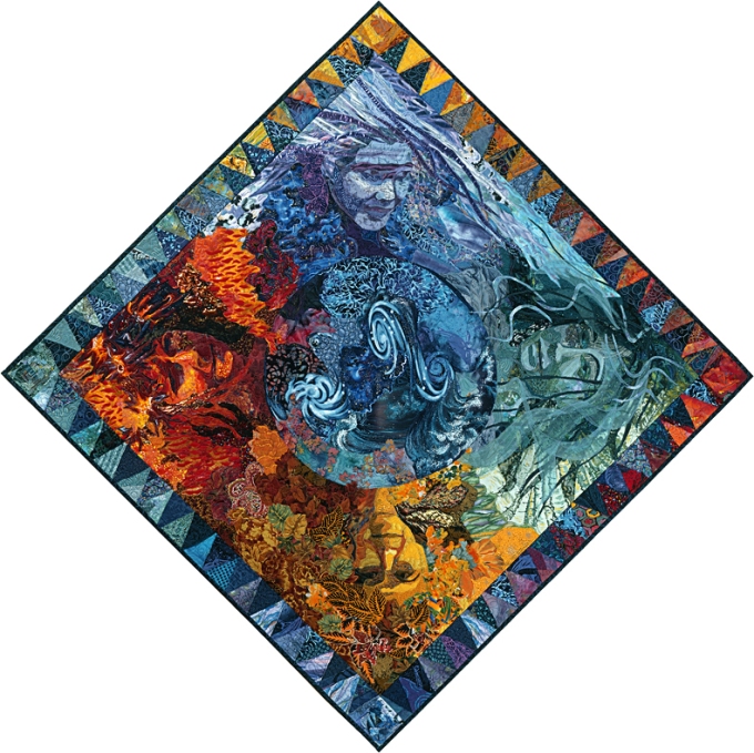
The quilt was inspired by a guild challenge: create a representation of the four elements—earth, air, water, and fire—in fabric. This was in 1993. Most of my quilts before that time had been portraits of people. I had just finished “Surprise Me,” a realistic portrait of my husband and his two college buddies. So of course I immediately thought of making a personification of each element.
But how to compose such a work?
I needed some sort of organizing structure to give me a starting point. I did some pencil sketches. I don’t remember other ideas I might have considered but not used. Eventually, I settled on a globe around which the four “earthly elements” would be arranged.
I don’t know why, but once I had the concept down it became clear that each element would be represented by a certain color. And then the circular format of course led to the idea of using the entire spectrum of color, one color blending to the next, like a huge color wheel.
Now all I needed were models for the portraits.
So I dug through my collection of snapshots. And yes, remember, this was 1993—they were snapshots. I was looking for nice closeups with appropriate expressions, and poses that I thought worked well in the composition. (Remember, 3/4 view is better than straight on.) As it turned out, though, I found that my choices also made sense of a sort according to the personalities of the models.
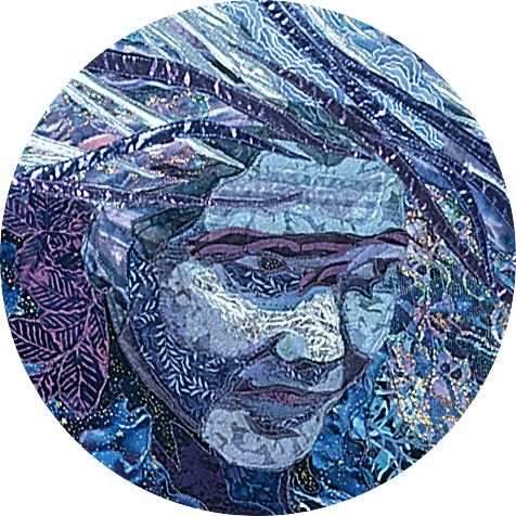
For Air, I chose a pic of my sister, Heidi. I liked the sweep of her hair and the angle of her head. Look how her eyes are focused ahead, as though bending into a gale. In her youth she was something of a free spirit, which seemed to suit the Air element.
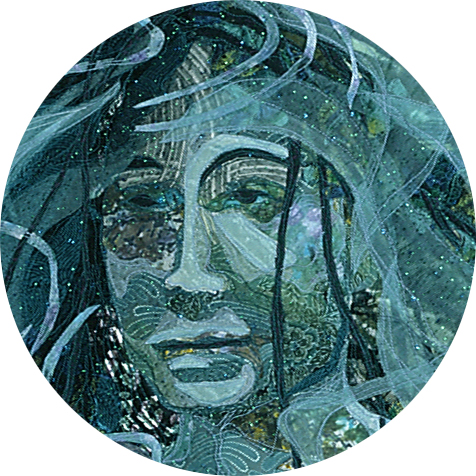
For Water, I wanted long flowing locks as though they were floating free in the depths of the sea, like seaweed. And while the ocean can obviously be a ferocious place, I wanted to make my Water calm and peaceful. This picture of my friend Pam, who at that time had beautiful long hair, reflected the serenity and empathy she projects in real life and was something I tried to capture in her portrait.
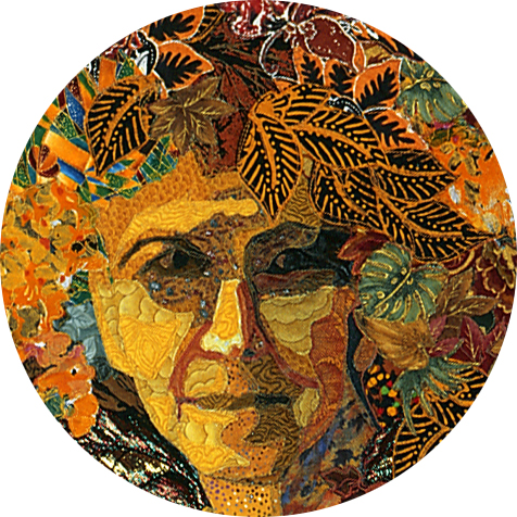
Mother Earth may be a cliché, but the foundation of my life is my mama. So it seemed clear that she would be the personification of Earth. In this picture, her expression is ambiguous—a Mona Lisa expression—one that creates its own mystery. Is she smiling? I think so.
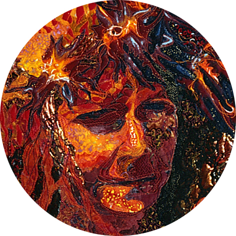
I needed someone for Fire, but none of the women in my pile of photos seemed quite right. Then of course it became obvious who was missing from the group. The one person tying all of them together. Myself. So maybe I wouldn’t have chosen Fire for myself, but the others worked so well, by process of elimination, it fell to me.
My mother thinks that I was a little harsh—that I could have made Fire more flattering. But Fire wasn’t intended to be a perfect likeness. I needed Fire to be harsher, more consuming than I feel I am.
Turning Points
Look at the following three quilts:
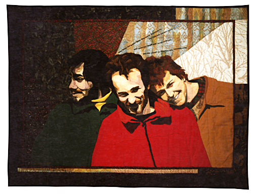
Notice any difference between “Surprise Me” and “Twilight”?
Yeah. Color. Lots of it.
The concept of personifying the elements gave me permission to use non-realistic colors. I’ve never required permission since then. I don’t think I have ever used “realistic” colors since then either, except in a few commissions.
I believe “Elements” would have been a turning point in my career no matter what, but it certainly helped that it received a very warm reception. That year I entered the quilt in the League of New Hampshire Craftsmen’s Annual Fair. It won the Best in Show at the Living With Crafts exhibit. Shortly after that I appeared on New Hampshire public television’s program “Crossroads.”
I think it’s an accepted fact, whether true or not, that an artist ought to pursue his or her craft without regard for recognition. The writer in his lonely garret. The painter selling his canvasses on street corners. The singer-songwriter strumming in the subway. We expect them to be satisfied with the coins we toss into their hats. We assume that artists don’t need recognition at all if they are really, truly dedicated to their art.
I’m not sure I believe that. After all, other than “More is better,” my husband says my motto is:
“All art is good art.”
I try to respond to art that way, to meet it where it stands rather than forcing it to meet my expectations of it.
I see beginning artists in every one of my classes. I don’t expect them to progress without an encouraging word. Why would I expect that of anyone else? Why would I expect that of myself?
Would I have continued to make quilts even if “Elements” hadn’t received so much positive attention? Probably. Eventually. Instead, the response it received accelerated my commitment to being an artist.
Who knows where I would be today if not for “Elements.”
Wow. Thanks for taking time away from your art to share your journey with others. I really appreciate it.
Really makes me think of my art journey. Who inspired me and how I see things so differently. “It’s all about the color” (Malinda Bula) and then you. With both your generous teaching and techniques I have really grown as an artist. I just keep on learning, thanks for sharing,
Your work is beautiful and thought-provoking as are your words. Thank you for sharing both!
Love the creative color choices.I am just now learning that it is ok not to stay inside the lines. My children think it is funny that I am breaking out of “the box” . Rules? I don’t need no stinking rules ! Thanks for sharing your views on colors!
You continue to inspire me! Love the use of color!
I really appreciate that you take the time to write a blog, rereading “Bird by Bird” after your suggestion and find that also very encouraging.
Your work is an inspiration. I love the energy of LIFE that your work exudes. Beauty is always appreciated, and much needed in the world.
Your art is simply amazing.
Just amazing! So enjoy your posts. Though I couldn’t make it to Asilomar this year perhaps I can pick up a workshop with you somewhere along the way. Selma Zinker
Sent from my iPad
>
This has been one of my favorite artworks since the first time I saw it – probably very soon after you made it. Thank you for sharing more of your process!
I love all your quilts. I have your books. Just waiting for you to get in striking distance for a class.
Thanks for doing your blog! It’s always a treat to read.