UPDATE
I received the following comment on my Facebook page the other day:
Question: Do you use batiks exclusively or regular cotton fabric as well? Many of these pieces have so much detail in the fabric that I’m guessing you would have to be shopping for fabric all the time in order to find the best fit for your piece.
This question, along with recent experience in my classes, convinced me that it was a good time to re-visit “Choosing Fabric for Fabric Collage” (see original post below). Choosing fabric to bring to class, or to purchase in a store, will always be a challenge because much of it depends on trial-and-error experience. Plus there’s a mind-boggling assortment of fabrics to choose from. No doubt, the perfect fabric will be left at home—or on the store shelf— it’s just one of those rules. And as far as the second part of the comment above, “Yes, I do shop for fabric all the time—doesn’t everyone?”
Since it was obvious some could use further guidance, I decided to take another crack at selecting fabric in this update.
First, though, let me answer the Facebook question directly:
Yes, I do use a lot of batiks. In fact, that’s kind of a short-hand answer for what kind of fabrics I would choose for fabric collage. (I also use all sorts of other cotton, and non-cotton, fabrics.) However, I need to clarify. Some batiks work well while others don’t.
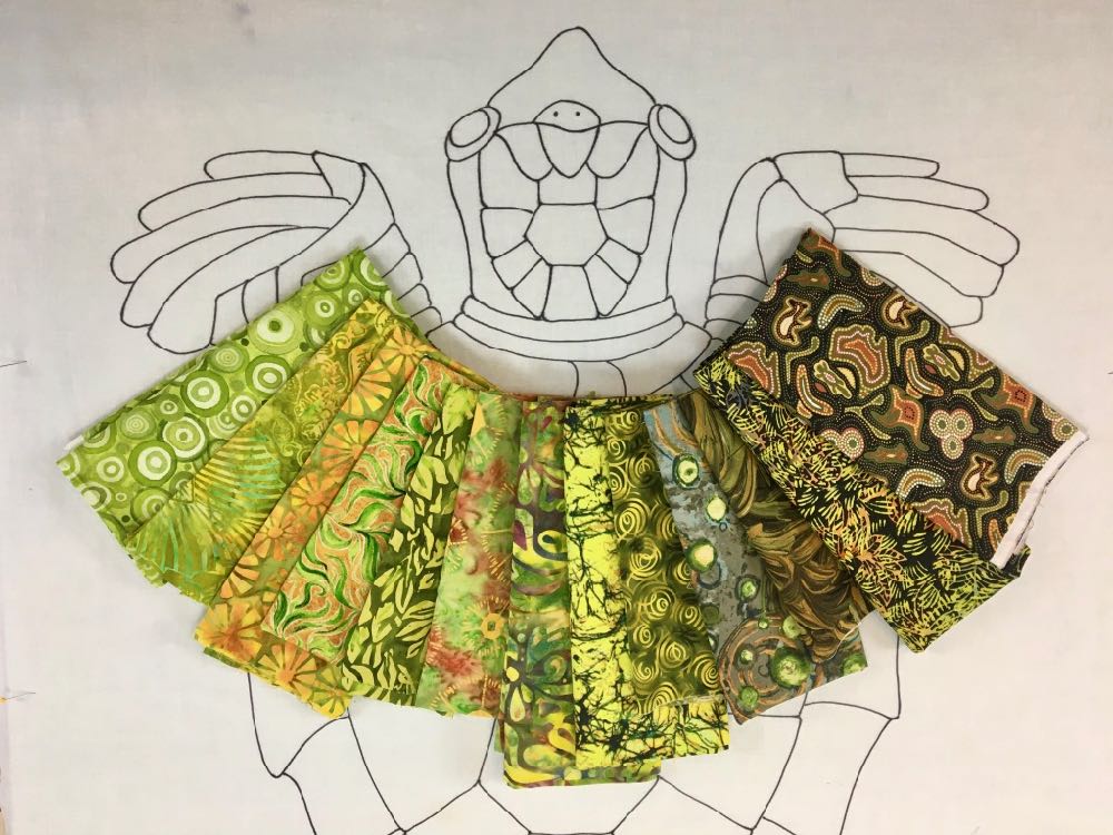
The distinction I draw is between regular batiks and “printed” batiks—batiks that have an overall pattern or design printed on them. I prefer the printed batiks. The way I work and how I teach my students is to use the prints in the fabric to help create form. Don’t ignore the print. Don’t cut through or across the print. The printed design is used to emphasize contours, visual movement and texture in the image being collaged. It’s like a treasure hunt to find the right print—combined with color and value—in the fabric. I then cut along that print to create an irregular shape, adding to my palette of “scraps” to choose from.
Here are a some batik examples.
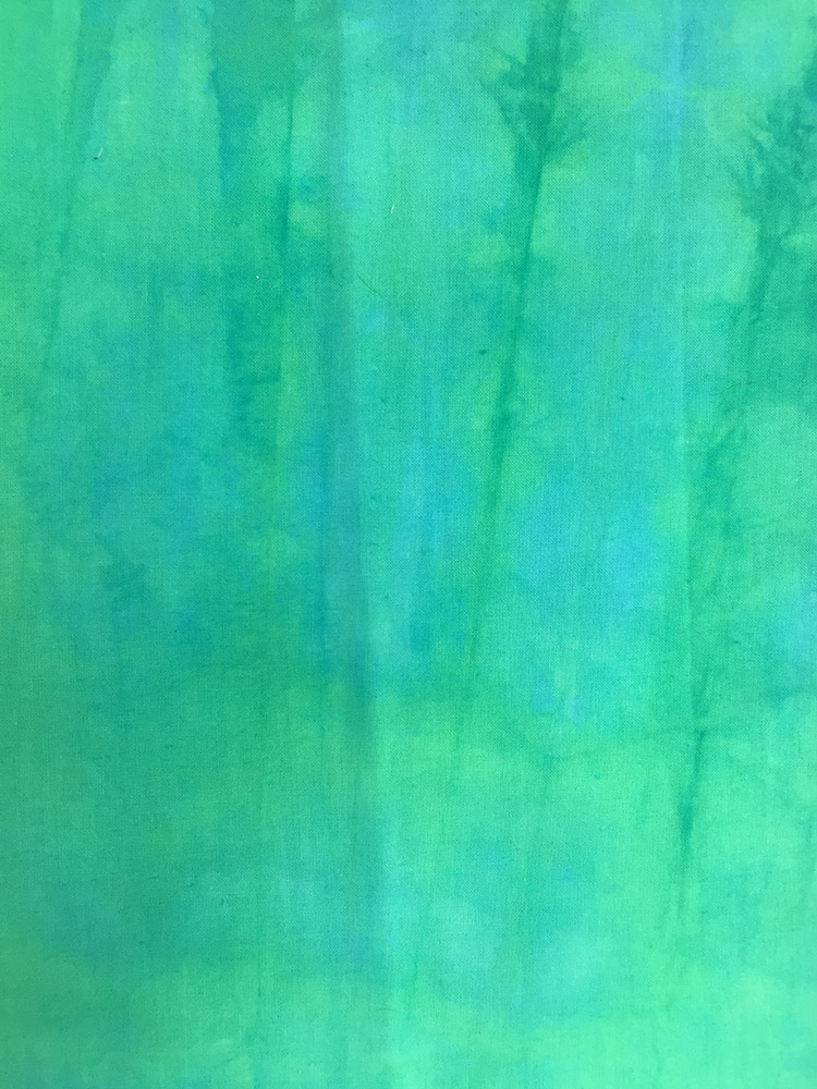
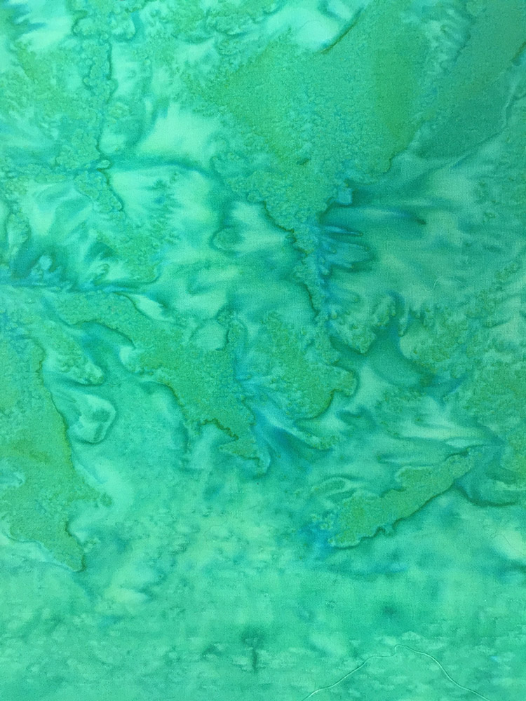
The hand-dyed batik on the left is a beautiful color, however there’s no print for me to cut around—and if I were to create a shape it would look like a solid color. I’ve found solid colors hard to “blend” (but that’s a subject for another post.) The one on the right, is also a non-print batik, but with more light/dark variation which could be seen as random shapes to cut around. It’s possibly useful, depending on the subject matter, but wouldn’t be my first “best bet” choice.
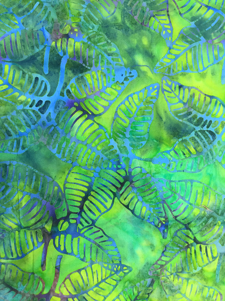
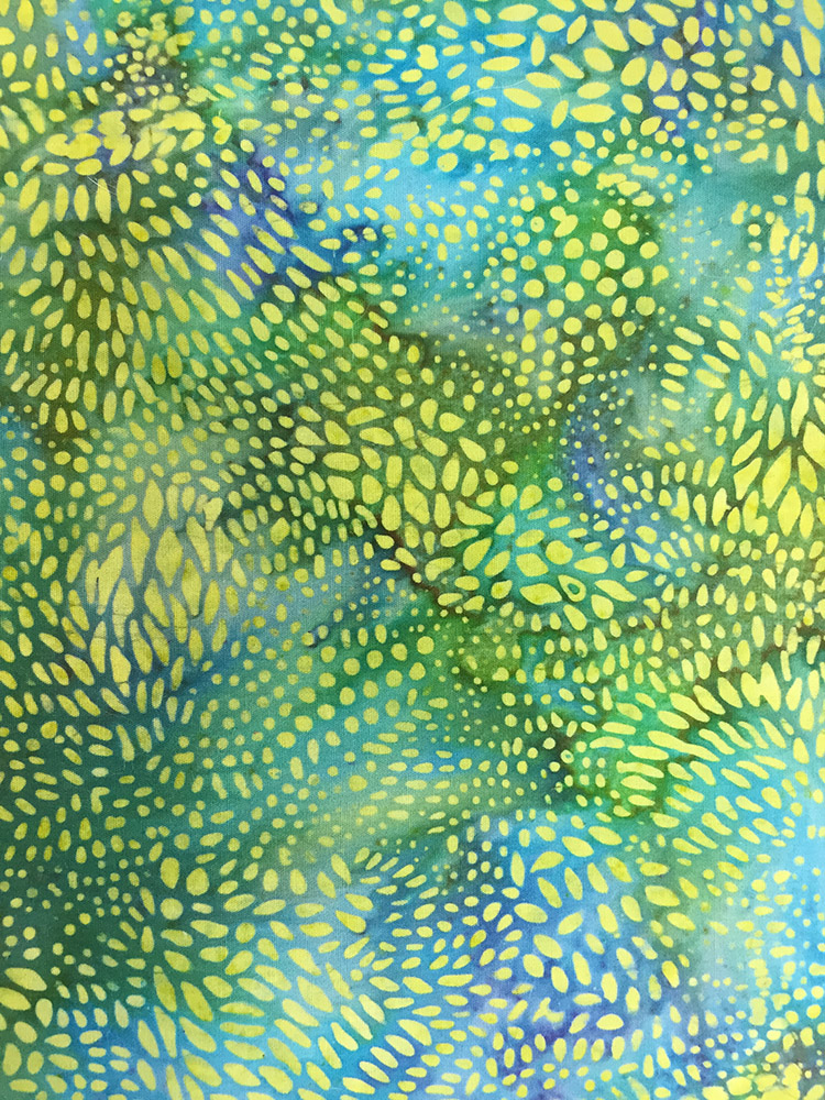
The batiks that turn my head are printed batiks like the ones above. The prints provide movement and another layer of variation in color and value in addition to the base batiked fabric. I find fabrics like these much more versatile for my fabric collage method.
Take a look at the two new videos I have added to this post. They approach the issue from opposite directions.
The first talks in a general way about the fabrics I have collected recently, but without any particular project in mind. They might be good for any number of subject matter. But you can see from my examples the kinds of fabrics I would suggest to add to your stash.
The second, longer video takes a subject-oriented approach. In it, I encourage you to look closely at the features in your subject to help choose printed fabrics that will work with it. Does your subject have long, flowy hair or a tail? Is your subject round or more angular? What are the form and contours of the features you’ll be portraying in fabric? Answering these sorts of questions will help you focus in on the print you’re looking for, whether you are in class or at a fabric store dreaming about your next project.
After these videos is my original blog post from a few months prior. Collecting fabric for fabric collage is an on-going process. May this updated post help you in making your “best bet” selections for your next project.
Original Post
Of course, while I must admit that I have such a broad taste in color and design that my husband sometimes says it amounts to no taste at all (I prefer to describe my taste as “eclectic”), I do have some broad guidelines for how I select fabric.
If I had to break it down, I might use the following criteria:
- Color
- Pattern
- Scale
- Quantity
Students always find it difficult to know just which fabrics, and how much, to bring along with them to my fabric collage classes. One advantage of teaching at a place like the Quilt Gallery in Kalispell, Montana, where I was recently, is that it’s a fabric store. This is one of the places I teach where, if students don’t have the right piece, they can browse a whole shop’s worth.
So what makes a particular piece of fabric useful for fabric collage? What kinds? What colors? What patterns? How much do I buy?
These were the sorts of questions my students in Kalispell were asking, so one afternoon right after class, I invited them to accompany me on a tour of the store as I shopped for my own stash. As I pulled bolts, I talked aloud about what attracted me to them. Students also pulled bolts and asked my opinion of them.
It occurred to me then that fabric selection would be a good topic for a blog post.

Color
As I have mentioned before, I like strong, bright colors. The more color the better. Multiple colors are great. But of course I’m attracted to certain colors—aren’t we all? If I don’t have a particular project in mind, I tend to gravitate toward that particular color range. Check out that selection above. A little heavy in the pinks and oranges, with green creeping in and touches of aqua. Add some yellow and that’s me.
Without consciously searching them out, I had pulled fabrics that color-wise could work well together. I’ve realized that if I trust my instinct, I don’t go far wrong.
Once a certain color fabric has caught my eye (rather like something shiny catches the eye of a magpie), I then look at the value range in the piece. If the fabric is pretty much all one value—is visually flat—I am less likely to buy it. If, however, it has a dynamic range of value, from dark to light—maybe even with another color thrown in—I am much more likely to keep it in my shopping cart. Patterned batiks, for example (all but three of the above samples), are often useful as they contain a lot of variation in value, and usually color.
Pattern
The photo above of my Quilt Gallery purchase ought to also give you a clue as to the patterns I prefer. The prints I choose are primarily natural shapes: leaves, flowers, insects, shells, swirls, animal prints, marbleizing, and so on. Abstract prints are also useful, especially those that are based on natural shapes.
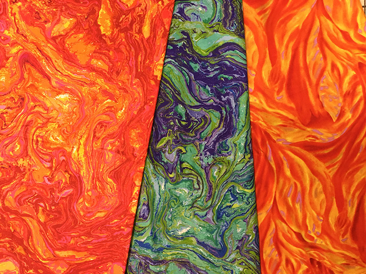
These patterns usually provide a nice variety of curves, repeated patterns, and variations in value to help give form to the images I create. I look for designs in the fabric that I can cut around and use as contours in my image. Such fabric is often able to serve multiple purposes. Long curves for hair or the flowing tail on a fish or air currents across face of a sun could all be from the same fabric.
Scale
A discussion of pattern leads directly into scale. Scale refers to how large the repeated image is. I’m attracted to larger scale prints. Students tend to be hesitant about using them, but I find them more useful that small-scale patterns. If you need a curve, it’s easier to cut one from a large pattern than it is to combine several smaller bits to create that curve.

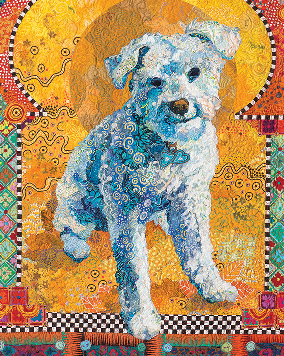
However, smaller overall designs have their uses as well. I often use them for more subtle blending from one value to the next, such as in a face of a person or the body of an animal. See the photos of the “Cousins” and Kali the dog below.
Quantity
I tell my students variety is more important that quantity. I can and do use hundreds of different fabrics per piece, yet most of my quilts are no bigger than a couple yards total in size.
I typically buy fabrics in half-yard (give or take) increments. Even fat quarters are sometimes enough. When do I buy more? The answer to that question is mostly dependent upon scale—the size of the image repeated within the fabric.

For example, in my quilt “Dixie Dingo Dreaming” I used exclusively aboriginal motif fabrics. Many of those Australian fabrics have large design elements, so large that I usually bought a yard or more of each to ensure that I got enough of those repeated patterns to use in the piece. A few of those fabrics then came in handy for Crocodylus Smylus, an Australian saltwater crocodile, a few years later.
Examples
Sometimes you just have to see something done in order to understand it. I use two of my pieces, “Kissin’ Cousins” and “Golden Temple of the Good Girls” to demonstrate how and where I used particular fabrics.
For scale of the patterns, each fabric swatch is 5 inches wide by 8 inches tall.


So, there are just a few of the thoughts that go through my head as I’m making fabric choice decisions. I know some students may be looking for hard and fast rules for choosing fabric, but I guess it’s more like guidelines.
First, buy fabric that makes you smile and you feel good about. There’s nothing bad about that. Then supplement with fabric picked specifically for your project, be it because of color, design, or scale. Go for variety. More is better. That’s my motto and I’m sticking with it.
I remain unapologetically eclectic.
Super video. Wow, you were great in explaining how the fabrics can be used. Thank you for that!
Susan, you did a great job of giving useful information on how to use different fabrics and what to look for.
Susan, Thank you for your continued guidance even after class! I was one of those students who left my chosen fabrics home on the dining room table! It DID force me to look at the fabrics I had and the scraps on the piano (from your friend- please thank her for me!) in a different light. I continue to work on my class project with delight, even thinking ahead to the background! I am holed up at home with a possible broken ankle, but once set up, will be able to work on my collage. I won’t even be responsible for dinner or laundry. HA! Thank you again for your generosity in sharing your methods.
Susan, loved your explanation and examples. You are an artist after my own heart! For years I have been perusing every aisle in my local shop looking for fabrics that can be used in my art quilts, much to the delight of both other customers and staff when I explain what I see in a piece. Great job.
Hello Susan,
What a great tutorial–thank you! For Asilomar, I thoughtfully curated my fabric choices for the weeks leading up to your class. Then, as I finished packing, I was overwhelmed by doubt and basically started raking an assortment of “just in case” fabric choices into my bags and suitcases! Because Civil War reproductions and vintage Christmas prints are perfect for fabric collaging a chocolate lab–um, no! Thank you for your generous teaching style and for all the help with my dog, Cajun. Happy Spring from Southern California!
Juliet
How informative this has been for me! It makes me look at my fabrics with a new eye after every post you make. It was especially helpful on the batiks. Where I fall short is the large print fabrics. I’m headed to Paducah next month and you can be sure I’ll shop with this blog in mind. Thank you, thank you for sharing all of this wonderful information.
Susan, Thank you for the wonderful videos and information in your blog. It will give me lots of things to think about as I plan and pack for your June class in Harpswell.
Great video! Very informative… It’s so wonderful for you to share your thought process and your talent.. Looking forward to the online classes! Thank you again!
The updated and detailed “selecting fabric post” is so helpful. I can really see the differences clearly now, between plan and patterned batiks! MUCH APPRECIATED!!!
New video is so helpful. MUCH APPRECIATED!
Thanks so much. This was so helpful.
Susan, I’m echoing every one of the “thanks!” posted here! I’m working through the lessons in “Serendipity Quilts” in anticipation of my class w/you at ArtQuilt Tahoe in November, and the update video on fabric selection is very helpful. I wish I had seen it before I began my sun quilt, but will take your advise when I begin the moon next month. I’ve been focusing on color, when I should have been looking at shapes as well. I guess that means I just HAVE to buy more fabric … What a shame! 😄
Hi Susan. This post couldn’t be more timely, as I am preparing to head over to Kalispell on Monday to take part in your first class. It will be my first time working with you and I am sooo excited. I have been making a lot of purchases, as currently my personal stash is just full of tone on tone batiks that just aren’t quite right for your method. I am glad to know that I have not been way off track with my purchases, but your thoughtful guidance has given me more insight as to what to look for as I shop hop across Washington and Idaho on my way to see you. Thank you for this post. It is ever so helpful!
Hi Susan,
I took a workshop from you in Portsmouth many, many moons ago – and am still at it!
I struggle with a storage system for my fabrics so that I can search effectively for a particular need – be it hue, value, pattern, etc. – especially since the fabrics end up being all shapes and sizes. Right now, it’s by color, then value, but I”m wondering if it should be value first, then color. Do you have any suggestions?
Lois,
Here’s a blog post I wrote about how I store my fabric: https://susancarlson.com/2016/01/16/sort-it-out-organizing-fabric/ That ought to answer most of your questions. Let me know if there’s something missing.
I love quilt art and I bought your book, my stash is very limited so I have markers thought I would use for more detail? You have given me a lot of ideas and I thank you for that. You are so inspiring. Cynthia