UPDATE
Here’s a video I made as a test for my online fabric collage course.
Of course, while I must admit that I have such a broad taste in color and design that my husband sometimes says it amounts to no taste at all (I prefer to describe my taste as “eclectic”), I do have some broad guidelines for how I select fabric.
If I had to break it down, I might use the following criteria:
- Color
- Pattern
- Scale
- Quantity
Students always find it difficult to know just which fabrics, and how much, to bring along with them to my fabric collage classes. One advantage of teaching at a place like the Quilt Gallery in Kalispell, Montana, where I was recently, is that it’s a fabric store. This is one of the places I teach where, if students don’t have the right piece, they can browse a whole shop’s worth.
So what makes a particular piece of fabric useful for fabric collage? What kinds? What colors? What patterns? How much do I buy?
These were the sorts of questions my students in Kalispell were asking, so one afternoon right after class, I invited them to accompany me on a tour of the store as I shopped for my own stash. As I pulled bolts, I talked aloud about what attracted me to them. Students also pulled bolts and asked my opinion of them.
It occurred to me then that fabric selection would be a good topic for a blog post.

Color
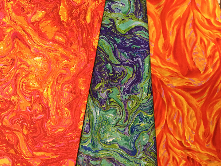
As I have mentioned before, I like strong, bright colors. The more color the better. Multiple colors are great. But of course I’m attracted to certain colors—aren’t we all? If I don’t have a particular project in mind, I tend to gravitate toward that particular color range. Check out that selection above. A little heavy in the pinks and oranges, with green creeping in and touches of aqua. Add some yellow and that’s me.
Without consciously searching them out, I had pulled fabrics that color-wise could work well together. I’ve realized that if I trust my instinct, I don’t go far wrong.
Once a certain color fabric has caught my eye (rather like something shiny catches the eye of a magpie), I then look at the value range in the piece. If the fabric is pretty much all one value—is visually flat—I am less likely to buy it. If, however, it has a dynamic range of value, from dark to light—maybe even with another color thrown in—I am much more likely to keep it in my shopping cart. Patterned batiks, for example (all but three of the above samples), are often useful as they contain a lot of variation in value, and usually color.
Pattern
The photo above of my Quilt Gallery purchase ought to also give you a clue as to the patterns I prefer. The prints I choose are primarily natural shapes: leaves, flowers, insects, shells, swirls, animal prints, marbleizing, and so on. Abstract prints are also useful, especially those that are based on natural shapes.

These patterns usually provide a nice variety of curves, repeated patterns, and variations in value to help give form to the images I create. I look for designs in the fabric that I can cut around and use as contours in my image. Such fabric is often able to serve multiple purposes. Long curves for hair or the flowing tail on a fish or air currents across face of a sun could all be from the same fabric.
Scale
A discussion of pattern leads directly into scale. Scale refers to how large the repeated image is. I’m attracted to larger scale prints. Students tend to be hesitant about using them, but I find them more useful that small-scale patterns. If you need a curve, it’s easier to cut one from a large pattern than it is to combine several smaller bits to create that curve.

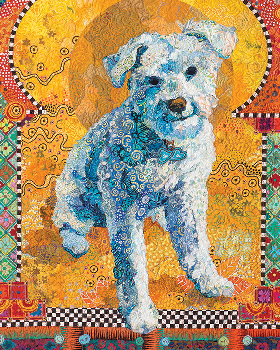
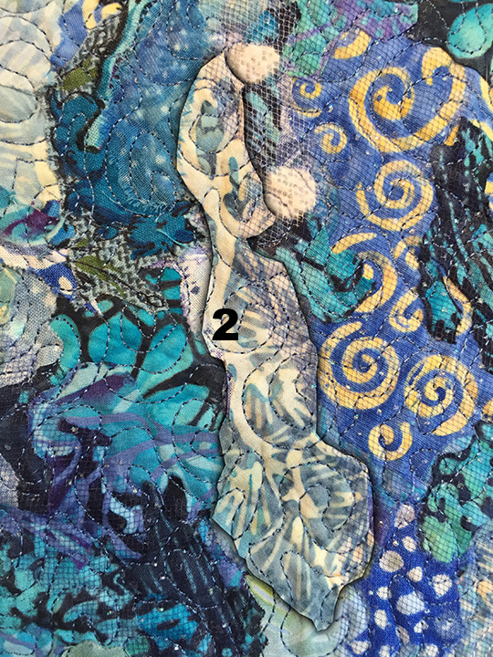
However, smaller overall designs have their uses as well. I often use them for more subtle blending from one value to the next, such as in a face of a person or the body of an animal. See the photos of the “Cousins” and Kali the dog below.
Quantity
I tell my students variety is more important that quantity. I can and do use hundreds of different fabrics per piece, yet most of my quilts are no bigger than a couple yards total in size.
I typically buy fabrics in half-yard (give or take) increments. Even fat quarters are sometimes enough. When do I buy more? The answer to that question is mostly dependent upon scale—the size of the image repeated within the fabric.

For example, in my quilt “Dixie Dingo Dreaming” I used exclusively aboriginal motif fabrics. Many of those Australian fabrics have large design elements, so large that I usually bought a yard or more of each to ensure that I got enough of those repeated patterns to use in the piece. A few of those fabrics then came in handy for Crocodylus Smylus, an Australian saltwater crocodile, a few years later.
Examples
Sometimes you just have to see something done in order to understand it. I use two of my pieces, “Kissin’ Cousins” and “Golden Temple of the Good Girls” to demonstrate how and where I used particular fabrics.
For scale of the patterns, each fabric swatch is 5 inches wide by 8 inches tall.


So, there are just a few of the thoughts that go through my head as I’m making fabric choice decisions. I know some students may be looking for hard and fast rules for choosing fabric, but I guess it’s more like guidelines.
First, buy fabric that makes you smile and you feel good about. There’s nothing bad about that. Then supplement with fabric picked specifically for your project, be it because of color, design, or scale. Go for variety. More is better. That’s my motto and I’m sticking with it.
I remain unapologetically eclectic.

This was a very helpful and interesting post–thanks for sharing your knowledge and experience. I have to tell you that I really like your style of writing, and, in addition to the content of your blog, I really enjoy READING it! Thank you.
Susan, you are so very talented! I’m thrilled that you are doing this blog, especially this installment. Thank you again for sharing. I wish I had half of your talent. It would make me happier! LOL
You are definitely the “McGyver” of fabric collage! Thanks for the tips!
McGyver. That’s one I haven’t heard before! Thanks.
By the way, I would like to enter my serendipity moth (I made from your class) in our local quilt show. Would you give me permission since I used a pattern a purchased from you? Thanks!
Of course. Please mention that it is based on my pattern. Thanks.
I enjoyed reading this. Now, a technical question, how did you outline each piece in your example photos? It’s very effective.
My husband did it in Photoshop. He says he outlined the highlighted fabric and then used a an option called “outer glow.” He’s handy to have around. I guess I’ll keep him.
Thanks!
An awesome post. I’ve been so enjoying reading and absorbing your writings. Now I just have to gather my courage to try one. Blessings,
The fabrics were wild but they sure looked good when it was done. Loved the tutorial.
You make my heart sing!
Excellent education on fabric selection. Will help to look at fabric in whole new way. I often wondered how to pick great fabrics for collages. These fabrics move and I think that is why I see movement rather than flatness in your collages. Thanks so much.
This blog is definitely going to be printed so I can refer to it as needed in my sewing room. Absolutely excellent information. Love the kitty!
Wonderful tutorial! Loved seeing the detail and being reminded of how many different fabrics you use and how small some of the pieces are. Fantastic!
Once again awesome insight into the workings of Susan Carlson’s creativity. Thanks for sharing!!!
Susan, how do you decide where to put tulle?
Susan, I am really enjoying your blog. Lots of helpful information. I’m so disappointed I was unable to attend the class in Kalispell. How do you store all your fabric?
Funny you should ask. I wrote a blog post about that a while ago. Just search “fabric storage” and you should get it on my blog.
Susan- Can I share this post with my guild? I will appropriately give credit of course. -Peggy Billingsley
Sent from my iPhone
>
Of course. Please do!
Fascinating. I thought I had a fair understanding of the types of fabrics one chooses for your collages but this description really helped to “gel” that understanding. Now I see how you achieve the depth in your pieces. Always something new to discover. 😊😚
Thank you so much for sharing your expertise and knowledge. I love reading your blog.
Susan Carlson is the teacher I signed up for. Check out her quilts when you have time. I might do an iguana in class. MM
Sent from my iPad
>
Thanks for giving us a look at how you make your wonderful pieces. The number and shapes of fabric are amazing. I would like to see you actually putting together a small area. I found Crocodylus smylus(sorry about the spelling) accidentally and have since been following you. I love your wok!😀🎆. Pat